Online shopping carts are an easy way for consumers to save their favorite selections. But will those consumers remember to come back and purchase those items they wanted a second ago? Time to dive into increasing revenue with abandoned cart email campaigns that will keep on bringing customers back to you.
Online shopping puts the world at consumers’ fingertips. They can browse across multiple websites, compare prices and even save their favorite selections in just a few steps. Unlike brick and mortar stores, no one will give them a second look if they fill their carts and then wander off without finalizing their purchase.
Many online stores even encourage shoppers to “park” their carts and return later by remembering their selections.
But do customers return later? Not always.
Average cart abandonment rates vary by device and industry. In Q2 of 2021, 80.6% of US shoppers using mobile devices and 66.1% of those shopping via desktop abandoned their carts. That’s a lot of potential revenue!
What’s your cart abandonment rate? If your analytics dashboard doesn’t provide this data, do this to find out: Divide your completed purchases by your total number of carts initiated within a set period (then multiply by 100).
Of course, not all those filled carts represent potential conversions. But, they do signal interest, if not buying intent. Website visitors place items in their shopping carts for a reason. They have reasons for abandoning those carts, too.
Understanding and `speaking’ to your customers’ intent in your cart recovery emails are the key to unlocking these missed sales and growing your revenue.
It’s one of the most imporatnt types of transactional emails you can send.
And this is a lot of revenue, mind you.
How much are we talking about? Abandoned cart emails have an average conversion rate of 10% to 18%.
This post will show you how to capture this revenue with customer-centric, conversion-focused automated cart recovery emails to maintain momentum and convert interested visitors into committed purchasers.
Abandoned carts are an evolutionary feature (or bug?)
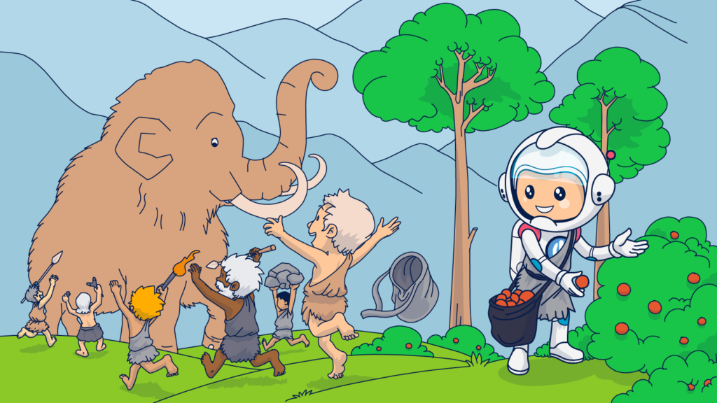
Human beings are natural shoppers. I’m not saying that people began to walk upright just so they could carry a shopping bag, but we’ve always been driven to acquire things. That’s how early humans earned their `hunter-gatherer’ reputation.
Early hunter-gatherers didn’t have the convenience of delaying their decisions like we do today. The rules of survival dictated that If they needed something, they had to go out and get it. And, they had no guarantee that if they didn’t take it as soon as they found it, there would be something still waiting for them when they came back for it later. Savage.
But what about stuff they just wanted, like a pretty shell, a colorful feather, or some soft stones that could be carved into jewelry? Early humans gathered those types of items, too.
The acquirer’s journey was simple:
- They saw it.
- They wanted it.
- They took it.
Since all that hunting and gathering consumed time and energy, it was only a matter of time until barter systems developed. Then systems using items with symbolic value to facilitate trade developed. Next came central marketplaces and roads to reach them–shopping was born!
These early buyer’s journeys were literal. People traveled vast distances to see, want, and purchase items they couldn’t or didn’t want to acquire on their own.
Today it’s much easier and faster for humans to find and get what they want or need.
Digital customers’ journeys begin when an impulse, a need. Or it’s curiosity that leads them to a website.
Once there, they find items that fulfill their needs or pique their interests and place them in a virtual cart. From that point, completing the transaction becomes a matter of choice.
Will they complete the checkout process? Good question.
Modern methods of acquisition have reduced the risks of delaying a decision. Unlike our ancestors, we can walk away from a cache of sweet berries or a rich vein of bronze and expect it to be there still/replaced with the same kind of product when we return.
Okay, we still face the risk that goods in a physical or virtual store will be sold out before deciding. But, because we can go to so many different online shops to find the things we want and have them delivered straight to our doorstep, walking away isn’t as consequential as it used to be.
Our online shopping expeditions aren’t limited to obtaining only physical items. Today’s virtual hunter-gatherers can acquire digital services or products, schedule appointments, make travel plans, or book reservations online.
These changes present tremendous opportunities to convert new customers. They also present uniquely modern challenges to closing the deal. The digital buyer’s journey is easy to begin and abandon.
- We see it.
- We want it.
- We can’t quite make up our minds. 🤷
When does the digital buyer’s retreat represent an abandoned cart?
There are several different touchpoints on your buyer’s journey where they can decide to wander off course. Identifying your website visitors’ points of departure can give you valuable insights into their purchase intent and why they abandoned their journey.
Here are some of the key departure points you should be on the lookout for:
Browse abandonment
From the moment someone lands on your website, they continually choose whether to stay or go. How long your visitors stick around and how many products they view is valuable intel you can use to learn more about your customers and how they interact with your site.
But not everyone who visits your site has high purchase intent. Many website visitors will leave without placing anything in their carts. This departure point is called “browse” or “browser” abandonment.
Visitors who are just looking don’t always leave an email address. It can make it hard for you to track the number of virtual window shoppers your site attracts or follow up with them. However, if you can connect your visitors with an email address in your CRM, you can tweak your abandoned cart email campaigns to create a browse recovery campaign to win them back.
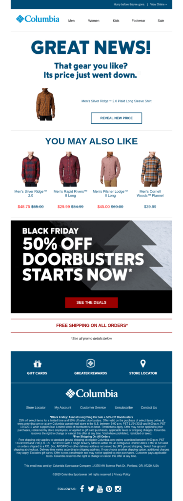
For example, Columbia pulls out all the stops to win over non-carting customers with a personalized price update, additional product suggestions, and a sale announcement.
Abandoned cart
Cart abandonment covers a lot of territory along the buyer’s journey. It may occur as soon as someone takes the affirmative step of placing something in their virtual shopping cart or basket. Alternatively, it can happen after selecting, deselecting, swapping, and considering several items. If all those activities don’t result in a conversion – abandonment, it is.
A shopper’s level of activity after starting a cart and before leaving your site can provide you with clues about their intentions. Were they genuinely interested or just virtual window shopping? Maybe they are comparing prices across sites or didn’t have time to conclude the transaction.
Supplement what you observe about your site visitors’ behaviors with surveys or preference centers to get more feedback to learn even more.
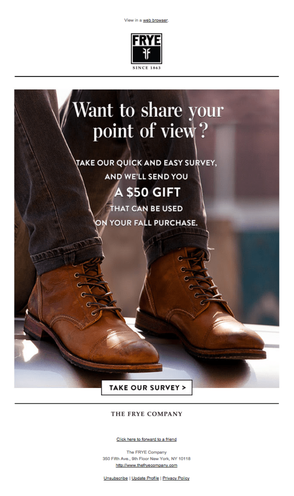
The Frye Company uses a clever campaign strategy to get valuable feedback and give visitors 50 good reasons to return to the site and do some shopping.
What about shoppers who add several items to their cart, sort and narrow their selections and visit multiple product pages?
Shoppers who spend time and effort signal a greater purchase intent than those who are quick to depart (a.k.a. a good conversion opportunity).
At this stage in their journey, prospective buyers may begin looking at customer reviews, alternative products, and comparing prices across platforms. Make sure your product pages and FAQs make it easy to find the information they need.
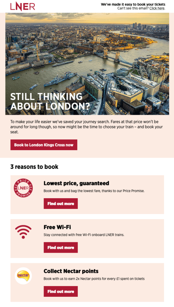
London North Eastern Railway tops its cart recovery email with a customized `book now’ CTA. Then adds several other easy-to-spot links to ensure visitors can find answers fast.
Form abandonment
Not every transaction involves a cart and checkout. Signing up for a webinar, planning a travel itinerary, or requesting more information signal intent. When the process is left incomplete, that sting you feel is from form abandonment.
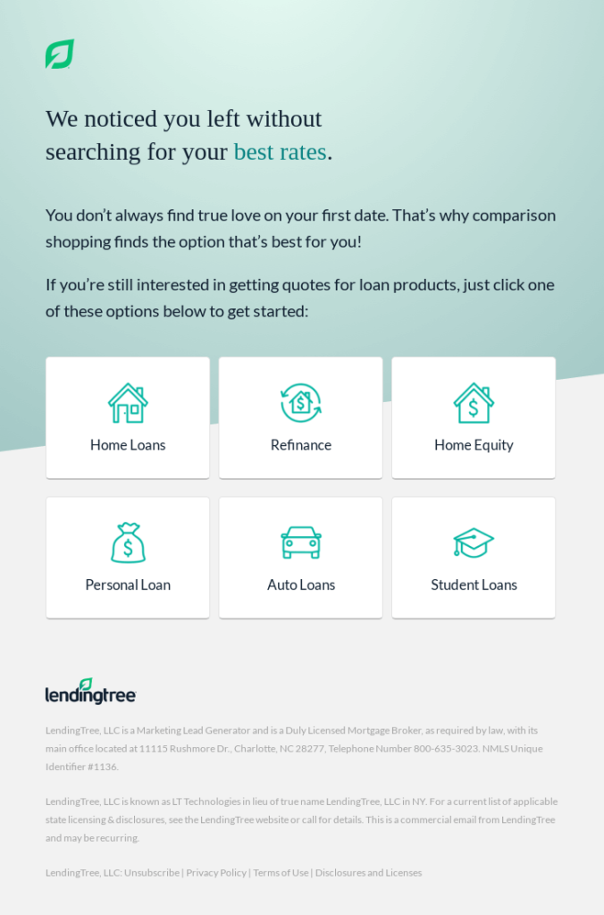
Below is an example of a form abandonment email from Lendingtree. Despite not selling a physical product, the company still employs product visuals to encourage customers to return.
Checkout abandonment
Placing an item in your cart signals interest. But conversion requires completing the checkout process, and a lot can happen between cart and checkout that causes your customer to drop out of the process.
Many of the reasons customers lose interest at this point are checkout-specific. So improving your checkout experience can give your conversions a powerful boost.
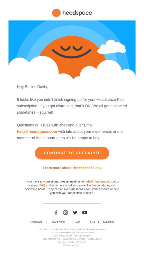
Checkout abandonment doesn’t happen only in online retail. Wellness app headspace sends this inviting email to encourage visitors to complete its premium subscription checkout process.
In the following sections, I break down why shoppers abandon their journeys and advice for getting them back. I’ll also explain how to optimize your checkout process to keep your customers in the virtual checkout lane.
Plus, I’ve prepared a list of conversion-focused email recovery campaign best practices that you don’t want to miss!
Why don’t customers finish what they started?
Wow. So many customers. So many reasons for them to abandon their carts. Figuring out each one’s why may seem overwhelming.
But, here’s some good news. Even though every person is unique, we share common behavioral patterns.
For example, one key motivator for early humans was that If they had limited time and resources, they first sought out food and materials critical to survival before hunting for ornamental or non-essential things.
Need is still a primary motivator of human action, and we prioritize needs over wants (most of the time). That’s why cart abandonment rates for frequently used items and necessities are lower than those for discretionary or luxury purchases.
For example, the average cart abandonment rate for utilities in 2020 was 77%. In contrast, abandonment rates for fashion and travel were 84.4% and 87%, respectively.
Necessity isn’t the only motivator humans have in common, though. Ask yourself how your customer would answer the following questions:
- Will acquiring this product or service benefit me or someone I care about?
- How valuable is the item to me? How valuable is it to other people?
- How easy will it be for me to get this item later? Is there a limited supply?
- What will we have to sacrifice (pay) to get what we want?
- How much effort would it take me to find this item elsewhere?
- Will obtaining this item secure my social status?
- Will this purchase make my rivals jealous?
Put your answers together with the abandoned cart data researchers have gathered and what you learn from your customers’ on-site behavior. You’ll have what you need to create compelling cart recovery emails.
Here’s some more data to add to your knowledge about why online shoppers abandon their carts.
Why are people abandoning cart?
They weren’t really planning to make a purchase
Shopping soothes our inner hunter-gatherer even when we don’t make a purchase. So we do a lot of looking that isn’t backed by real intent. Among US online shoppers, 58.6% report abandoning their carts because they were just browsing. These customers may still be in the discovery stage of their journey or simply bored and looking for something to do.
What can you do about it?
Entice your customers to complete their transactions with an email campaign that adds to the thrill of the hunt. Show them new finds or offer them a sweet first-time buyer discount to recapture their attention.
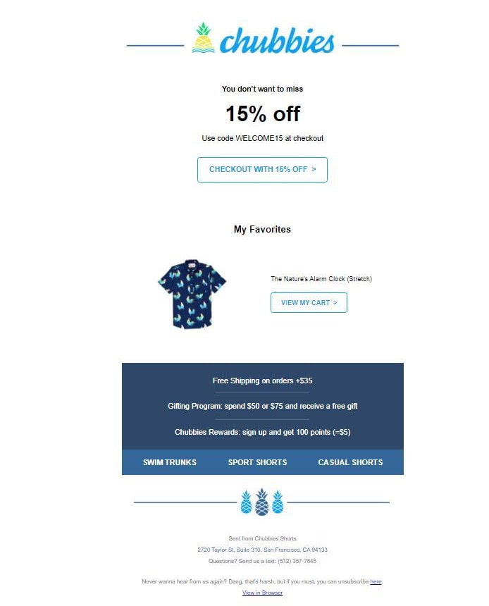
In the email featured below, Chubbies seeks to rekindle shoppers’ affections with a personalized product image and a “welcome” discount code.
They aren’t ready to commit
Inertia and indecisiveness are powerful forces that can prevent your customers from finalizing their purchases. Send a supportive nudge when the interest is there, but the action isn’t.
You can help your on-the-fence customers choose by sending a recovery email that includes social reinforcement in the form of customer reviews and user-generated content.
Check out how this sassy email from Adidas does it.

If you aren’t sure why your customers aren’t ready to take that final step, respond to their concerns anyway.
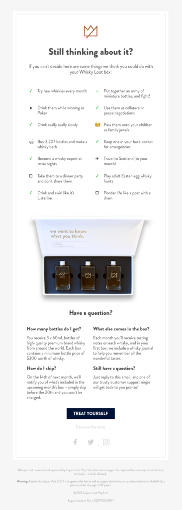
Proactively address possible objections with an email that answers the questions they haven’t even asked yet, like this witty email from Whisky Loot.
The mind is willing, but the wallet is weak
Pay attention to when your customers make purchases. Are they saving items in their cart until the end of the week or month? This behavior may signal that they are waiting to make sure their picks are within their budget.
Basically, your shopper may want the items they saved to a cart but can’t afford to buy them–yet.
What can you do?
Give your customers a break with a discount offer or a buy now, pay later (BNPL) option.
Fender appeals to both emotion and reason in its recovery email for a prospective custom-built guitar customer. The customer’s dream guitar is the hero image but a buy now, pay later financing offer is the headliner.

Don’t forget that you can automate when your abandoned cart emails are sent. Use data about repeat customers’ spending habits and send an email shortly before the time of the week or month that they usually make purchases.
It’s not them; it’s you
More specifically, it’s your website’s UX. If your website isn’t fast, easy to navigate, accessible, and mobile-friendly, don’t expect customers to stick around.
Keep your customers engaged and conversions high by designing an intuitive, frictionless process from the first click to the final payment.
Don’t discount the importance of a flawless mobile experience, either. Mobile commerce now accounts for 39% of all eCommerce sales. Yet, eCommerce conversion rates for mobile devices are less than half of desktop rates (2.25% for mobile vs. 4.81% for desktop).
Your checkout experience caused them to pause
This is the big one. Clicking the checkout button signals high purchase intent. Unfortunately, it doesn’t mean the sale is in the bag.
In fact, among website visitors who abandoned their carts, 41.4% do so after they’ve entered the checkout phase.
That’s quite a reversal.
Why would your customers walk away after investing time and effort to select their desired items and clicking the checkout button?
Baymard Research asked US online shoppers, and here’s what they said:
- Nearly half of the respondents (49%) didn’t appreciate the extra fees such as shipping, taxes, and other costs tagged on at checkout.
- Close to one-quarter (24%) didn’t want to be forced to create an account just to make their purchase.
- Slow delivery times were a deal-breaker for 19% of the respondents.
- A complicated, lengthy checkout process caused 18% to back out.
- 17% of the respondents didn’t trust the site with their credit card information.
- Another 17% were dissatisfied that they couldn’t get the total cost calculated before proceeding.
Website crashes, unacceptable return policies, too few payment options, and credit card rejections were among the other reasons buyers abruptly choose to end their purchase journeys.
Optimizing your checkout process can prevent 35.26% of these losses. That’s why, in addition to sharing my top tips for creating fruitful cart recovery campaigns, I’m going to share my best abandonment prevention measures, too.
Avoid cart abandonment before it happens
Cart recovery emails have great ROI. But you know what has even better ROI? Getting the sale on the first visit. Follow these tips to provide your customers with a checkout process that keeps them moving forward without hesitation.
Clarify everything that can be clarified
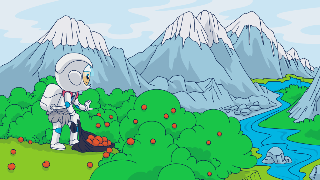
Imagine living back in the Stone Age, and you are hungry. There’s no delivery service. So, to satisfy your need, you pick up your rucksack, spear, and blade carved out of stone and set out to find food. You hope that your quest won’t be a long and treacherous one. But it’s the Stone Age. There are no guarantees.
The laws of self-preservation dictate that you will try to minimize risk as much as possible by avoiding the unexpected. So maybe you choose to hunt and gather along paths you’ve traveled in the past. Or, you move cautiously–on the lookout for hidden dangers.
Then, as now, humans don’t like unpleasant surprises.
In ancient times, sudden risk may have come in the form of an angry apex predator or a dangerous sinkhole. Today, it’s more likely to be high shipping costs, added fees, or unexpectedly long delivery windows.
Avoid cart abandonment by being transparent.
Provide your customers with the information they need to minimize risks along their journey. Disclose inventory, shipping, and fees early and clearly. Include this information in your FAQ section and on your product checkout pages.
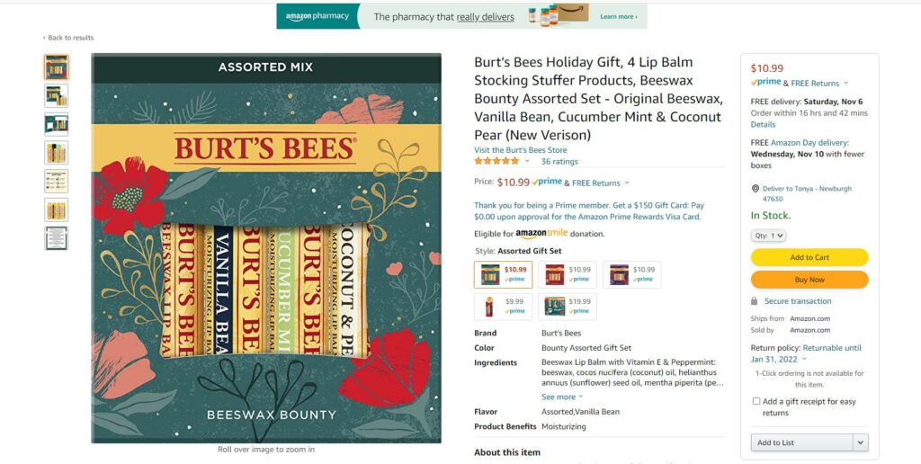
Even though not everyone shops with Amazon, the online everything store has a huge influence on people’s expectations. Look at how Amazon preemptively answers its customers’ questions on its product pages. Details about shipping costs, delivery times, and return policies are easy to locate and accessible before the shopper adds the item to their cart.
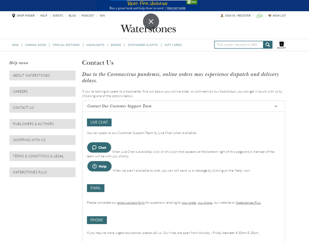
Beyond on-page transparency, add extra assurance by making it easy for your customers to engage with your service representatives and providing multiple communication channels, as Waterstones has done on its customer service page.
Avoid account creation during checkout
Customers in brick and mortar stores don’t have to fill out a form before being allowed to pay for their stuff and leave. Why do your customers? Offer account-free shipping to secure conversions from shoppers willing to commit to purchasing but not create an account.
Do customers dislike creating an account so much that they’ll leave your website at the checkout? Yes!
More than 20% of customers will abandon their cart at checkout if asked to create an account!
Creating an account doesn’t require much more work than filling in your shipping and billing details, but it is still more work for your customer. These extra steps add friction and slow your customers’ happy shopping flow.
Instead of adding an obstacle to completion, ask your customers to complete this step after they’ve finished checking out.
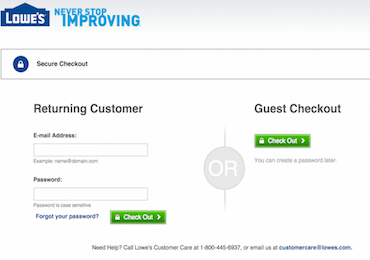
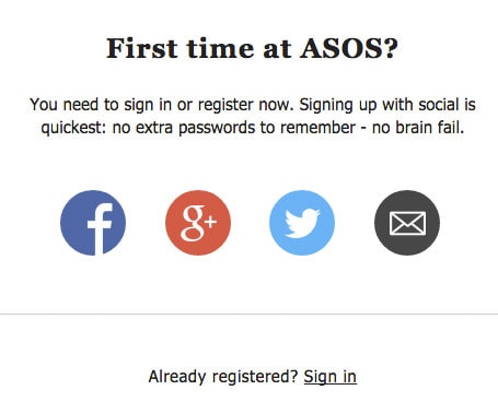
Prior to checkout completion, keep your eye on the prize: conversion. Invite customers to use their social logins or create a guest account to complete their transactions.
Here’s how Lowe’s does it.
ASOS gives their customers plenty of freedom to choose how they’ll handle their checkout with several social logins.
High-effort checkouts lead to higher rates of abandonment
You’re still trapped in the Stone Age, and you’re still hungry. But just how hungry are you? Are you hungry enough to cross a raging river, climb a mountain, and crawl through a narrow cave to capture a rare delicacy?
Probably not. If you could get something not quite so rare yet still satisfying by simply walking down by the river and grabbing it, you’ll opt to get that.
With the digital world at their fingertips, today’s shoppers almost always have a more accessible alternative. They aren’t going to buy from you if you make them work too hard to do it.
Make shopping on your site a pleasure, not a pain. Focus on streamlining your UX on your product and checkout pages.
Avoid using small buttons, requiring multiple steps at checkout, or employing `user-unfriendly’ Captchas. (No, I can’t tell if that is a light post or not, and I can’t read the squiggly letters.)
Review your checkout process for accessibility as well. Are your form fields clearly explained and optimized for screen readers?
Also, don’t ask your customers to fill in the same information more than once. Use autocomplete and other measures to reduce the number of clicks it takes to complete a transaction.
💡When it comes to assessing ease, perceptions may matter as much as reality. Reducing the number of form fields your customers see when they reach the checkout stage may prevent them from abandoning the process.
Give your customers control by offering choices
You know that you serve millions of customers, each with their own distinct preferences. But, to each shopper, their experience is singular, and they want it to meet their expectations.
That’s no easy feat!
How do you keep all these personalities happy?
By offering them choices. Take shipping, for example. Nearly all shoppers in one survey reported that fast delivery was a high priority, but 65% also said they would forego speed in exchange for free shipping.
Think beyond traditional credit cards to facilitate payments, too. Worldwide, 11% of online shoppers use their mobile wallets weekly.
Of course, you don’t want to trigger analysis paralysis by overloading your customers with too many decisions. But, presenting them with options instead of a one-size-fits-all solution demonstrates that you value them and their wishes.
Tap into third-party research and industry reports as well as your customers’ behavior to uncover the choices that matter most to your audience.
Earn your customers’ trust
Humans today are strange. We send money worldwide to people we’ve never met and just trust that we’ll get something delivered to our doorstep or email inbox in return.
What are we thinking?
Trust in online businesses and faith that our payment and personal information are secured is essential for digital commerce to work. If your website or any part of your checkout process looks untrustworthy, you will lose conversions.
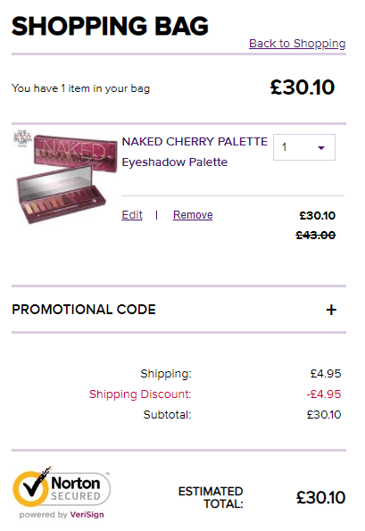
Meet your customers’ need for reassurance by including customer reviews and testimonials on your product or service pages. Add security seals or logos from the brands you do business with as well.
For example, Urban Decay has the Norton Cybersecure logo prominently displayed on its checkout page.
Be consistently engaging (and persuasive)
In addition to these preventive measures, keep visitors to your website engaged and moving toward conversion by presenting a consistent brand message across your communication channels and using persuasive devices throughout their journey.
For example, make sure the destination page customers reach when they click through from an ad or email meets their expectations. Use on-site personalization to create a more intimate shopping experience and strategically employ social proof, scarcity, urgency, and psychological triggers to give shoppers a reason to “buy now.”
What if your customer still doesn’t complete their transaction despite your best efforts?
I got you covered.
A step by step guild to getting your cart recovery working
No matter how enticing your offer or how smooth your checkout process is, some people will still click out before completing their purchase.
I’m sure you can imagine many reasons customers end their journeys early beyond those I already shared. Maybe they were secretly shopping for a gift and had to close their browser to avoid getting caught! Or, they might have been browsing at work and decided to wait until they were home to finalize their purchase.
Anyway, we know cart abandonment happens. So, let’s look at how you can recover some of those missed sales with rock-solid abandoned cart campaigns.
Yes, you need to get your visitors’ email
Before you can send a cart recovery email, you need to know where to send it. That means you need to know who your website visitors are. The sooner you capture this information, the more data you can collect about your visitor’s preferences and behavior.
But shoppers aren’t always thinking about logging in when they visit your site. So you’ll need specific strategies to ensure you get the information you need to follow up with them later.
Try these methods to get that information.
No cookies for you!
Cookies, pixels, and other multi-channel tracking are still in use, and as long as that boat is afloat, you can use it for retargeting your visitors.
But, the world is slowly moving away from third-party cookies.
Meanwhile, several solutions are being offered to track visitors with email campaigns after they leave your website, and one of the most promising ones is cookieless tracking, i.e., first-party tracking.
With cookieless tracking, you can recognize the visitor’s IP, and track their behavior on your page, but keep other types of information private.
You can also build audiences and test behavioral patterns with cookieless scripts, so don’t worry. However, if you don’t have their email, you won’t be able to send them an email once they visit your website, right?
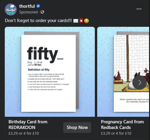
Thortful used retargeting to appear in a customer’s Facebook timeline within minutes after the customer left their site:
Of course, this method of capturing data has some serious limitations. You can only use it to identify visitors who have provided the ability to collect identifiable data in the past or at the start of their current visit. Plus, your visitors may reject or delete cookies, and you can’t track their activities across devices (a problem cookieless tracking is working hard on solving.)
That’s why you have to get those emails!
Capturing your visitors’ emails early in their journey allows you to understand them better and deliver a better experience across channels. The data you gain directly from your customers is a valuable, proprietary asset that you can use to improve your marketing campaigns, product offerings, website experience, and revenue projections.
In a post about sign-up form creation, we shared some great sign-up strategies to help you build your email lists. You can use these same strategies along with the ones below to capture your visitors’ emails for recovery campaigns:
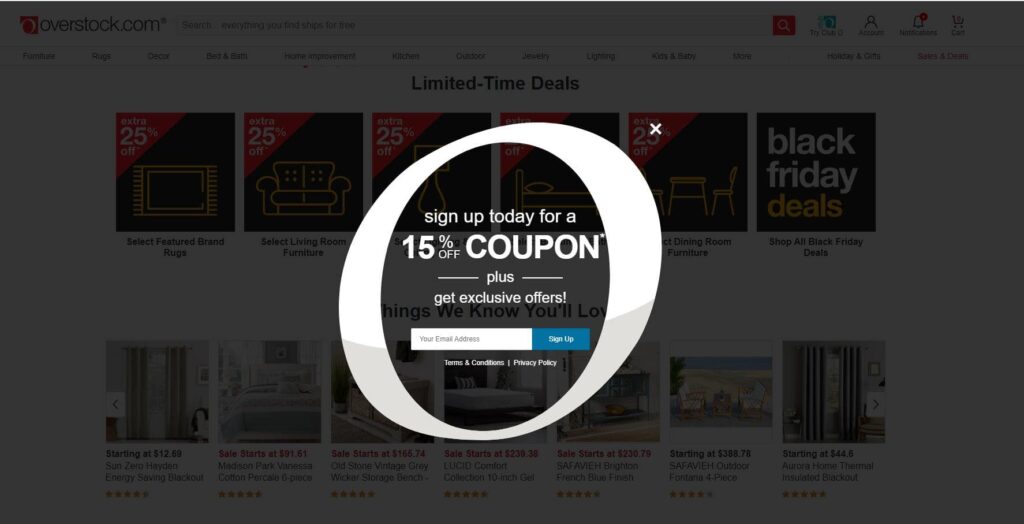
- The “welcome to our site” email request. This request is often delivered via a pop-up, but it doesn’t have to be. In this request, you won’t ask for a lot–just an email. You might follow it with a second request for a mobile number.
Increase your chances of collecting customers’ emails by adding a discount or other incentive like Overstock does in its welcome pop-up.
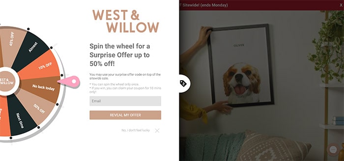
- The midway momentum-building request. Making your sign-up request part of the shopping experience can help keep visitors on your site and convince them to share their email. Try using a survey, quiz, or other interactive elements to make your request fun and engaging.
The image below is a lead and conversion capture element used by West & Will that offers shoppers a chance to win up to 50% off their purchase.
- The ever-present header or footer invitation. Including sign-up forms in your header or footer allows your visitors to sign-up when they’re ready. Placing your sign-up where people expect to find it also makes it easier for them to share their email with you.
Lindt Chocolates uses this strategy to convert website visitors into email subscribers.
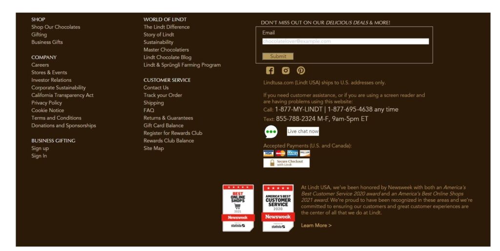
Tell users what they’ll get in exchange for signing up when using this type of form. Will they receive the latest product news? Get an exclusive discount? Spill!
- The “let us save that for you” pop-up. This special pop-up is triggered only when a customer has placed an item or items in their cart and offers to save that cart for the shoppers’ convenience. This request is particularly attractive because it allows you to serve your customers and get needed data in return.
When you create your “save my cart” offer, make it short and sweet, and consistent with your brand voice.
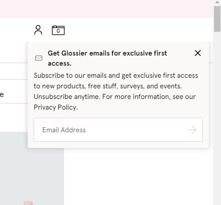
- The “before you leave” pop-up. If all your efforts to capture your visitor’s email have failed, try a final pop-up triggered by their move to exit. Make sure you offer a sweet incentive for them to sign-up before they go.
Glossier offers exclusive first access to new products and other goodies to website visitors headed for the X.
- The “now that you’re ready” pre-checkout sign-in. I’ve already discussed the dangers of asking your shoppers to create an account before completing checkout. But, asking for an email only is different. Gaining this critical piece of data is worth the risk.
One final note about email capture: cart abandonment emails are transactional. They’re sent to an individual subscriber in response to a specific interaction with your brand. However, that doesn’t mean they won’t be viewed as promotional emails by your recipients.
Comply with consumer privacy laws when collecting email addresses. Also, be cautious when sending messages to shoppers who haven’t volunteered their contact information (or might not remember that they did). This will preserve your sender reputation and ensure that you communicate with customers who want to hear from you.
Combine data and technology to automate and personalize your cart recovery campaigns
After finding out where to send your emails, the next step is to set up a system that automatically sends them at the right time. Ongage users can do this by creating automation rules using predefined events based on an identified visitor’s on-site activities.
For example, you might prepare an automatic email to be sent after a shopper views three or more product pages or places an item in their cart before leaving your website.
You can use the data stored in your CRM to personalize your emails based on your customers’ behaviors and other data, such as their birthday, product preferences, or geographic region.
This customization feature also allows you to create emails that address your customer’s progress in their buyer’s journey or relationship with your brand. For example, you can welcome new shoppers with a first-time buyer’s discount or offer bonus loyalty points to a valued repeat customer.
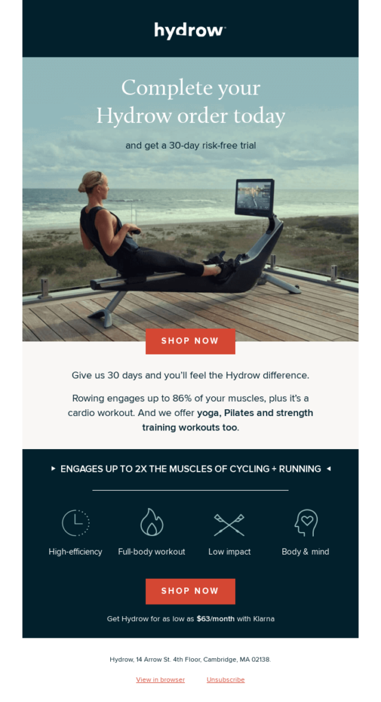
Notice how this email from Hydrow aims to overcome the fears of first-time buyers by offering a 30-day risk-free trial.
Use dynamic content and template selections to tailor your incentives to match each customer’s cart. For instance, send customers who qualify for free shipping an email emphasizing this benefit. If their basket total doesn’t qualify yet, switch the message to one that offers product suggestions that will top them off.
This personable and personalized email from Jack Willis includes the shopper’s cart total and informs them that they qualify for free shipping. If that isn’t enough to convince them to come back, the email mentions a 50% off sale, too.

Use a scheduled sequence to ensure your message gets through
If at first, you don’t succeed, try again!
Your first email should be timed to arrive about 1 hour after your customer leaves your website. This gives them enough time not to feel like you are watching their every move, but not so long that they forget about you.
Don’t get discouraged if this first message doesn’t bring your customer back. The timing might not be right for them. Try again if that first recovery email doesn’t earn a click-through and conversion.
Chubbies uses a four-email sequence that escalates in urgency. The first message offers a reminder and a 15% discount. The last warns that the offer is about to expire.⌛️

Choose your own best time to send
When should you send your follow-up emails?
Many email marketers recommend sending additional emails at the 1-day and 3-day points. But I’m going to propose that you do something more tailored. Evaluate when your customers interact with your emails and when they shop. Then, sequence your cart recovery emails to match your customers’ behavior patterns.
Do you get most of your sales on Monday over lunch or on Saturday afternoons? Are your customers most engaged with your emails at midday or midnight?
For example, send your first email to an absent customer 1 hour after they left your website without making a purchase. Send the next email the following day, but choose the time of day based on when your customers tend to be online and to view their emails. Then, if your customers usually shop more on the weekends, schedule the third email to arrive on the following Friday afternoon.
If you’re not sold on this plan, do some A/B testing and follow our best times to send advice.
When setting up your campaigns, ensure your automated sequences know when to stop. You don’t want to become a pest or send a recovery email to someone who’s already completed their purchase!
Prioritize ROI
You can create email flows with branches and subbranches, dynamic content, and precise targeting using automation rules and your proprietary data. But are all your website visitors worth the effort? Does it make financial sense to offer a discount to recapture every abandoned cart?
Probably not.
Your abandoned cart campaigns should be conversion-focused but not to the point of no return. Watch those margins!
Your incentive plan should maximize conversions and revenue and save the best rewards for your highest-value customers.
Offering a discount to every customer can become a hard habit to break. If shoppers realize that they’ll always receive a discount offer if they leave without finalizing their purchase, then many of them will always leave without finalizing their purchases.
One study found that 43% of customers solely place items in their cart to trigger a discount offer.
Depriving your customers of discounts isn’t without risk, though. The same study found that 18% of shoppers won’t check out until they get a deal.
How can you motivate your customers to click through without a discount?
Before reaching into the discount jar to boost conversions, try other persuasive devices and messaging that overcomes shoppers’ objections. Incorporate social proof, trust signals, and answers to FAQs in your recovery emails using strategies similar to those you use for abandonment prevention.
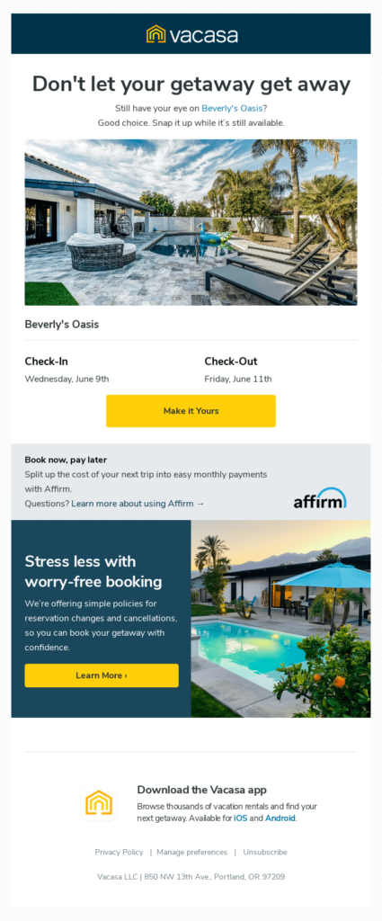
Vacasa’s cart recovery email featured below skips the discount and uses scarcity and urgency to nudge its customer to action, reminding recipients to book their reservations before it’s too late.
The email also addresses potential objections with a “book now, pay later” financing offer and links to its reservations and cancellations policies.
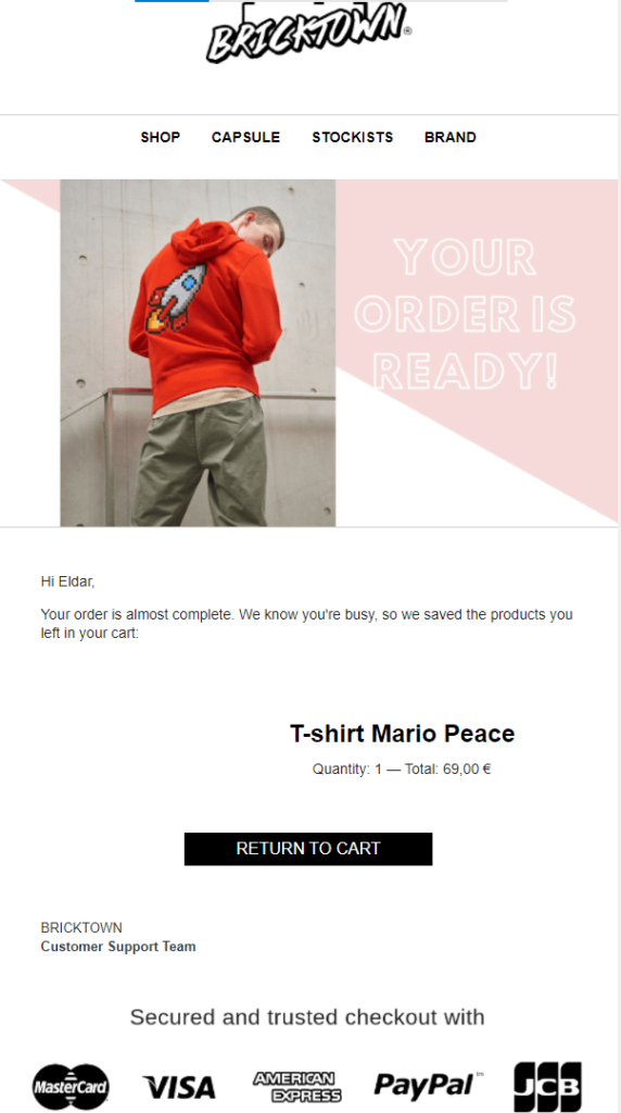
This email from Bricktown seeks to instill confidence by including the logos of its trusted payment partners.
Convey your cart recovery email’s message consistently from the subject line to CTA
Cart recovery emails are your attempt to get your customer gone astray back on track. Keep your email focused to keep your customers focused. Maintain your mission throughout.
- Communicate your purpose clearly with subject lines and preheaders. Your objective is to get recipients to remember their cart. So, use language that accomplishes this goal at every opportunity.
For example, the From Names, subject lines, and preheaders featured below jog recipients ‘memories even before opening.
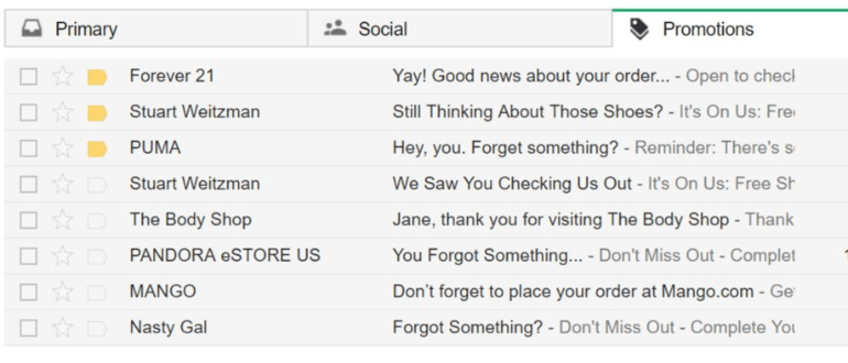
If you need tips on how to write subject lines that draw your customers’ attention, this article by Haim will help you get going.
- Inside your email, support your objective with personalized, targeted messages and compelling graphics. Avoid using a header that presents all of your shop links. This can distract your customers and dilute your message.
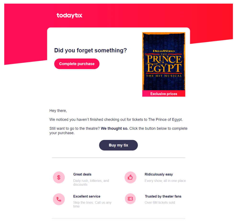
Be sure to take advantage of humans’ “see it, want it” nature by prominently featuring product images in your emails.
No physical product? No problem. You can still add an image to convey your message.
Check out this attention-grabbing email from TodayTix.
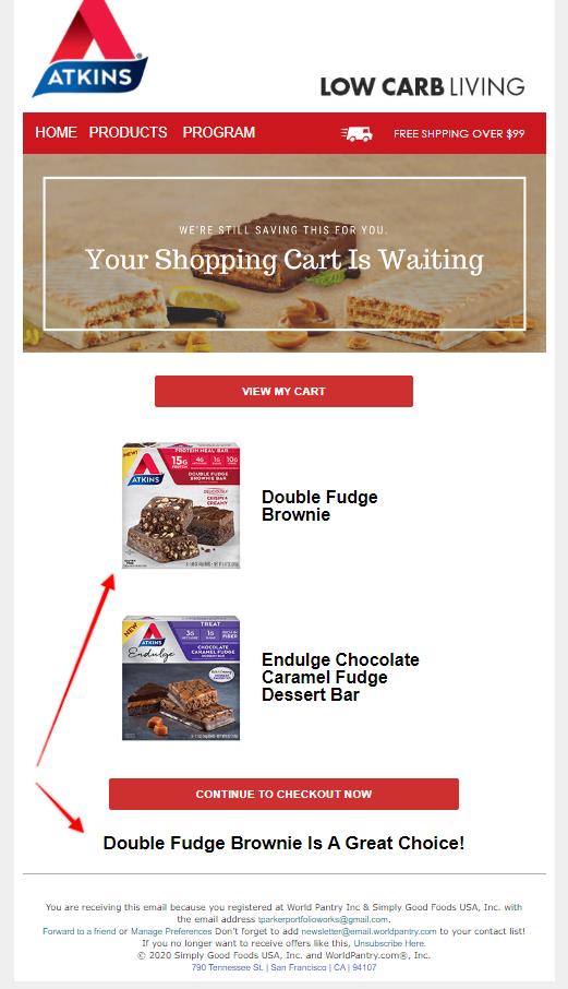
- Use automation rules plus templates using dynamic blocks and fields to customize your emails at scale.
In the email below, Atkins doubles up on the personalized elements. Both the text and images reference the individual shopper’s cart selections.
- Think beyond a simple “Buy Now” button for your cart recovery email’s call to action and use your CTA to support your message.
Warby Parker’s approach is friendly and reassuring in this cart recovery email. The copy emphasizes the no-risk nature of their offer by reiterating that shipping and returns are free. Its CTA is a made-to-match clever play on words, “Have a look.”
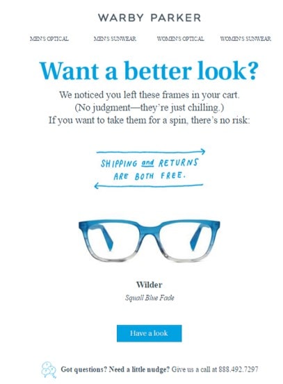
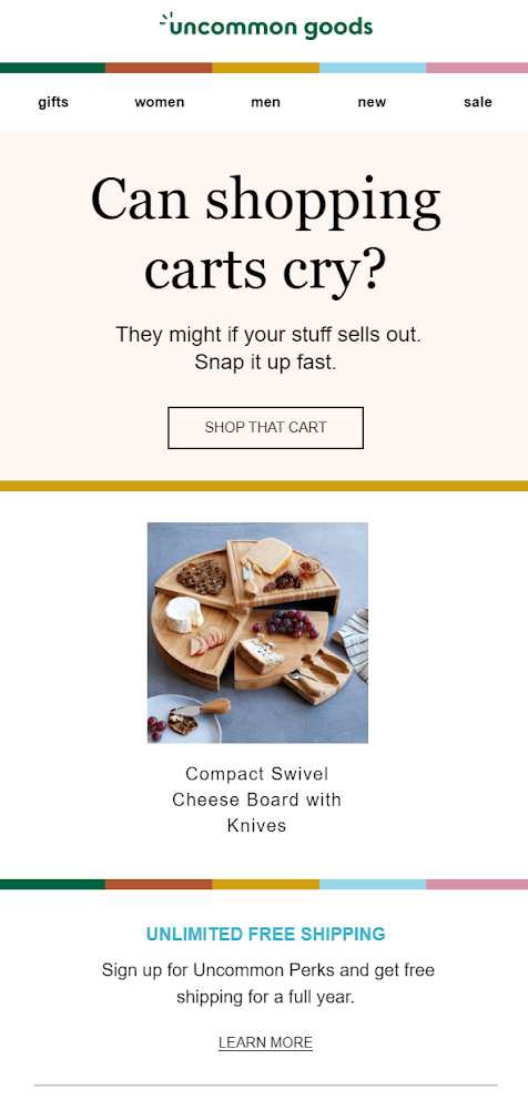
In contrast, Uncommon Goods’ email message is one of scarcity, suggesting that the shopper take action before their stuff sells out. The “Get it Before It’s Gone” CTA reinforces this message.
With average open rates of 42.3% and click-through rates of 8.49%, abandoned cart emails are a great vehicle to reach your customers and show them your brand personality.
Be the low-hanging fruit
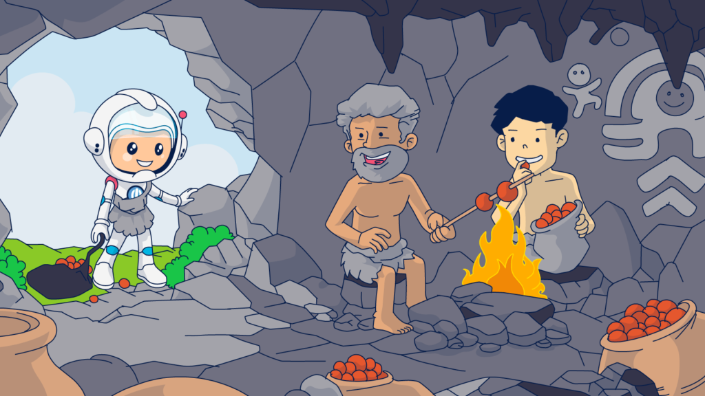
Do you know what makes hunter-gathers from any era happy? Being able to get their hunting and gathering done, go home, and relax. Engaging with your cart recovery emails shouldn’t be a chore.
Plant your CTAs throughout your email where they will be easy to find and click. Keep that thumb zone clear so your mobile users land exactly where they expect to when they tap your message. Also, don’t make customers reach for the goodies you promised! Automatically add any discounts or other benefits to their carts.
Refresh your customers’ memories across multiple channels
I mentioned the benefits of retargeting earlier to keep your brand in front of your customers online after they click away from your website. But one of my favorite channels for gaining a return visit is SMS.
Email and SMS marketing make for a winning combination because they each perform a different function. Email enables you to share images, detailed text, links to resources, and more with your customers.
SMS is very effective at reaching your customers fast. 60% of consumers view their texts within 1 to 5 minutes of receipt and match cart recovery emails’ conversion rates. Since SMS messages are usually viewed sooner than emailed ones, test a cart recovery sequence that opens with SMS and uses email to follow up. Track your metrics and your customers’ engagement with each of these channels to uncover your winning combination.
Monitor, test, review and reiterate to maximize your abandoned cart email campaign conversions
Data is a precious resource for the modern marketer. It is what we hunt and gather, and understanding your data will set you apart from your competition.
As you implement the advice from this article, monitor what works and what doesn’t for your brand and your customers.
A/B test your new (and existing) strategies and maintain a record of past results and benchmarks to add to your proprietary knowledge base.
Gather data about your customers’ behavior and feedback and generate customized reports using your Ongage analytics dashboard to uncover the best methods for communicating with them and adding value to their shopping experience.
With the right tools and strategies, you can turn many missed sales into more revenue for your brand.
Continue your cart abandonment journey to better KPIs with Ongage
Abandoned cart emails are just one of many methods successful businesses use to stay in touch and engage with their customers and subscribers. The Ongage blog is chock-full of additional tips and advice to take your email marketing strategy to new heights.
For example, this article about calls to action includes design and copy tips that will help you get the most out of these messages. And you won’t want to miss this guide to email personalization at scale.
Leave a comment if you liked what you read!

