Welcome emails are the most important emails you’ll send. They offer high engagement rates, increased revenue, and a first impression that lasts. In this post, we’ll explain the psychology behind, what matters first, and how to apply everything to create the best welcome email possible.
When someone signs up for your service or newsletter, they expect a prompt and warm welcome email.
This type of transactional email is the first interaction you have with them, and as such, it is a mental representation of the rest of your relationship.
We, humans, really enjoy great hospitability, and your welcome email does just that. It shows your hospitability level.
Nobody likes sucky welcoming committees.
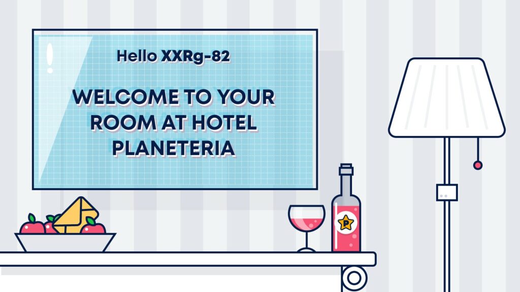
Hotels and other hospitality service providers understood that long ago, and they based their business on that.
That’s why we are wooed with a red carpet, catered to visually by amazing sights and scents, and greeted by smiley faces at every step of the way. It instinctively calms us down and helps us to merge with the whole atmosphere.
And the beauty of it all?
Everyone is welcome in the hotel, and no matter who you are, you’ll get the same warm welcome.
Your welcome email is the lobby of your business, and impressive lobbies leave an emotional impression that lasts long after the sights and scents disappear.
Let’s set up the tone for the rest of your relationship, and show you how to portray what you do in the most favorable light, and tell a story that will draw the readers in to perform the actions you want them to do.
In the post below, we’ll show you how to create a highly engaging welcome email, with examples you can steal from leading brands.
Shall we begin?
Understanding the impact of your welcome emails
The image of a welcoming tent or oasis in the middle of the desert, a place in which you can find refuge and quench your thirst, is ingrained in our collective memory.
Desert dwelling cultures are well known for their hospitability and hospitality. For them, it is a matter of life and death, and it evolved as a way to survive long trips through searing landscapes.
In these cultures, the narratives of hospitality and the human condition are intertwined, as can be seen in `The Guest House’ Poem by Rumi, a Sufi 13th-century Persian poet, that talks about his home and mind in the same poem.
”Treat each guest honorably.
Meet them at the door laughing and invite them in.
Welcome and entertain them all!”
In the poem, the `guests’ are allegories for events in your life.
They can be challenges or uncertainties, or lucky breaks and instances in which you’re happy.
The poet recommends treating them all equally because your guests will always mirror your behavior.
If the concierge in your ‘hotel’ will greet you with a frown, and the bellboy won’t help you with your luggage, it’s going to paint your future experience in a different, more negative light.
Your audience wants the red carpet, and you should provide exactly that. It’s your make-or-break moment, and there are no second chances for that first impression.
Making sure that the first impression counts
Every time our senses meet a new `first,’ our brain starts to create a mental image of what that relationship will look like.
And these first impressions last.
While they can be misguided, they still shape the lenses and filters from which we look unto the world.
Our mind creates an entire profile of someone just by taking a quick look at them. The same is true for welcome emails.
Once your audience sees one, they’ll characterize your brand, for better and for worse.
To make sure that your audience sees the images you want to project, first, you have to ask and answer questions that define that mental image.
These can be questions like:
- What’s the voice and tone of your brand?
- Do you want to be perceived as a light and breezy brand or an esteemed one?
- How willing are you to invest in crafting that mental image?
- Can you test what you do? Etc.
The way the welcome email is structured, designed, and written, will dictate the end result in the customer’s mind. It’s worth your time.
High engagement and revenue rates
Open and click rates are some of the most critical metrics in email marketing.
They are the gateway to generating revenue from emails and are a significant indicator of excellent email deliverability.
And you know who has the best open rates and CTR? You guessed it, welcome emails.
They not only have the best metrics – they surpass any other type of email campaign by far!
When compared to regular campaigns, welcome emails enjoy:
- x2 open rates.
- x3 click through rates.
- x4 revenue per email.
In terms of the impact, It’s easy to understand why they perform so well.
When you sign up for a service, you expect to receive an automatic welcome email quickly, and you usually respond or engage with that email.
Most people do.
When someone registers for your service, they usually already had some kind of interaction with your brand. For instance, they might have interacted with your website or social presence. This means that their purchase intent is higher, and the engagement metrics reflect that.
Regardless of your goals, what you need is to capitalize on that intent and engagement levels because they’re already `in’.
Use it to:
- Send more content to subscribers that will push them down the funnel.
- Share with them tips and expose additional services or product capabilities.
- And, of course, define how it all converts to your end goal.
Much like in hotels, once people are in, it’s easier to convince them to upgrade their booking and eat dinner at the hotel’s restaurant.
Improving deliverability
Due to their very high engagement rates, welcome emails can improve your sender reputation, landing your future emails in the inbox.
If your sender reputation is less than stellar, it’s possible your current emails, including the welcome email, are landing in the spam folder.
Capitalizing on your audience’s intent and encouraging them to find and interact with the welcome emails, be it in the spam, promotions tab, or inbox, will send a positive signal to ISPs and boost your sender reputation.
Of course, if your sender reputation is terribly low, it means you might have to fix the situation first. You don’t want them to disperse into the ether.
Luckily, it’s never too late to rectify and start cultivating good email deliverability habits.
Whether maintaining or enhancing your sender reputation, welcome emails are the lowest hanging fruits in deliverability, so use them well.
How do you write a good welcome message?
For your welcome emails to do all of the above, you need to take care of your customer’s experience’s technical and psychological aspects.
Ready to get down to brass tacks?
Sending as fast as non-humanly possible
By delaying the welcome email or not sending one, you’re off to a bad start.
Much like ringing the concierge bell and not getting anyone to respond, it feels rotten to hit the refresh button in your inbox and to see nothing showing up.
Most new subscribers expect an email in their inbox immediately after they finish up the sign-up process.
To meet these expectations, you must deliver your welcome email to their inbox within the minute. In a time of ever-dwindling attention spans, any delay can hurt your engagement rates and revenue.
To meet your audience’s expectations, you’ll have to use email automation. It will allow you to deliver the welcome email a few seconds after someone signs up on one of your forms. Later on, we’ll show you exactly how to do that.
Adding value to achieve your goals
People signed up for a reason. It may be that you promised them an ebook, a one-time discount code, or that they just want you to drop knowledge bombs on them.
Whatever the reason is, now’s the time to walk the walk.
To avoid sour faces, concierges send guests into royal suites for the smallest inconveniences, ensuring that their experience is intact.
The same applies to you. You don’t want to mess up at this stage. It will forever impact your relationship, and the compensation will not be cost-effective, to say the least.
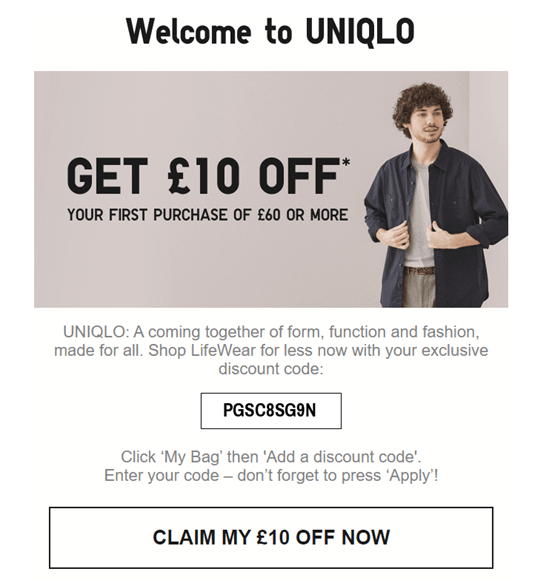
If you set expectations, meet them, and accede them, like Uniqlo is doing in this example, after saying they’ll reward you with a discount for subscribing.
Even if you didn’t promise anything, it doesn’t mean you can’t provide value right away.
For instance, helping users to get started with your not so intuitive (yet exciting) service can be perceived as value.
The welcome email can show users how to set up their account or send them to a digestible knowledge base.
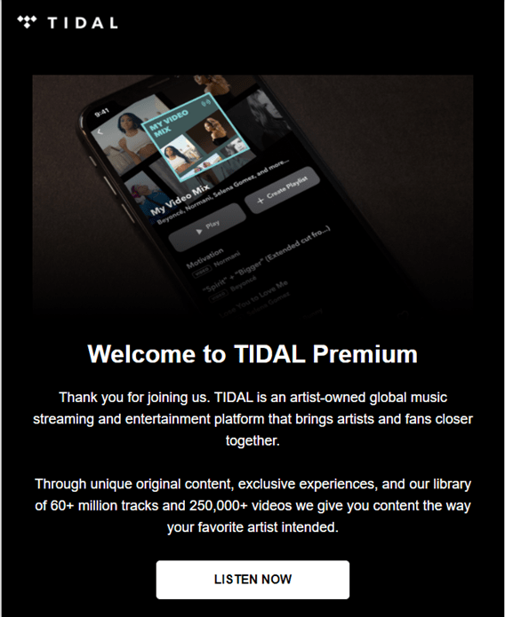
Tidal presents their value as a platform, urging you to start listening to music right now with a clear and prominent call-to-action.
And if someone signs up for updates?
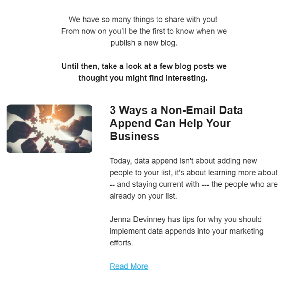
Start your relationship by including relevant articles and blogs in your initial email, like email list hygiene provider Webbula.
Having said all of the above, the content of your welcome emails eventually boils down to your goals.
Once you define your goals, you can devise a coherent strategy and reverse engineer how you achieve them.
Personalizing your emails
Personalized emails increase open and click rates by dozens of percent.
Now, imagine the numbers a well-personalized welcome email can pull based on what you read above. Mind-blowing, right?
The most basic way to start personalizing your email would be approaching the subscriber with their first name, either in the subject line or in the message itself.
When I wanted to receive fresh pasta to my doorstep, I subscribed to Pasta Evangelists and received the following email, personalized with my first name.

But it’s possible to take personalization even further. If the shift manager would know what type of food you like, they’d be able to point you to places that would better fit your palate.
Similarly, when you ask your subscribers for more information on the sign-up form, you can send better and more engaging emails.
Asking subscribers to share their location or gender with you, for example, can help tailor the welcome email’s content and push it to deliver even more value.
However, keep in mind that this might reduce conversions, so follow your metrics closely to decide if the trade-off is worth it.
If you don’t want to ask for such details, there might be solutions in the pre-registration stage.
- Websites might identify users according to IP or geo-location.
- The places your registration arrives from might also shed some light on how you can personalize their experience.
- If someone filled a form on a specific landing page, the welcome email might benefit from reflecting the user’s previous experience.
Finally, you might choose to collect that info by using the welcome email itself.
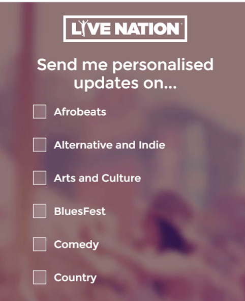
Live Nations asks users what’s their favorite music genres to send them personalized emails later on.
Show excitement and appreciation
The fact someone opted to give you their email address, perhaps along with a few other details, shouldn’t be taken for granted.
Providing value is definitely a way to show appreciation, but a couple of words can often go a long way in making subscribers feel special, loved, and appreciated.
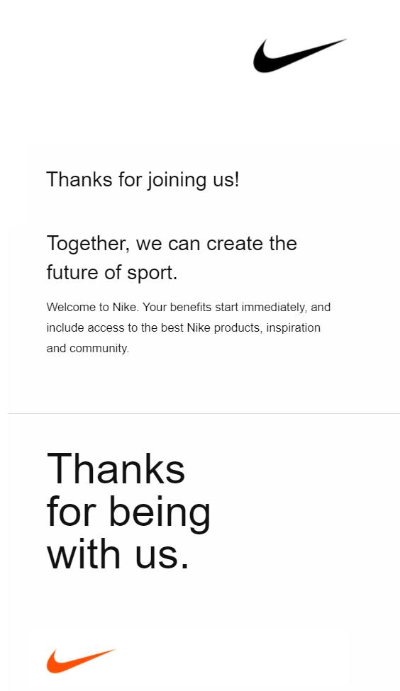
Nike’s email is doing a great job of making new subscribers feel wanted, thanking them for being a force for change in the simplest of ways.
Since a new relationship is a cause for celebration, don’t be afraid to throw some excitement into the mix.
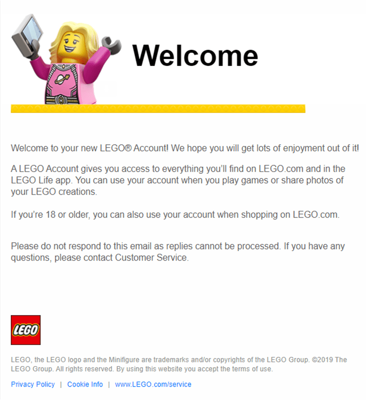
LEGO is a fantastic example of doing all of this while maintaining their brand language with the adorable celebratory banners at the top.
Being smart with colors, copy, images, and more
Colors, copy, and images are all capable of creating various emotional responses. It’s well worth testing out different combinations to see how the emotional response they evoke affects your KPIs.
Is your copy calm and authoritative? Dynamic and exciting? Soothing? If you’re not sure, A/B test your emails until you find the right formula.
Realize your brand’s identity and the emotional response that you want to evoke. Then, create (and as mentioned above, test!) emails that will reflect that.
If you’re not sure how to strike the right emotional notes, A/B tests various options until you find something that resonates. You may be surprised at what works best for you. Take this example from Virgin Trains:
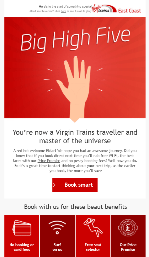
Their imagery, colors, and copy instantly grabs your attention.
They instill you with confidence that you’ve made the right choice and joined the winning team, with a welcoming high-five.
Wording like “price promise” and “book smart”, along with a slew of benefits, also makes you feel good about going with Virgin.
In the end, it’s all about the emotional response they manage to get out of you.
Bringing in the nostalgia
Nostalgia is a powerful drug – particularly as humans are wired to look back at things with rose-tinted spectacles.
Knowing your audience, age, interests, and cultural context allows you to shower them with blasts from their pasts. This will ignite the rosy emotions they associate with that time in their lives.
Marvel is an excellent example of a brand that uses nostalgia to their advantage.
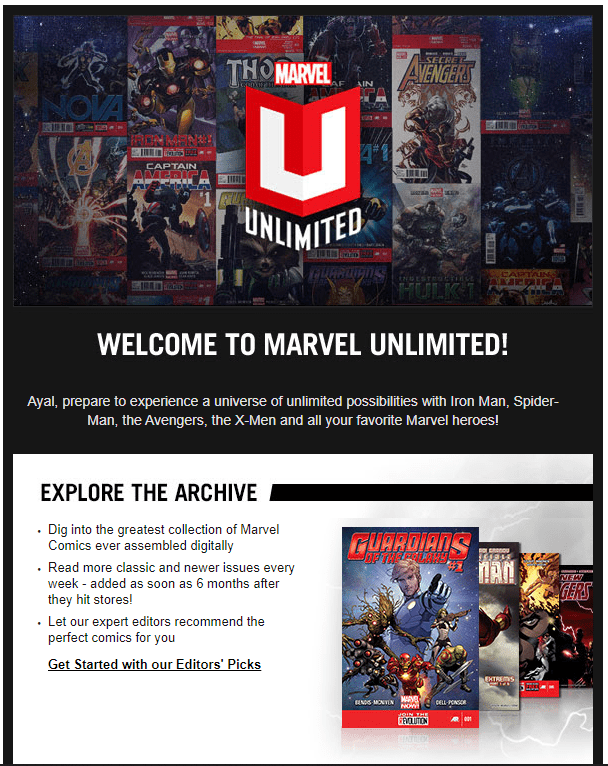
When you sign up for their Unlimited services, they greet you with a big ensemble of comic covers, ranging from Iron Man to the Avengers.
They encourage you to dig into their archive, which hosts classic comic books and stories from your past, to pull on the value and nostalgic heartstrings.
All in all, it manages to give its customers a sense of timeless glamor. What comic buff wouldn’t dive in?
Helping your subscribers take action
Motivating users to complete a goal is a fantastic way to build enthusiasm and launch them into action, especially in welcome emails.
For example, doesn’t it make you itch when you see that your LinkedIn profile is only 64% complete? Or that you’re two achievements off from unlocking a special game feature?
Progress bars and structured tips with clear goals can motivate users into action.
Check out this example from Tripit:
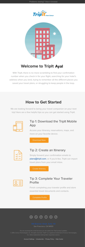
It’s a straightforward format, but it works amazingly well. Don’t you want to follow these three simple steps, marked clearly with big CTA buttons? Tripit tells you just how to make that happen.
Making your subscribers come back for more
The best emotional connections are the ones that stand the test of time.
Subscribers that engage over more extended periods are, ultimately, more valuable to your brand than those who are there briefly. It’s worth putting effort into building these strong emotional connections to bring about long-term brand/customer relationships. Here’s how:
Leaving a taste for more
As the early master of marketing P.T. Barnum once said, “Always leave them wanting more”.
We all have drives, like the drive to learn, acquire, and bond. These are all ‘slow burn’ drives. They are big and deep and ‘fill-up’ slowly.
You can keep these emotional drives engaged with a constant, slow trickle of content that piques but never floods them. Talk about new features, success stories from other clients, and so on. Hopefully, your subscriber will keep coming back for that fresh slice of the action.
Inviting them to be part of your community
The drive to bond is one of the most powerful and fundamental of all the drives. It can evoke an enormous range of emotions, from bliss when it is fulfilled to despair when denied.
People want to connect. They want to belong. And what better way to do that than the get-go?
By bringing your subscribers into your fold, making them a part of a community, you can use the drive to bond and all the emotions it brings with it to your advantage.
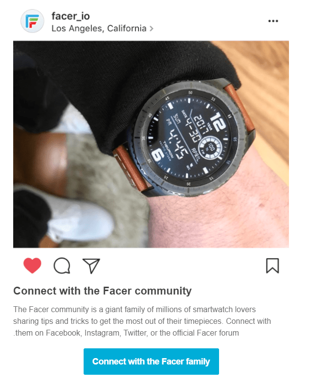
This example from Facer uses words like Connect and ‘Community’ to make the user feel like part of the family. They double down on that feeling by encouraging you to reach out to this community via social media platforms.
Setting the right expectations
This is the first time your subscribers hear from you. They don’t really know what to expect.
- Will they receive an email every day now?
- Is it strictly promotional content?
- Or will educational content be included as well?
These are all relevant questions subscribers ask themselves when they hand over their email address.
No one likes to be kept in the dark, to expect one thing and then end up with another.
Such instances can strain your future relationship with subscribers, so it’s important to let them know the lay of the land in advance.
Share the intended frequency of sending and the type of content they will receive. Is it blogs? Exclusive content? Special promos?
Furthermore, you can use this opportunity to give the audience more control over the above.
Set up a preference center, and let your subscribers be the ones to dictate the frequency and type of emails they’ll receive from you.
Medium doesn’t use the welcome email to tailor frequency, but they do ask new subscribers to help them “make this email better.”
A click on the “tailor your topics” button takes them to a webpage filled with content. All you have to do is click on the one you find interesting, which will allow Medium to send you personalized content.
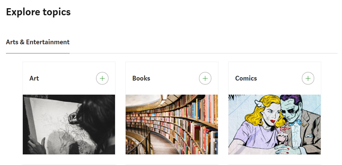
It’s a win-win for both sides, as a happy subscriber is an engaged subscriber.
Dealing with unsubscribes the right way
Losing subscribers always hurts, and losing them a mere minute after signing up is even more painful.
But there’s no use in clinging to users who don’t really want to hear from you.
Sometimes people will sign up for a single benefit or quickly understand your service is not what they’re after.
Now’s the best time to say goodbye.
Sending further emails will only hurt your deliverability. As such, subscribers will lower your engagement rates, or worse, report you as a spammer.
Don’t block the doors of your hotels with artificial barriers and stipulations. Provide every guest with a quick and easy way out.
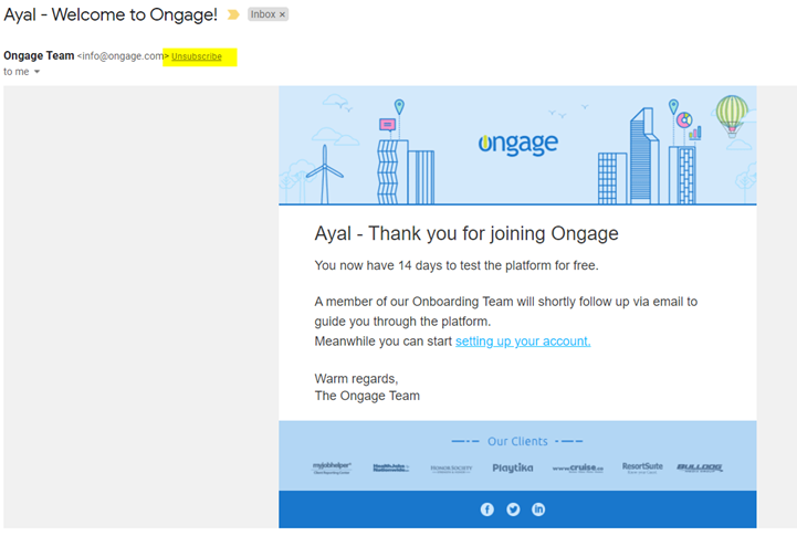
You can do this with a clear and clean unsubscribe button.
Make sure it stands out in your footer with a readable font and contrast that will make it visible.
You can, and should, go the extra mile by implementing a list-unsubscribe header. It is done via your ESP/SMTP, though when using Ongage, it is automatically added to most SMTP relays.
Once implemented, your emails will have a clear exit from future communications and should look like this:
Optimizing for mobile
You don’t need to be an expert to know that mobile interactions catch your subscribers and customers while they’re on the go and during hours they’re not working.
This means that once a new customer signs up, there’s a very good chance that the first impression you’ll leave will be on a mobile one.
You must make sure your welcome email is mobile-optimized to make that impression count. Here’s how:
Create a responsive design – People view your emails on dozens, if not hundreds of devices. Laptops, tablets, smartphones all come in different shapes, sizes, and resolutions. What works for one, most likely, won’t work for the others.
Make sure your layout is flexible, and images resize depending on the device.
If you’re an HTML and CSS master, that’s great! But since many of us aren’t, using email builders like beefree and stripo can usually ensure compatibility on a multitude of devices with little effort.
Use prominent and readable fonts – since not everyone reads emails on a nice 24” screen, you have to keep your fonts and sizes in mind. The mobile screen is smaller, and the same font that worked for desktop users might strain mobile user eyes.
Optimize image size – using images is a fantastic way to captivate your audience, but it can backfire, especially for mobile users. If a user has to wait a couple of seconds for an image to load on their mobile connection, it can be a huge issue, especially if your image is crucial for the email.
To tackle this, consider the following:
- Reduce image sizes by using services like tinypng.
- Use alt-text for images.
- Include important information in text-form, and don’t limit yourself to images.
While this issue is considered mobile-specific, this can also happen when you’re sitting at home on your laptop. It might be wise to consider the above suggestions in any case.
Be aware of dwindling attention spans – mobile users are much more on the go, looking for something else, be it in their mobile device or on the TV that’s currently on. This means you have to keep your copy concise and to the point, respecting your subscribers’ time.
Optimize your website – some welcome emails send subscribers to a web page, either to start using a service or to fill out additional details. Whatever your reasoning is, you better be sure your web page looks good on mobile and is easy to navigate. A bad experience will sour the initial interaction between your brand and your new customer.
Preview your email – Doing all of the above won’t ensure your emails will look great on the hundreds of available variations. That’s why we recommend using email preview tools like Email on Acid, which will help you understand how your emails look across different devices.
Thinking about the little things that matter
Before subscribers see what’s inside your welcome email, there’s another first impression forming, just like before stepping foot in the hotel itself.
At first, they see your email as another row in their inbox, with a:
- Sender name.
- Subject line.
- And a preheader text.
Even when users expect to receive an email from you, all of the above can play a significant role in the famous game show called “to open or not to open.”
To get as many opens as possible, you’ll need to polish all three aspects of your email.
Your sender name (or from name) is what helps users identify you. There’s no need for much sophistication here, and we recommend using a clear and simple name one that matches your brand.
To increase your chances, use real people’s names. A welcome email from the CEO or business owner makes an undeniable impression. The same goes for an email that has the customer’s dedicated account manager.
The preheader text is the line that comes right after the subject line. You can use it as extra real-estate, letting subscribers know what’s waiting for them if they click on the inbox.
Further, we recommend using this real-estate because you end up with an awkward email if you don’t. There are cases where your subject line will be repeated, or a message saying “to view this email in the browser” will occupy this space.
This well-known brand below can do better on both fronts. The sender’s name is “donotreply,” and the preheader text is on the repetitive side of things. While this doesn’t mean people won’t open the email, it doesn’t inspire confidence with the customer, and it’s definitely not the warm welcome they’d expect.

The subject line is probably the most important one out of the three. 47% of email users report that the subject line is their main way to decide whether to open an email or not.
There are many ways to approach the subject line in your welcome email.
- Personalization – if you collected data from the sign-up form, you can use it here to give your email a more personal touch.
- Value – as you might remember, Uniqlo promised me a £10 discount if I subscribe. That was the focus of their subject line, instantly letting me know what’s inside and why I should open their email.
- Emojis – while not a proven method to boost open rate, emojis help your happy holiday emails stand out and can be a nice breath of fresh air when used moderately and applied with thought.
Tidal’s welcome email has a nice style to it, checking all three boxes of sender name, preheader text, and subject line, which has a creative use of emojis.

How to set up your welcome email in Ongage
As mentioned before, automation is the best way to approach sending in welcome emails.
Once a lead is collected, you need two things to happen quickly and automatically:
- Transfer the newly acquired information to your email platform from your webform or CRM. For that to happen, you need a CRM email integration.
- Send a welcome email from the email platform once the new contact is generated.
As for the first requirement, many brands prefer to have a communication line between their CRM and the email platform, rather than the webform itself.
The CRM is a system that hosts data and is being populated continuously from various sources – web forms, social media email collection, phone app email collection, etc.
Funneling all that info first directly to the CRM and then to the email platform makes life easier for marketers, and there are streamlined ways to do so via an email API.
Whichever option you prefer, transferring the data from either your webform or CRM. In Ongage, it’s a simple procedure done by an API and a POST request to
https://api.ongage.net/api/v2/contacts/
The request needs to contain a JSON payload, similar to this example:
{ "email": "john@doe.com", "name": "John Doe", "country": "Chile" } Now that you have leads created in real-time within the platform, all that’s left is the second part of the equation – sending these leads the welcome email.
This part is easily handled by built-in functionality for sending welcome emails once a new contact is created in the system.
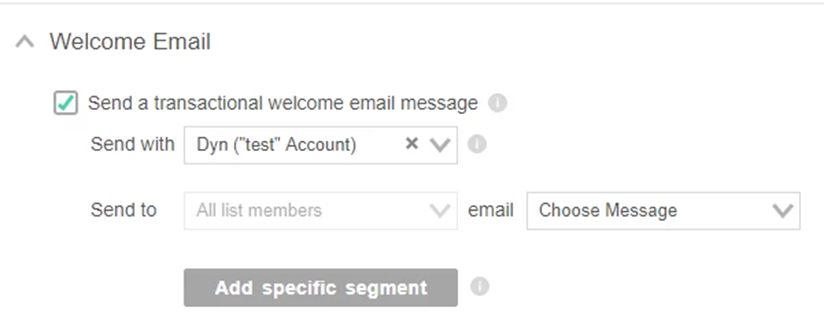
When you check that box, you ensure that each new list member will receive an automatic and prompt transactional email.
But there’s more to this module, like sending this welcome email by segment!
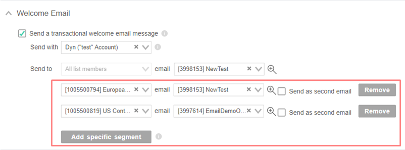
If you want to send a specific welcome email to a certain segment, you can easily set it up. Do you want men to receive one variation and women another? Add gender as a segment. The same can be done for age, different types of preferences, and even intent.
Your segments are based on your data and allow you to personalize your welcome emails better and increase engagement.
FYI, it’s possible to send these segment-specific welcome emails on top of the generic and default welcome email. All you have to do is check the box on the right, and you’re set!
It’s worth noting that this built-in module is provided for each of your sending lists on the platform.
This means you can send different welcome emails to different sub-brands, web properties, and country-based lists.
Welcome email examples that inspire excellence
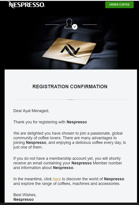
Nespresso’s zing
The leading coffee company has a fantastic welcome email, filled to the brim with best practices.
It’s clean and sleek, just as you’d expect from the Nespresso brand.
On top of that, they are “delighted” to have you and welcome you to their community of coffee lovers. You feel right at home by reading this.
The email also features a non-intrusive CTA button at the top for ordering coffee and an invitation to explore their range of products. It’s a great way to monetize the welcome email while providing new subscribers with some coffee zing.
NordVPN’s values
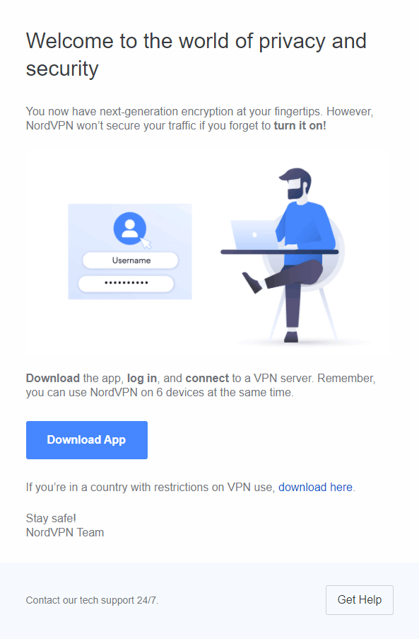
The popular VPN service makes their welcome email shine with tons of value.
Already in their warm welcome greeting, they talk about the value of using their VPN – security and privacy.
Further, they remind you what needs to be done to enjoy these benefits and include a helpful gif to demonstrate set up, accompanied by download links to their app.
Value and knowledge bombs, right there!
One of the things I loved about this email is how NordVPN encourages you to get help with a big CTA button at the bottom. Many brands shy away from this, with many sending from a “do-not-reply” address, which is not very welcoming.
Email on Acid’s personality
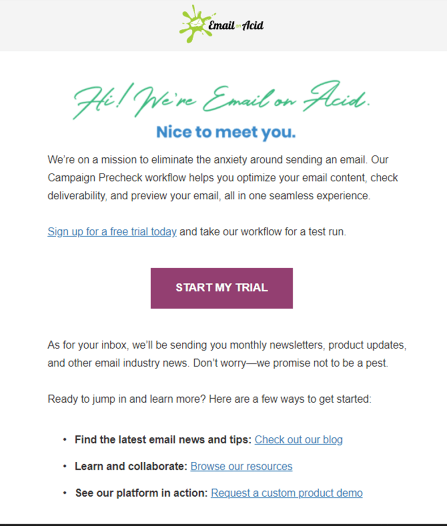
When subscribing to the email-preview service, you immediately receive the following email, with this great subject line: “👋 Welcome, Friend! Here’s what you need to know.”
The friendly tone from the subject line continues later in the beginning of the email, where a “nice to meet you” message greets you. This is then further amplified by the cursive handwriting banner.
You can already feel the sense of warmth emanating from this email, even before you dive deeper into the email. That’s a great first impression.
Email on Acid also sets expectations for the new subscribers while also providing value with:
- Educational content.
- Free Trial.
- And a product demo.
Headspace’s header space
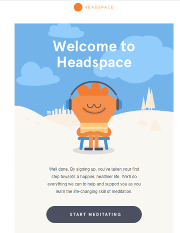
This meditation app has an instantly recognizable style. The brand uses it to their advantage, with a welcome email that makes you want to send a chef’s kiss their way. The email is clean, making you feel welcomed (and relaxed) just by looking at it.
The value is clear and is something that rings with everyone – “a happy, healthier life.” Who wouldn’t want that?
To top it off, they use a clear CTA, with a clear message that will send you into your first meditative session with them.
Stepping up your welcome email game
The welcome email is the cornerstone of your newfound relationship with subscribers, and it holds many benefits when done right.
It’s worth stopping for a moment, asking yourself what do you want to achieve with it? What’s the value you provide to your new subscribers?
If you’re not already sending a welcome email, we highly recommend taking the time and setting one up, as you and your subscribers are missing out. But if you feel your welcome, email already has what it takes and reaches to the stars. We’d love to hear about what you’re doing in the comments section!

