Email newsletters are a mainspring for many email marketing programs. These flexible email messaging vehicles help brands stay in touch and top of mind with subscribers with consistent, value-adding contact. But consistency takes effort. Is your email newsletter process fine-tuned for success? Discover the best practices for building email newsletters that are on-brand, on-time, and value-adding.
As email marketers, it can sometimes feel like chaos surrounds us.
So much to do, no time to get it all done, and always another deadline approaching.
For instance, to create an effective email newsletter, the marketing team has to build and manage its subscription list, develop a design and prepare new editions with value-adding content regularly.
It’s a continually renewing workflow that can become overwhelming without the right strategies in place to tame it.
Thinking about this made me think of Lewis Carroll’s character, the White Rabbit, from his book Alice’s Adventures in Wonderland.
The White Rabbit character is most memorable for his obsession with being late.
That’s partly because of the author’s intent and partly because the animated Disney version of the tale memorialized this trait in the song, “I’m late, I’m late for a very important date! No time to say Hello, Goodbye, I’m late!”
But the White Rabbit’s anxiety isn’t the whole of who he is. This character is also a guide. He appears throughout the story moving Alice forward on her journey, and even offers advice to the king.
This is the part of this literary character’s personality that I’d rather emulate when preparing my email workflows. I’d like to create newsletters that lead my prospects and customers forward on their journeys and offer sound advice–without always feeling like I’m running late.
I bet you would, too.
One way to get ahead of your newsletter workflow is to develop standard practices—best practices—that you know work.
With a solid set of email newsletter best practices in place, you can stop worrying about every design and distribution detail and focus your attention (and time) on adding quality content to each new edition of your newsletter.
With the right guidelines in place, you can stop wondering about what to do and spend more time doing it.
It just so happens that I have that set of guidelines, with over 40 tips and best practices that will streamline and improve your email newsletter design and workflows.
Want to find them?
Follow me down the rabbit hole and uncover the path to efficient, effective newsletter production.
How do email newsletters differ from the other emails businesses send?
An email newsletter is one of several types of emails a business might send.
Email newsletters are part of the marketing half of branded email communications, meaning they are permission-based. Your brand shouldn’t send newsletters to people who haven’t consented to receive them.
Newsletters are distinguished from other marketing emails because they are an ongoing series of communications. A blast campaign, in contrast, is usually a single mailing or campaign series that has a distinct beginning and ending date.
Newsletters and blast campaigns have in common that we send them to all or a large set of subscribers–they are high volume or mass email sends.
And while you can personalize your email newsletters, they don’t have the same degree of contextualization as triggered emails that aren’t sent on a predetermined schedule.
📊 Content Marketing Institute reports that 69% of B2B marketers used email newsletters to distribute content in 2021. Among owned channels, only the brand’s website and blog ranked higher.
Where newsletters fit into branded email communications –
Transactional (non-marketing) emails—Regularly scheduled or event triggered, non-promotional, necessary, or business-related messages that confirm or update transactions, follow-up on requests, request information or provide customer service support.
Brands may send transactional emails without gaining explicit consent from customers. Consent is implied through the fact of the transaction and the necessity of the communication.
Marketing emails—Emails for which the primary purpose is to build brand awareness, make sales, expand revenue, and build customer loyalty. In most jurisdictions, and as best practices, marketers should obtain express consent to send marketing emails to someone.
Marketing email subcategories include:
- Newsletters sent in bulk to all or part of a subscriber list on an ongoing and regular basis.
- Email blasts or blast campaigns that are pre-scheduled by the sender and sent to an entire or large portion of their subscription list. These may be single messages or one-time campaigns.
- Triggered emails sent to individuals in response to the occurrence (or non-occurrence) of an event or passage of a milestone. You may know these as drip, cascade waterfall, or lifecycle campaigns.
8 common types of email newsletters used by brands to engage with subscribers
The broad definition of an email newsletter as “a marketing email that is sent on an ongoing and regular basis” leaves senders lots of room to define what their newsletter or newsletters will look like.
What types of emails your organization should send to subscribers will depend on your objectives for the newsletter and your subscribers’ preferences.
Some businesses differentiate the types of newsletters they send by creating separate segments for each type and sending them under different From names.
Others combine different newsletter formats sending a variety of content to the same list using the same From name. For example, an ecommerce brand might alternate between promotional and informational templates when preparing its newsletter content.
Below are examples of several common types of email newsletters businesses use to stay in regular touch with their subscribers.
📰 Business newsletters that share company news and updates. These messages are used to keep customers, investors, or other stakeholders informed about the status of your organization. As marketing vehicles, they are primarily reputational, supporting your brand’s image and enhancing its credibility.
📰 Organization newsletters that share updates and news about the organization. These newsletters are like business newsletters and are usually more informational or educational than promotional.
📧 Mortgage trade organization AIME’s weekly newsletter to subscribers informs them about upcoming events, introduces them to industry participants, and shares advocacy and professional development resources.

A variety of call-to-actions in this newsletter encourage engagement. Throughout the newsletter, they invite subscribers to:
- Get your tickets today!
- Listen now
- Take action
- Get connected
- Check it out
- Use template
- Subscribe
- Download
Action-based CTAs that continue your copy’s message is an effective way to move subscribers from passive to active engagement.
📰 Promotional newsletters that announce sales, promote specific products, and are directed at driving sales. These newsletters are the opposite of the business newsletter in purpose–they are conversion-focused pieces that aim to increase revenue.
📧 Fashion retailers like Ann Taylor and Kohls stay top of mind with their subscribers by sending newsletters highlighting new products and the latest sales.


Each of these retailers has a distinctive style for their newsletters designed to appeal to their target audiences.
B2B brands also send promotional newsletters, although they may not look like traditional promotions. B2B promotional newsletters usually include a list of upcoming webinars or other events that are part of the brand’s marketing efforts.
📧 Content Science Review’s “The Update” newsletter includes a mix of promotions for its articles, downloadable content, webinars, and workshops.

📰 Informational and educational newsletters that share tips, advice, how-to’s or other information that adds value for your subscribers without directly promoting your product. These newsletters may serve a promotional purpose by encouraging subscribers to use your products. But they aren’t as direct as a promotional newsletter.
📧 Keto foods encourages subscribers to purchase its ice cream by sharing a tasty-looking recipe in its newsletter.

Subscribers don’t have to click through to view this “Recipe of the Week,” but the CTA invites them to do so. Presumably, they’ll find more recipes on the company’s website when they do.
A separate CTA links them directly to information about the featured ingredient in this recipe, Keto pint peanut butter ice cream.
If your newsletter is brief, you may choose to use a single CTA. If your content’s length requires readers to scroll your primary CTA out of view, then adding additional click-through points may be a better strategy. You can read more about how to make your CTAs effective in the article Email Call-To-Action Examples: A Guide to the Click Now.
📰 Blog newsletters are like other informational newsletters except that their scope is limited to sharing the sender’s blog content. These newsletters inform the subscriber that new content is available and often have an excerpt or summary of the blog along with a link that directs the subscriber to the brand’s website for further reading.
📧 Each Ongage newsletter introduces a single article and provides subscribers with a summary that explains why they should click to read more.
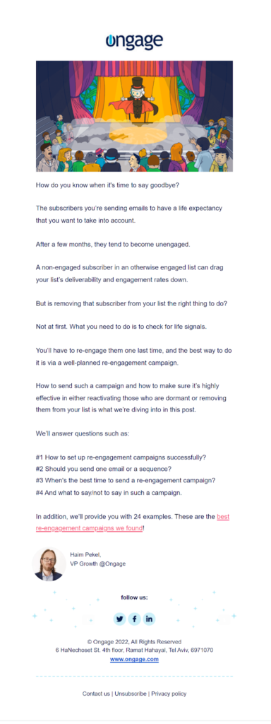
Focusing on a single blog in each newsletter, Ongage provides subscribers with a short, but detailed explanation of why they should click-through to read the entire article.
📰 Editorial newsletters are comprised of original content prepared for the publisher’s audience and intended to provide independent value or demonstrate the brand or individual publisher’s expertise and thought leadership. Non-profit and trade organizations and for-profit ventures may use editorial newsletters to share valuable information with subscribers.
📧 This newsletter from CB Insights is packed with the consulting firm’s latest insights and observations about the economy.
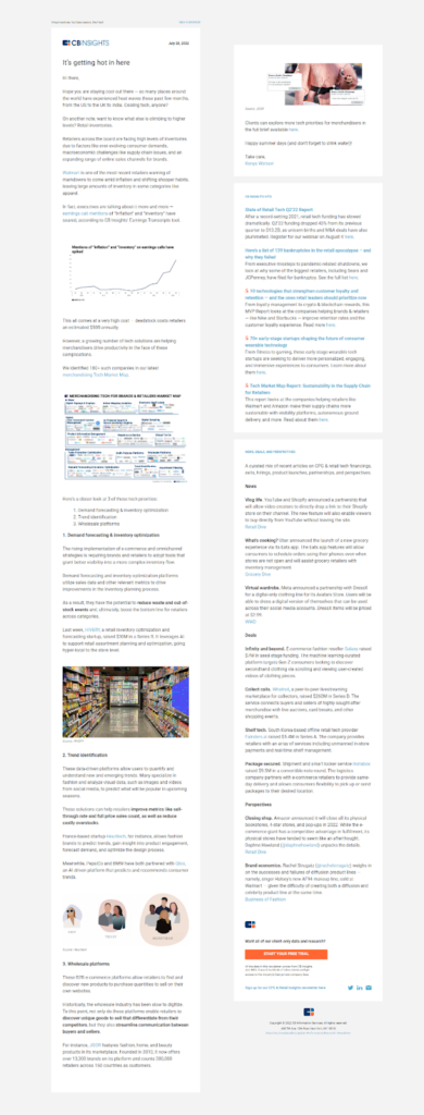
📰 Curated newsletters are a popular choice for publishers, trade organizations and service businesses that want to share value-adding information from multiple sources. These newsletters enhance the publisher’s reputation as a useful resource, enhance subscribers’ experiences with the brand, and are sometimes an independent source of revenue for the publisher.
📧 TLDR gives subscribers the executive summary and a link to the latest tech news from multiple sources in every newsletter.
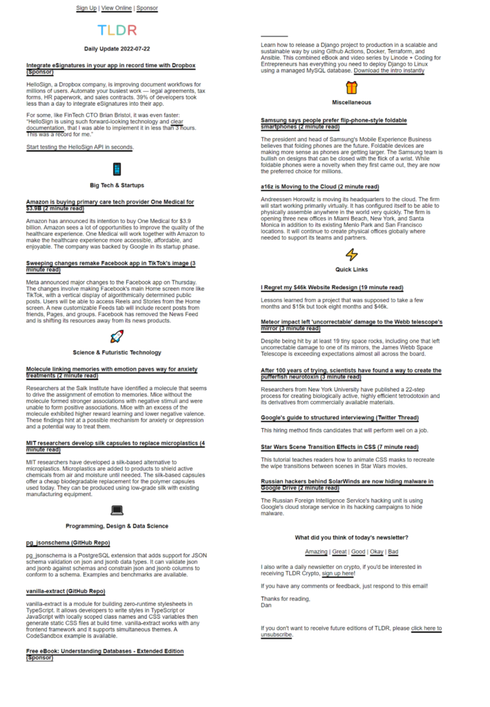
TLDR uses typography and emojis to help subscribers find their place in its information-packed newsletters. A “What did you think about today’s newsletter?” query above the footer encourages engagement and helps the brand gather feedback.
📰 Combination or hybrid newsletters. These newsletters combine features from two or more of the other types. For example, a brand might combine product promotions with curated news. An editorial newsletter may have sections for curated content and event announcements as well.
When you create a combination newsletter, organization and establishing visual hierarchies are critical to ensuring your subscribers keep scrolling to the end. Create distinct sections using subheadings or section titles to improve your message’s scannability.
📧 AMA keeps things sorted with images, design elements, color, and text.
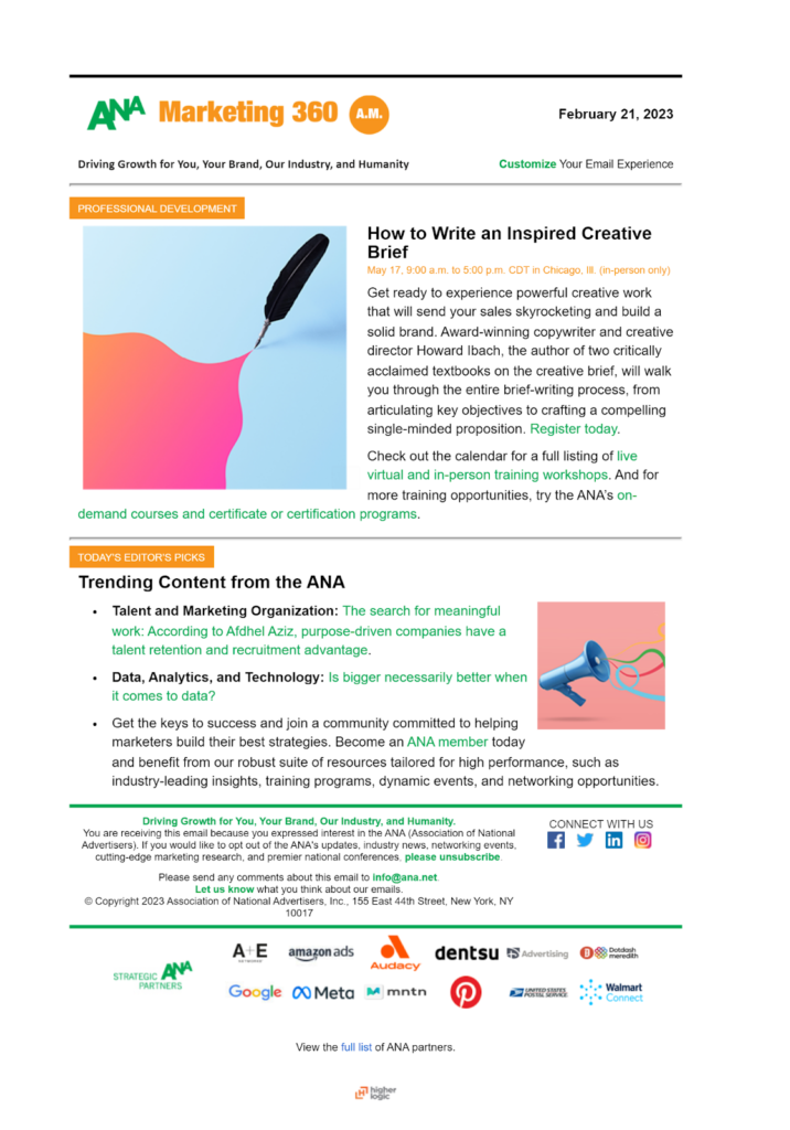
AMA’s Marketing 360 A.M. newsletter includes several sections with the two primary topics of the message denoted by color-blocked (orange with white text) titles. Changes in font sizes and colors and the use of lines to separate each section also help recipients find their way through this email.
How long should your email newsletter be?
Is there a best practice when it comes to choosing the length for your email newsletter? A newsletter may be a short promotional message with less than one hundred words of copy or a lengthy editorial piece of several hundred words.
When I researched this topic, I was surprised to find advice suggesting that your email newsletters should be 200 words or less! That doesn’t match the length of the newsletter examples I see in my inbox (or most of the ones I’ve shared in this article).
I suspect the disparity in suggested versus actual newsletter lengths is due to how those advisors defined a newsletter.
If you are sending short promotional campaigns, then your newsletters may consist of a graphic presenting your current promotion and a few sentences explaining the details.
📧 Sticker seller Big Moods lets the pictures do (most of) the talking in its promotional newsletter.
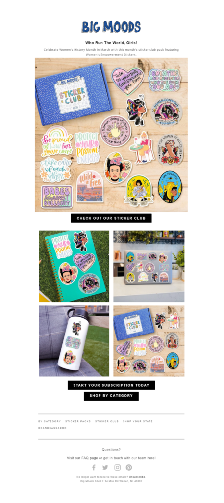
Newsletters promoting a single product or collection or announcing a special sale can be short on words.
But that’s just one of many types of newsletters you might send your subscribers.
My advice about choosing the best length for your newsletter is to apply the content marketer’s adage, “A piece of content should be no longer nor shorter than is necessary to achieve your objective.”
What to consider when choosing your ideal newsletter length
There’s no one length to rule them all when it comes to email messages. Use the following data to help you determine how long your brand’s newsletters should be.
The newsletter’s purpose. Are you notifying subscribers of a sales event or sharing a collection of curated articles and other resources?
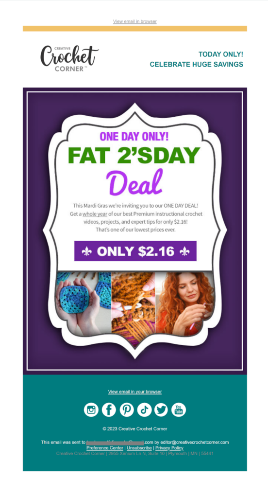
📧 This newsletter from Creative Crochet announcing a limited-time sales event doesn’t need much space to get its message across. Laissez les bon temps rouler!
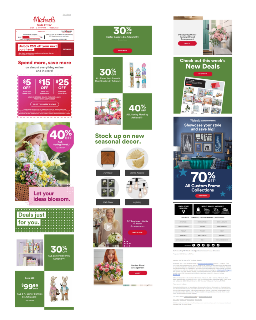
In contrast, DIY craft brand Michaels’ newsletter has multiple jobs to do. The email includes a personalized rewards program status update, clippable coupons that customers can use at physical stores, plus announcements for several sales offers across various product categories.
The newsletter also includes links to a video and other DIY resources. All that adds up to a much longer read!
📧 Michaels welcomes spring with data, deals, and resources to encourage online and in-store spending.
The frequency of your newsletter and other communications with subscribers. Summing up a week may take less space than updating your subscribers about a month’s or year’s worth of stuff.
Your performance and subscriber behavior data. How has your audience responded to past content of varying lengths? Above-average opens and engagement rates are behind the advice to keep your newsletter short.
Is that advice applicable to your audience? Gather your own data to find out. What matters most is your newsletter’s value to subscribers.
Email inbox (and clients) file size limitations. Your HTML and other assets in your email add to its total file size, and that size can exceed acceptable limits. When your email is too heavy (its file size is too large), your subscribers may not receive it, or the message may be clipped upon arrival.
Larger files take longer to download, too. Excessive load times will interfere with your subscriber’s experience, especially on mobile devices. Keep your file sizes below 10MB and use an email minifier tool to, well, minify your sending packet.
Managing your file sizes is one of several steps you can take to optimize your emails and your email marketing program to ensure positive subscriber experiences.
Your newsletter’s visual appearance on various devices. A lengthy newsletter requires both desktop and mobile users to scroll through the email to view all of its contents. When you design your newsletter, pay attention to the size of each panel or segment as well as the overall length.
Will subscribers consider it worth the effort to travel through your message from top to bottom? Is there anything you can remove to shorten their trip?
Whether your email newsletter is long or short, make sure it is easily scannable and navigable by employing a clear hierarchy with plenty of visual cues and white space.
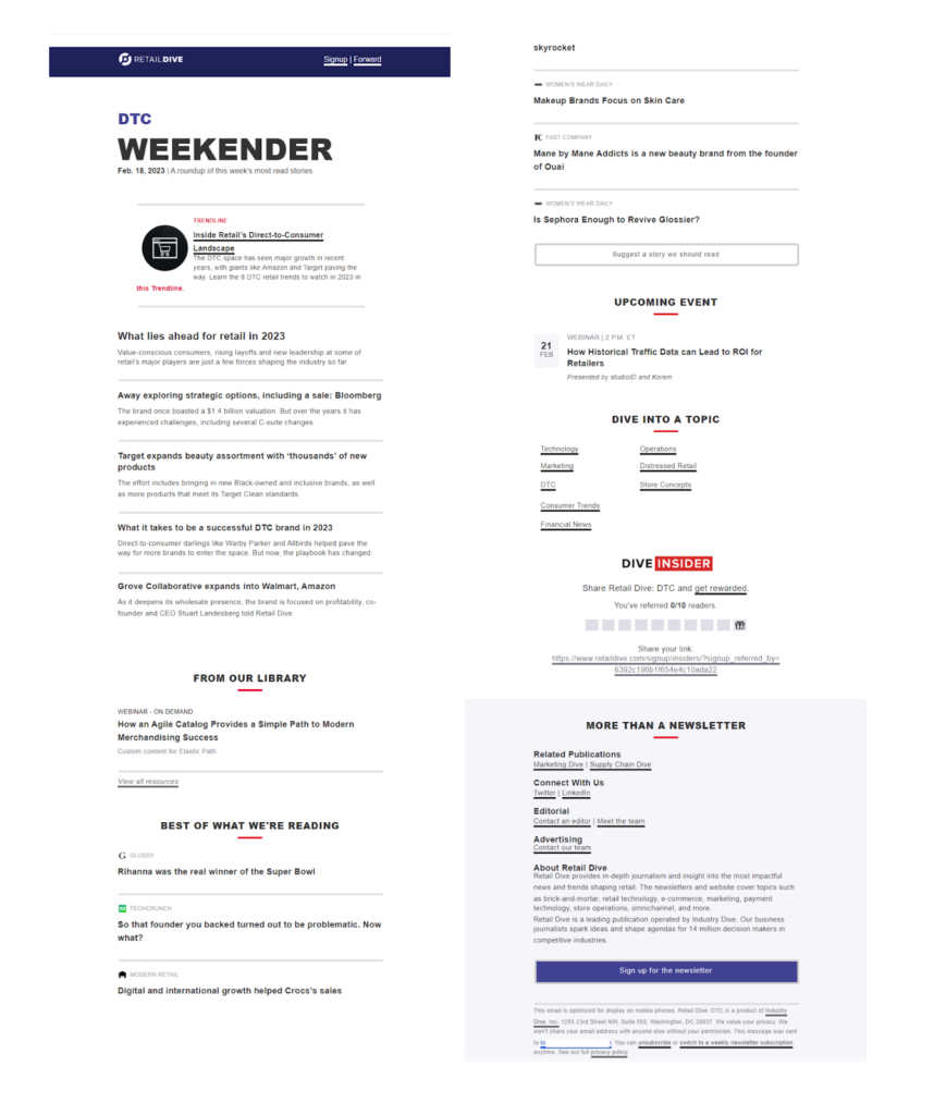
📧 The DTC newsletter uses section frames and banners, emojis, various fonts, and images to organize and break up its ‘everything’ ecommerce trends email newsletter.
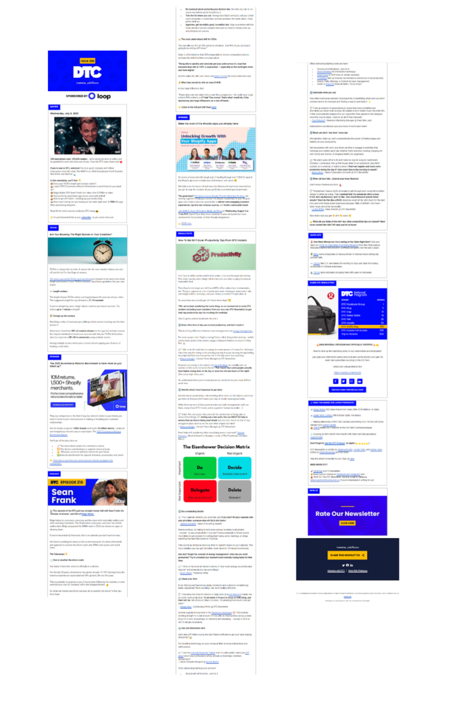
DTC newsletters are LONG. Fortunately, the publisher uses lots of visual cues to guide readers and break up the copy. This email ends with an invitation to participate in a referral program.
The email’s referral panel is customized so subscribers can find their referral link and see their current status here–giving those who know about the program a reason to scroll to the bottom of each newsletter to check their score.
💡Referral programs are an effective list-building tool for information-based newsletter publishers. Using dynamic content to include each subscriber’s customized referral link (and a progress report) in your newsletters makes participation enticing and frictionless.
What makes an effective newsletter?
Sending one or more newsletters to your subscribers on a regular basis involves more than just filling the fields on a template. The process involves defining why your brand should send newsletters and choosing what type or types of newsletters you’ll send. You need to build and manage your subscriber list and list segments.
Once you know who you’ll send your newsletters to and why, you can begin building your newsletter workflows and templates.
Making a good newsletter requires careful attention to each of several components, including:
- Sign-up forms or other subscription channels that you’ll use to build your list.
- Domain and sender, which define the sender name and reply address that appear in the recipients’ inboxes.
- A branded header that appears at the top of each newsletter.
- The subject line and preview text which may consist of a standard title or prefix and content that is updated for each newsletter.
- The newsletter’s overall layout which may also vary between editions.
- Each email’s copy, images, and other design elements.
- The links in the email’s body, header, or footer.
- A primary call to action (CTA) and any additional CTAs for each newsletter.
- A standard footer that houses contact information, an unsubscribe link, a link to the brand’s preference center, and (optional) social media pages.
- A preference center landing page.
- Custom landing pages for other links shared in the newsletter. (Optional)
Here are the best practices that will give you confidence that you’re executing each of these components well.
Plan your email newsletter campaign with purpose
Newsletters aren’t inherently relevant and contextual like transactional messages. What will you send subscribers that they look forward to seeing in their inbox that delivers value for your brand?
Begin planning by defining the purpose of your newsletter. What business and marketing objectives do you want to achieve?
Sending a newsletter without a purpose is a waste of time for you and may annoy your subscribers. So before you prepare your first newsletter, decide if you should send one (or more) and what type of newsletter you should send.
To decide which type of newsletter will help your organization achieve its goals, consider both your business objectives and your audience’s needs. Your newsletter can’t succeed if it doesn’t deliver something your subscribers want to see.
Narrow down the objectives for your newsletters by examining your customer journey and lifecycle maps to identify gaps or opportunities for growth.
In other words, where might a newsletter contribute to moving your subscribers forward either from prospect to purchaser, or from purchaser to high-value customer and advocate?
After you decide where a newsletter can shore up your marketing plan, then choose the type of newsletter you’ll send.
A promotional newsletter can prompt middle-of-the-funnel subscribers to make a purchase, while an informational newsletter will contribute toward building long-term relationships.
Avoid sending irrelevant or excessive content
Segment your audience to ensure you are sending relevant, value-adding content to your subscribers. Then monitor your sending cadences to avoid inbox overload.
Creating multiple newsletters for multiple list segments may seem controversial. After all, newsletters are bulk sends—how customized do they need to be? But, the key to adding value at any scale is customization.
Segmentation is a top-level method to ensure that the information you send to your audience is relevant and welcomed.
For example, if your subscriber list consists of job seekers and employers, a curated or editorial newsletter designed to serve both groups is unlikely to serve either as well as it should.
A better solution would be to create separate newsletters, each addressing the specific needs of their target audience.
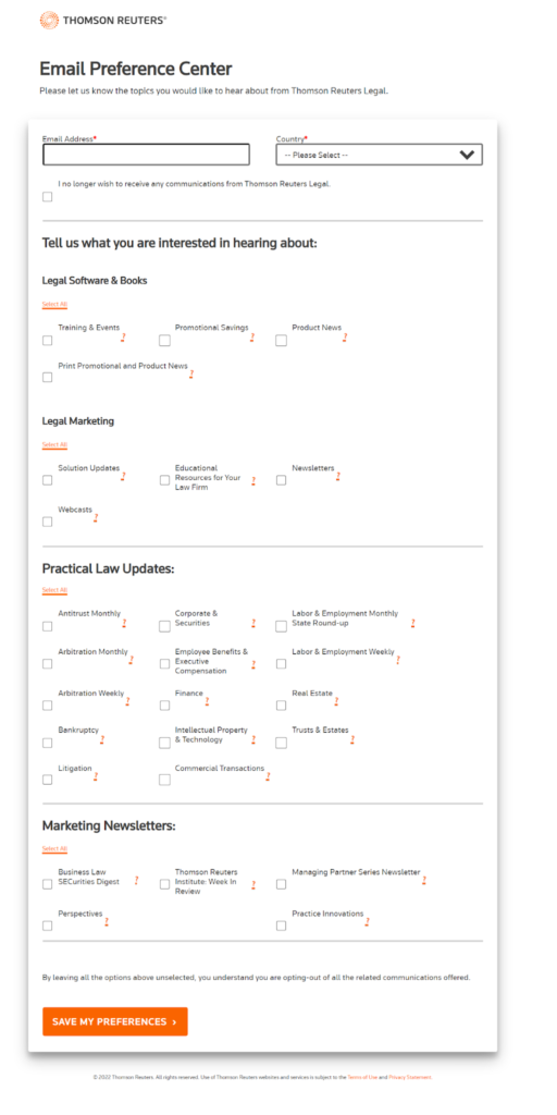
💻Publishing company Thomas Reuters Legal offers subscribers several newsletters, some providing updates for differing practice areas and others offering more general industry updates.
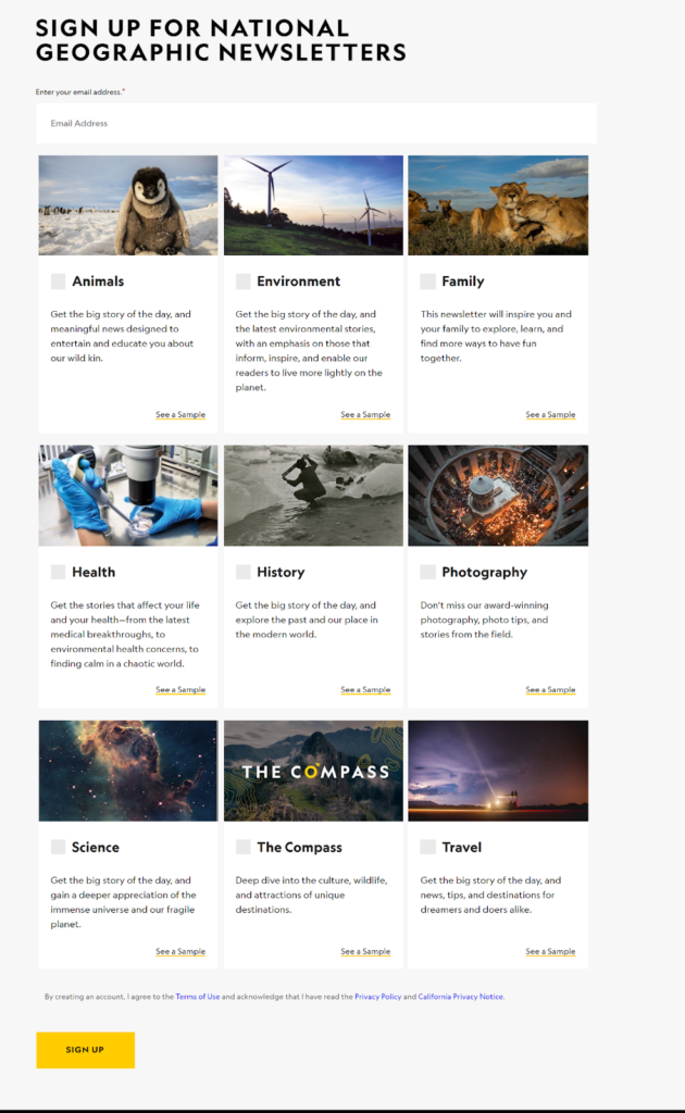
💻 National Geographic invites new subscribers to select from a collection of different topical newsletters via its newsletter preference page.
Don’t overload your subscribers’ inboxes with too many newsletters.
Some brands send a new email to their subscribers daily. Others send out monthly recaps. Still, others offer more than one newsletter, each with its own cadence.
For example, many companies that produce curated or editorial content offer subscribers a choice of receiving daily updates, weekly summaries or some other combination of messages.
When deciding how often to send your newsletter, examine your audience’s preferences, the purpose of the newsletter, your production capacity, and how your newsletter fits into your overall marketing program. In particular, look at the total inbox load your communications with subscribers produces.
If your brand sends subscribers blast and triggered campaigns at a steady pace, there might not be much room in their inbox for a daily newsletter as well.
Deploy your newsletters as part of a coordinated, cross-channel, lifecycle marketing strategy
Email is a powerful tool for reaching your subscribers. Use it to its full advantage by ensuring that your newsletters are part of a coordinated cross-channel effort to keep your pipeline moving and build lasting relationships with your subscribers and customers.
Break down silos across your marketing campaigns and between other departments within your organization to make your newsletters part of the whole. Create a universal calendar that includes marketing and sales events, important revenue cycle dates and holidays, and other dates that are relevant to your audience segments.
Develop your newsletters’ content calendars to complement and support other efforts and deliver contextual content to your subscribers.
Now let me share some best practices for each stage of your email newsletter campaigns, from sign-up to final send checks.
Email newsletter best practices to build and maintain your list
A healthy subscriber list is one populated by engaged subscribers who are valuable to your brand as potential purchasers, loyal customers, or brand advocates. High-interest subscribers are more likely to appreciate your newsletters and engage with the content.
Engagement moves subscribers forward in their buyers’ journey, builds brand loyalty, and protects your deliverability by signaling to email service providers that you are a responsible sender.
Create a sign-up pipeline that targets your ideal subscriber
Use your ideal customer profiles and customer personas to understand which people are most likely to be engaged subscribers. Then, place your sign-up forms and subscription invitations where those people are and use sign-up incentives that appeal to your ideal customer.
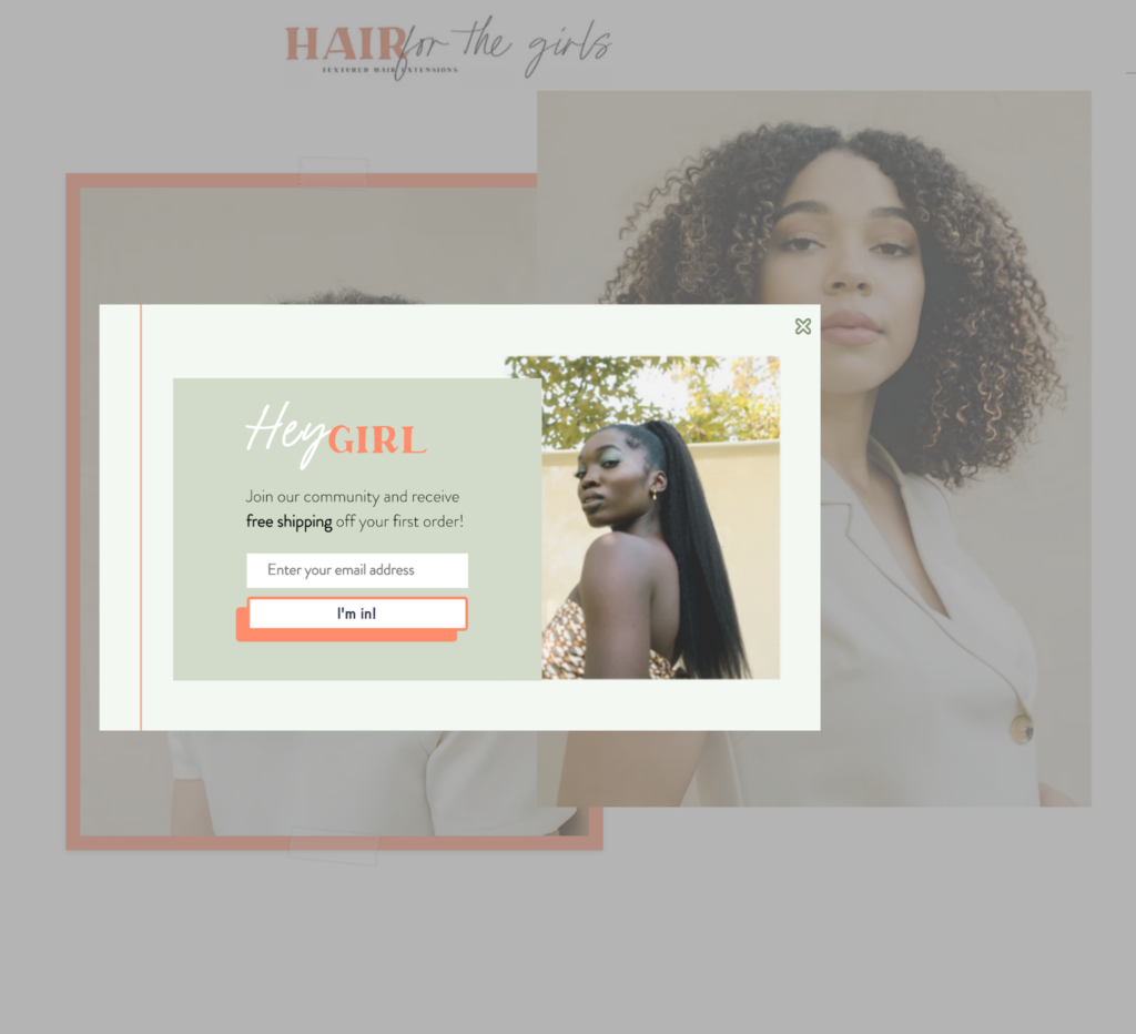
💻 This low-friction sign-up form for Hair for the Girls draws subscribers who plan to make a purchase with a free shipping offer.
Use multiple channels to grow your subscriber list, including social media
Encouraging existing subscribers to forward your newsletters to friends and colleagues. Add a “subscribe” link or button to your newsletters so that people who received it as a forwarded message can easily become subscribers.
Comply with anti-spam and privacy laws and regulations
Regularly review your sign-up and data protection policies to make sure you comply with the EU’s General Data Protection Regulation (GDPR), Canada’s Anti-Spam Law (CASL), the US CAN-SPAM Act, California’s Consumer Privacy Act (CCPA), and other local or international standards.
Remember to obtain separate consent to send subscribers text messages. Be sure to track your consent for each type of contact separately and follow applicable laws and standards, including the US Telephone Consumer Protection Act (TCPA.
Set your subscribers’ expectations at sign-up
Use your email sign-up form or page, or your post-sign-up thank you page to inform subscribers about how often you’ll message them and how they can unsubscribe to future messages.
Also, ask them to be on the lookout for your first message in their inbox and add your sending address to their contact list.
Confirm subscribers’ email address and interest before you send them your newsletter
Use a real-time email validation system to ensure that emails added to your subscription list are real. Then, follow up each subscription sign-up with a double opt-in email that confirms the subscriber’s interest.
Subscribers sometimes forget or don’t realize that they’ve subscribed to receive marketing emails, so use this confirmation message to explain how you got their email address.
📧 The footer of this email from snack bar brand Happy Cow explains why the subscriber is receiving the email and includes the brand’s contact information and an unsubscribe link.
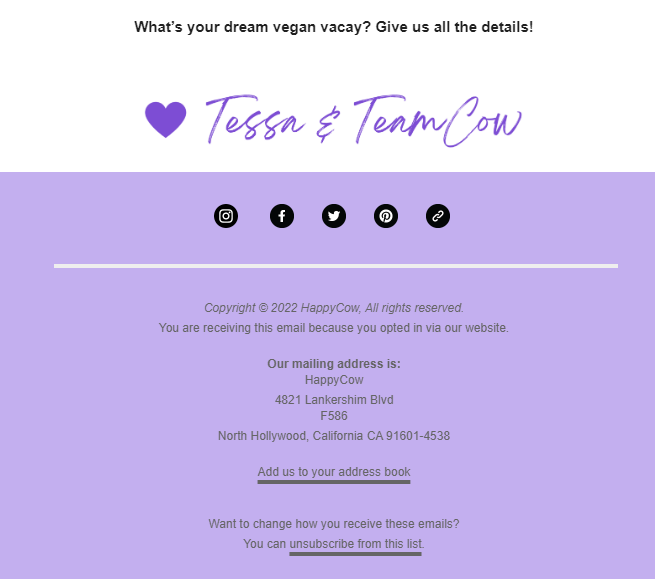
Happy Cow’s “Highlights of the Month” newsletter introduces a selection of themed content. This edition was all about traveling while vegan.
Keep your promises when interacting with subscribers
Avoid disappointed or frustrated recipients, and a damaged brand reputation by keeping the promises you made to obtain your subscribers’ email addresses. Send the type of content and on the schedule you described.
Give your newsletter subscribers control of their data and engagement with your brand
Offer your subscribers opt-down options and customized content choices in a preference center that puts them in control of how and when they hear from your brand.
Expand your preference center to include data control and consent management to demonstrate your commitment to permission-based marketing and your customers’ privacy.
💻 Consent management platforms such as Didomi enable brands to turn personal data control over to their customers.
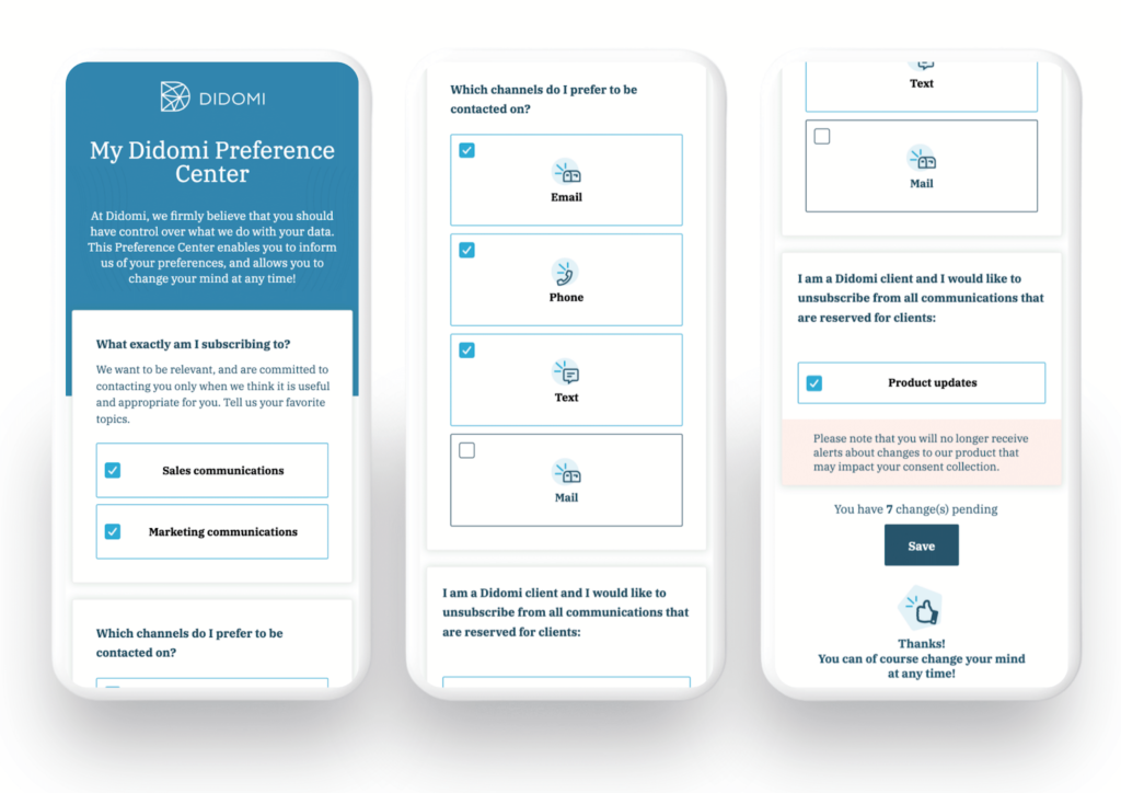
(Source: Didomi.io)
Welcome new subscribers with a triggered campaign
Build an onboarding email campaign that welcomes new subscribers and provides extra value to get your relationship off to a positive start. Use this campaign to deliver any promised sign-up incentives right away and track your newest contacts’ responses.
📧 This welcome email from Artwork Archive arrives shortly after new subscribers sign up for the publisher’s newsletter, filling the gap and building anticipation before the first scheduled edition arrives.

The subject line for this message says, “Welcome to Artwork Archive’s Weekly Digest.”
Inside the email builds enthusiasm and tells subscribers what to expect,
“Your inbox is about to get more exciting! Every week we’ll send you the best of our Artwork Archive blog, curated for your needs!”
The messages closes with links to several popular articles for subscribers to view while they wait for their first ‘official’ newsletter.
Remove lapsed emails from your newsletter subscription lists
Practice good list hygiene to avoid low engagement and spam traps.
Sometimes, relationships don’t last. Use re-engagement campaigns to get feedback and try to win back unengaged subscribers. However, if this strategy fails, take them off your list using automated sunsetting rules so you can focus your attention on subscribers with better potential.
Email newsletter best practices for design
A newsletter’s design, along with its content and the value it delivers, are its foundational pillars.
There’s no reason to reinvent the wheel (or the newsletter) each time you prepare to send a new edition to your subscribers. Instead, you’ll want to create one or more templates that you can use over and over again.
Doing so will give your newsletter a consistent look and save you loads of time–no running late for you!
The best email newsletter formats incorporate the principles of accessibility and good user experiences to create newsletters that are inclusive and easy to consume.
When possible, build these principles into your newsletter templates. Then after you’ve added content to each edition of your newsletter, make additional updates to ensure great UX every time.
Format your newsletter to be mobile-first
If your newsletters are a good read on mobile devices, they may not be read by many of your subscribers. The exact proportion of email messages that are opened on mobile devices is hard to pin down.
But we can say that a significant number of email users are using mobile devices to check their messages. Design your newsletters to be mobile first to prevent delivering a bad experience to your subscribers using mobile.
What can you do to make your newsletter designs mobile-friendly?
- Use short subject lines and preview texts that don’t run out of space in mobile inboxes.
- Select fonts that won’t blur together on a small screen and font sizes that allow viewers to distinguish between characters.
- Choose responsive or scalable designs that fit small screens. (Single-column designs work best.)
- Make sure your links and CTA buttons are well-spaced and large enough to avoid accidental clicks.
- Avoid oversized images and overall ‘heavy’ emails that slow download speeds.
Test your fonts, character and image sizes and color selections for legibility and readability
Whether on mobile or desktop, your subscribers can’t engage with your content if they can’t see and understand it.
Spacing, color, fonts and other factors all contribute to legibility and readability of your newsletter content. Adequate color contrast and font size is particularly important for subscribers who are visually impaired.
Use safe fonts for your newsletter’s text
Believe it or not, there are tens of thousands of fonts (a.k.a. typefaces) that email marketers could use to populate their emails. However, the list of fonts that will render properly across every email client and device is much, much shorter.
Email-safe fonts are ones that nearly every device and/or client support, so if you use these, you don’t have to worry about your selection being replaced by a default choice.
The list of safe fonts includes Arial, Helvetica, Tahoma, Trebuchet, Times New Roman, and a few others. If you plan to stray from the tried and true, make sure you add a fallback selection to your newsletter’s HTML code.
📧 The Products That Count newsletter has a crisp design with a simple font and ample spacing between lines that enhances its readability. Colorful CTAs and section lines help break up the newsletter’s sections and guide readers from start to finish.

Products That Count uses a newsletter template that includes a note from its founding CEO directly above the footer, giving the message a human touch.
Plan for dark mode
Dark mode has been making its way into email design for several years now.
While some email clients don’t fully support the option (displaying a dark background only around the edges of your message), you can get ahead of the trend by creating newsletters that look good night or day.
Add alt-text for your informational images
If your email will include images, then your HTML needs to include alt-text.
Alt-text is what subscribers who use a screen reader will hear when your newsletter is read to them and what those who don’t download images will see when they open your email.
You don’t need to add alt-text for purely decorative graphics, but you should ensure that all relevant information conveyed by graphics has a text backup.
📧 99designs uses images to accentuate its email newsletter while delivering the details in text so no one misses out.

99designs’ newsletter template keeps things interesting by using both vertical and side-by-side text and image placement.
📧 Beautyhabit’s image-only email might seem like it would fail to communicate. But the brand includes alt-text for all the copy presented in the image.
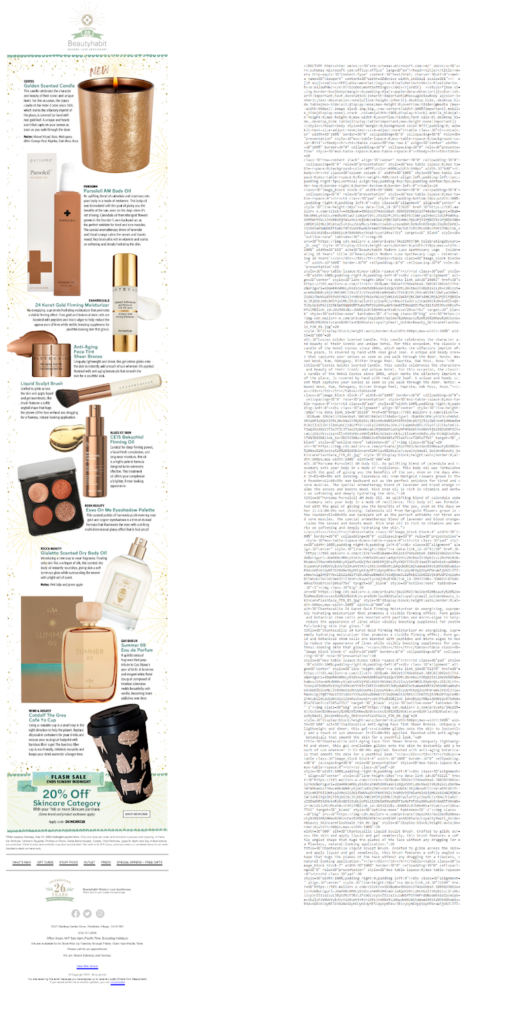
When you add text descriptions for illustrations or photos, make them contextual. For example, don’t just write, “Astronaut floating next to sign.” Write, “Ongage’s astronaut mascot floating next to a sign that says, “This way to out of this world email newsletter performance.”
For added accessibility follow the instructions for adding a plain text version of HTML emails to your sending packet in our article, Plain Text Email vs HTML Emails: Which One Is Best for Email Marketing?
Brand your email newsletters with custom headers and footers
A branded header and footer to bracket your newsletter gives subscribers an immediate visual cue that this message is special. Create a specific header and footer for use in your newsletter template that distinguishes it from your other email messages.
Use this space to add your newsletter’s name (if you named it) or your brand logo. Your newsletter footer should hold the usual contact and unsubscribe information, plus subscribing and forwarding information for the specific newsletter.
📧 Fortune’s CEO Daily newsletter is always topped by a custom header and its footer invites subscribers to explore the brand’s other publications.
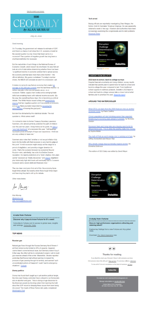
Fortune’s newsletter has a name, and a named publisher, Alan Murray. The newsletter gets a touch of personality from an opening commentary section by the author followed by curated content selections.
Brands can monetize their newsletters through paid subscriptions, sponsorships or paid ads such as the Deloitte ads inserted in this newsletter example.
Create a visual hierarchy using typographical elements to guide readers through your email
There’s a lot of advice to keep your newsletters short and simple, and that’s one way to go. But it’s not the only way.
You may have noticed that some newsletters are pretty long and have lots of sections. Your subscribers aren’t going to stay engaged if you present them with a huge wall of text.
📧 The Points Guy creates a path for readers to follow by using color, images, line breaks, formatting changes, and numbered lists.

📧 Nonprofit news livens up the usual visual hierarchy cues with the addition of emojis that add context and personality.

Employ visual cues such as section dividers, different font styles, weights and sizes, emojis, and other graphical elements to guide readers through your content and keep them moving forward.
Balance your newsletters’ content with ample blank space
Whether it’s a wall of text or images crammed together, a lack of space between visual elements makes for a bad user experience.
When the parts of a newsletter are difficult to separate visually, it makes your subscribers work harder to consume the information. This increases the chances that they’ll decide your newsletter isn’t worth the effort and disengage. ☹️
Take the pressure off your subscribers and give their eyes a rest by balancing your content with blank areas and nice spacing.
Present a coordinated, branded look across all the newsletters in a series
Who doesn’t like a well-put-together design, one where everything matches but is still interesting, and the shapes and colors have a good flow? You know it when you see it, right?
Your newsletter’s appearance is part of the package that helps you use it to build lasting relationships with your subscribers.
📧 National Geographic iconic color scheme and design make its newsletter immediately recognizable as owned content.
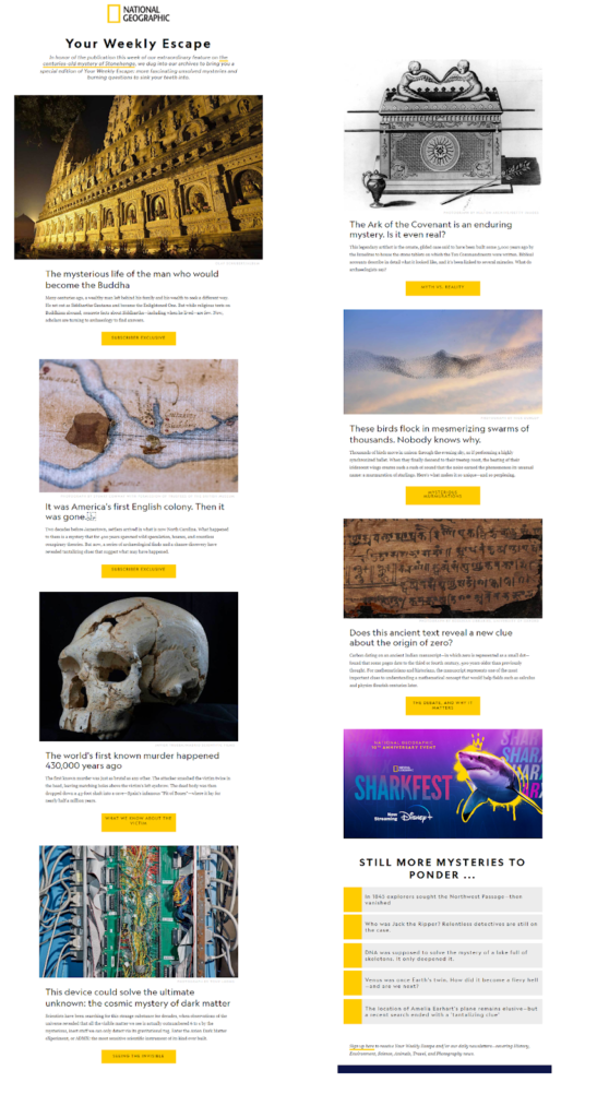
Each of your newsletter campaigns can have a personality separate from your brand or match it. But whichever choice you make, be consistent.
Even if your consistent style is to be different each time–do it in a way that is recognizable as an intentional pattern. People like surprises but value predictability, too.
Email newsletter best practices to improve inbox appearance and earn opens
A great newsletter may go unread if it doesn’t attract attention in your subscribers’ crowded inboxes.
Of course, your first step toward getting attention in the inbox is to make it to the inbox by following good sender best practices and ensuring a stellar domain reputation.
One of these practices is all about building an engaged subscriber list. Once you have your subscriber list prepared, follow these steps next.
Stay out of the spam folder with a good sender reputation
Your sender reputation is a composite judgment of your technical sending behaviors, the content of your emails, and how your subscribers respond to your messages.
To maintain a good sender or domain reputation and improve the chances that your newsletters will stay out of the spam folder:
- Warm up your IPs before you use them to send high-volume batches of newsletters.
- Avoid changing sending IPs, sending batches in different volumes or with erratic timing, or using unclear forwarding links and hidden text in your content.
- Download and follow the best practices in our free Email Deliverability Handbook.
Use a recognizable From name
Whether you choose to send your newsletter from an individual person (associated with your company), your brand’s email address or a newsletter-specific email address, make sure your sender name is recognizable.
Send your newsletters consistently from the same address, as well. These steps embed a sense of familiarity into your messages that makes your subscribers more likely to open them.
Add an extra level of familiarity and credibility using the Brand Indicators for Message Identification (BIMI) standard to attach your brand’s logo to your inbox display.
Should you give your newsletter a name
Newsletters are a specific type of marketing vehicle, meant to keep your brand top of mind with consistent communications with your subscribers.
For some brands, giving their newsletter a distinct personality and name helps set it apart from other email campaigns. A newsletter name helps subscribers quickly identify what “this” item in their inbox is and what it isn’t.
It may not make sense to name a promotional newsletter that serves as the equivalent of a digital sales flier–it’s pretty obvious what these messages are and what purpose they serve.
You may want to put ‘name or no name’ at the top of your list of factors to A/B test when you launch your next newsletter.
📧 Retail Dive DTC sends a Weekender edition newsletter that wraps up the previous week’s top content.
Creating attention-grabbing subject lines
Your subject line can cost you opportunities or gain them. Invest time in developing subject lines that spark recipients’ curiosity or interest, making them want to open your messages. Space is limited though, so you use subject line real estate well.
- Place the most important data at the beginning of your subject line to ensure it remains visible on small screens.
- Use an abbreviation of your newsletters name or replace it with an emoji to avoid taking up valuable inbox space.
- Ask questions, add numbers, give subscribers a hint at what they’ll find inside or use other subject-line copywriting strategies to encourage more opens.
- Avoid obscure references, emojis that can be misunderstood and repetitive phrases in your subject line.
- Personalize your subject lines with the subscribers name, geographic region, or a data point that relates to the newsletter’s subject matter. For example, if your newsletter includes dynamic content about a specific airport or career path, mention it in the subject line. “Sarah, Your best deals for flights out of Chicago Midway are inside.”
Coordinate your subject line and preview text
When senders don’t designate their preview text, email clients pull it from the email’s body. The result is often disappointing and seldom adds value. “FORWARD” and “VIEW IN BROWSER” aren’t inspiring.
Don’t leave your inbox impression to chance. Instead, give your preview text the same attention as your subject line and use the two together to make a compelling case for why recipients should open your message.
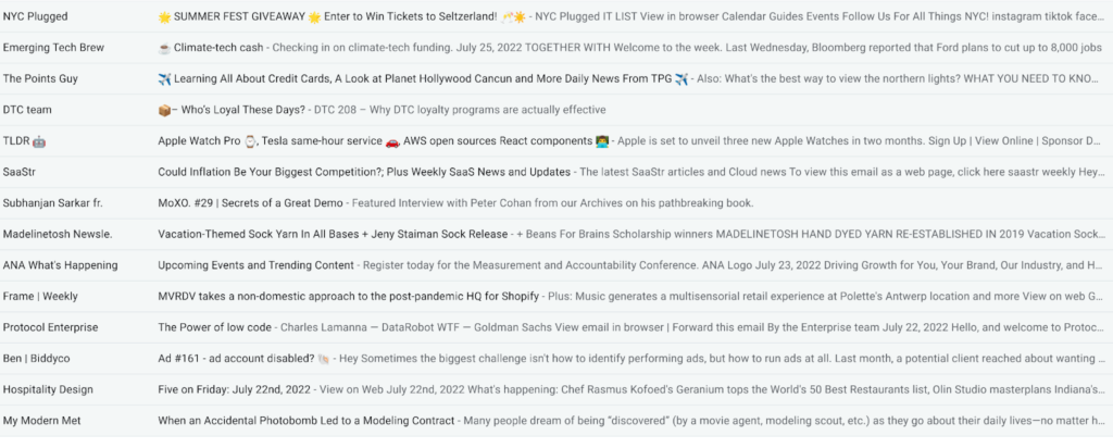
This collection of newsletter inbox entries (pictured above) represents a mix of tactics. Some senders use a personal name accompanied by the name of their company or newsletter as the From name. Others identify only the brand. While others use their newsletter’s name or the newsletter plus brand name.
Three of the senders, The Points Guy, DTC team and Emerging Tech Brew, consistently use the same emoji at the start of their email subject lines as a sort of mini-logo to help them stand out. The newsletters from Subhanjan Sarkar for X丨O Update and Ben at Biddy Co. begin their subject lines with a volume or edition number for the newsletter.
Once you’ve conducted some testing and found an inbox strategy that works for your brand, maintain it until you’re ready to test something new.
Email newsletter best practices for content that your subscribers won’t want to miss
What to say? What to say? That’s what your newsletter is all about, right? Saying something of value to your subscribers. But it’s not just what you say. It’s how you say it that matters.
The entire presentation of your newsletter creates an experience for subscribers that can be positive, negative or neutral. In an attention economy, positive experiences win.
These best practices will help you craft newsletter content that wins your subscribers’ interest and builds their loyalty.
Use multimedia content to give your subscribers some variety in their inbox
Simple, text newsletters aren’t bad. But they also aren’t for everyone. What about subscribers who are a little more adventurous like Alice?
You can serve up content for every palate by adding links to video or audio content in your emails. Spice up your newsletter with animated GIFs that show off your products or add a humorous take.
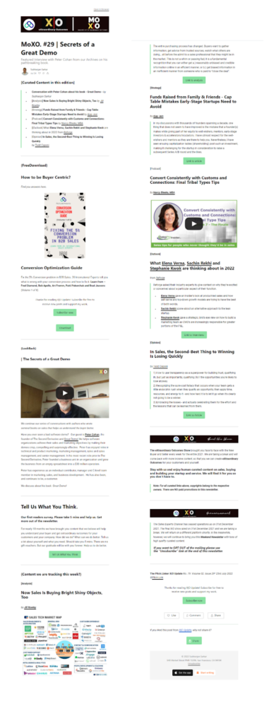
📧 This MoXO newsletter from X|O Update offers subscribers several ways to consume the information shared with a list of curated content, a downloadable ebook and links to video content.
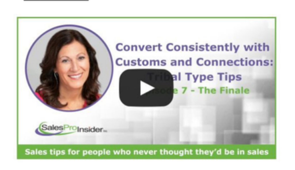
While embedding videos into your email content still isn’t feasible for most mass email sends, you can still use video content in your email newsletters by sharing a link.
Use text and visual cues such as the universal “play” symbol to communicate that subscribers can click through to view your videos.
Use your newsletter’s content and design to humanize your brand
Your newsletter can help you make deeper connections with your subscribers but not if it doesn’t connect with them. Use graphics, emojis, and conversational language to show your brand’s personality and human side.
📧 The Community Club has got it going on, showing its personality with emojis, a GIF, a community member spotlight, and posts by other community members.
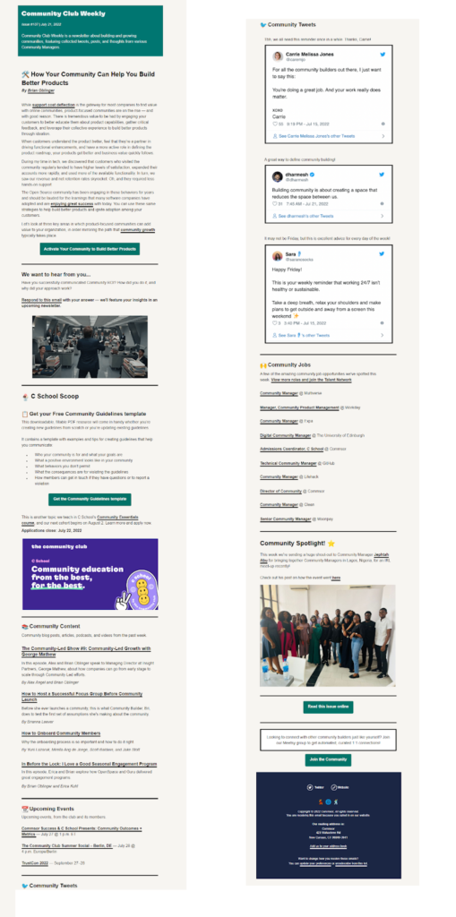
Adding social media content to your newsletter fuels a sense of belongingness. Your subscribers see that your brand is paying attention to them and their peers.
Personalize newsletter content by adding dynamic fields and blocks
Just because it’s a newsletter doesn’t mean it can’t be customized for each subscriber. Place dynamic blocks and fields in your newsletter templates to mass produce individualized content.
📧 Kayak brand sends out informational and update newsletters, the latter type includes a content block housing localized travel deals.

Drive subscribers to your social media pages or website with your newsletter’s content
Deepen your subscribers’ connection with your brand and move them forward on their buyer’s journey by starting a conversation in your newsletters that ends on your website or invites them to connect with you on social media.
Encourage subscribers to click to learn more, shop now, take a quiz or join the community to build longer lasting relationships with them.
Make your CTAs interesting and enticing
Your newsletter should have at least one CTA that invites subscribers to do something. Often you’ll have more than one. Think outside the button when you’re crafting your call to actions and use copy that tells subscribers what’s in it for them.
Try a variety of approaches to see which types of CTAs work for your audience. Do they respond best to humor or reason? Single words or longer phrases? Buttons or text? Apply what you’ve learned from other email campaigns to narrow your testing parameters.
📧 Artwork Archive uses distinct action-focused copy for each of the CTAs included in its email.

The mix of CTAs in this email includes: read more, join the discussion, get the August guide, reserve a recording, watch here, and view here.
Ask for feedback
Your newsletter’s content doesn’t have to just communicate at subscribers. Ask questions, embed an interactive poll or invite feedback to have a conversation with your subscribers and gain valuable data about your ideal customers.
📧 Planet Organic offers an easy, clickable interaction to learn more about newsletter subscribers.

Most of the messaging in this newsletter from Planet Organic is about is current “unmissable offers.” But the brand also shows its interest in learning more about its recipients’ needs.
Under the header, “Do you follow a specific diet?” subscribers can select one of four buttons (keto, vegan, gluten-free and low-sugar) to indicate their dietary preferences. Under these selections, the copy explains how the zero-party data subscribers provide will be use,
“Tell us about you so we can make your experience better. Based on your answer we’ll show you more relevant products and content.”
Deliver a variety of content in your newsletter
Hybrid newsletters are popular because they deliver something for everyone.
Maybe I’m not ready to buy my new spring wardrobe this week, but I am interested in reading about the new spring trends. Send me a newsletter that includes a spring sale announcement and a style guide.
Straight-from-the inbox ideas to inspire your email newsletter content
How can you deliver value-adding, relevant content to your newsletter subscribers? Try some of these ideas:
📰 Enrich your subscribers’ knowledge with educational content that anticipates their questions.
Use customer feedback, customer service queries and social listening to discover what your subscribers most want to know about your brand, its products or services. Then include the answers to these FAQs in your newsletters.
📧 This in-depth product review and how-to guide from Waves inspires confidence in the brand and answers questions about the featured product.
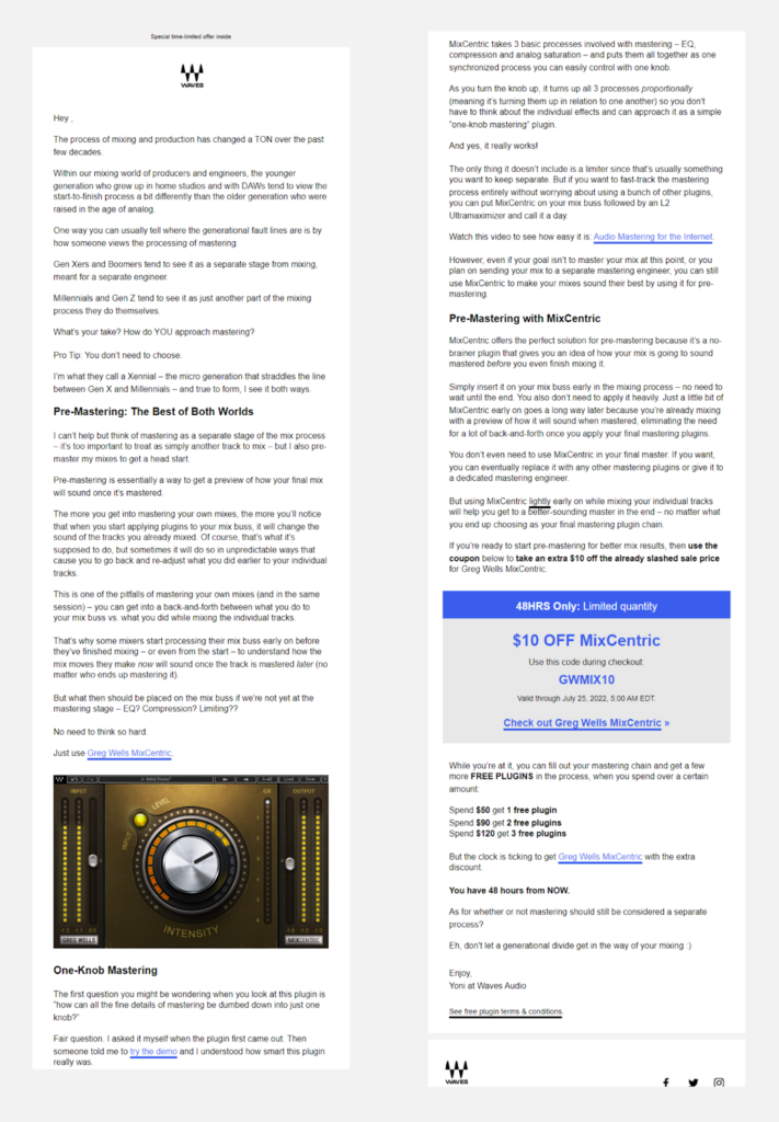
Newsletters are a great vehicle for showing your brand’s subject matter expertise. You don’t have to save all your best stuff for your blogs, videos and podcasts.
📰 Show your appreciation by making your newsletters about your subscribers.
Celebrate your customers with content that puts them in the spotlight. Share their social media posts and other user generated content (UCG) in your messages to make them feel special and build a sense of community around your brand.
📧 In this newsletter, Glossier links to a viral TikTok video created by one of its customers and shows off its products, too.

📰 Demonstrate your commitment to the values you and your customers share.
Today’s consumers look for businesses that share their values and expect to see proof that company’s mean what they say.
Make space in your email newsletter to engage in some attraction marketing by expressing your brand’s values and appeal to subscribers who are watching what you say and do.
📧 Uniqlo dedicated this edition of its newsletter to describe its sustainability efforts—with photos to show it did happen.
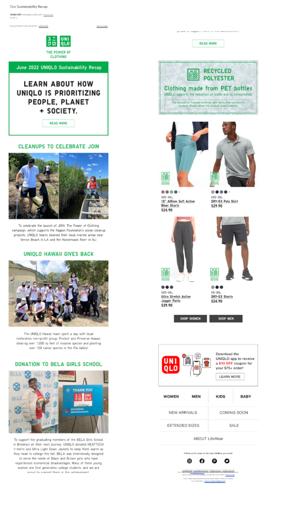
Uniqlo opens this email with a large CTA graphic inviting subscribers to “learn about how Uniqlo is prioritizing people, planet + society.”
📰 Give subscribers a reason to stay on your list with exclusive offers or membership privileges.
A lot of times email marketers use incentives and special offers to win new subscribers. But what about rewarding your loyal subscribers? Give them some perks for sticking around and give them a reason to open your next newsletter to see what’s inside.
📰 Let others do the talking about your brand by sharing customer reviews and testimonials.
Aside from family and friends, fellow consumers are the most trusted of voices when it comes to product recommendations. Your customers can be your best brand advocates, especially when you feature their ratings and testimonials in your promotional newsletters.
📧 Riff Raff brand put together a collection of customer testimonials for this aww-inspiring newsletter.
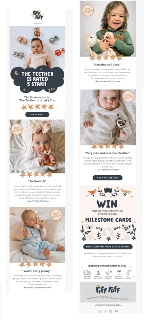
📰 Improve your products’ stickiness with articles that describe ways to use your products or explain advanced features.
📧 Humanizing? Moon Cheese lets the dogs out to add an endearing touch to its newsletters that make learning about its product mix fun.

“Did you know Moon Cheese snacks are 100% real cheese, high in protein, low carb, and keto friendly? Sit up and take notice, Hooman!” is the comment from the top dog in this email newsletter.
The CTA copy continues the fun, saying “The Hooman’s Nutrition Info.”
📰 Let subscribers see behind the scenes of your business.
Build connections that go beyond the product you sell by showing your subscribers how those products are made or sourced and introduce them to team members.
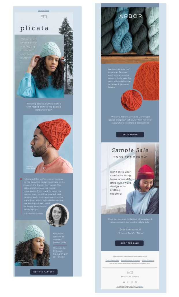
📧 Brooklyn Tweed aims to inspire the knitters who receive this promotional newsletter. It includes an interview with the fiber designer who created the pattern being promoted.
💡 You may have noticed many of the newsletter examples I’ve shared with you incorporate more than one newsletter best practices. That’s important. Like a great novel, it is the sum of its parts that make a newsletter great.
Good design, relevant content, great copy. It all matters.
Before you’re finished though, there’s one more set of best practices to follow. ⤵️
QA test and review your email newsletters before you schedule their send!
Testing and reviewing your newsletters should be an ongoing process.
Perform quality checks while developing your newsletter ideas and templates, and a pre-send check before you finalize each newsletter’s sending schedule.
- A/B test your newsletter’s parts against one another and with different segments.
- Preview each newsletter to ensure that it renders properly across devices and email clients.
- Check for broken or misdirected links before you send each newsletter.
- Make sure your dynamic content fields and blocks are pulling data from the correct fields and the input content fits in the space allotted. Do you have a default text for missing data points?
- Follow-through with your web team to ensure that landing pages for special links are operational.
- Review your images to make sure those that are supposed to be clickable are, that they have alt-text and render properly.
- Make sure your file sizes are appropriate and won’t slow downloads or cause your messages to be clipped.
- Track your deliverability and performance metrics after you send each newsletter and be prepared to make changes. Use your Ongage analytics dashboard to stay on top of your newsletters’ performances.
Well, that was quite an adventure wasn’t it?
This article has the information you need to prepare your regularly scheduled newsletters.
But are you wondering how to handle those special occasions when your regular newsletter just isn’t enough? Or maybe you just want more excellent newsletter examples to inspire you? Check out our Newsletters: Christmas Edition for even more tips, tactics and awesome ideas.


