Email preview text partners with your subject lines to give subscribers a peek at what’s inside your emails. It’s important attention-grabbing real estate in your inbox display that provides opportunities for more opens and clicks. Discover how to add irresistible email preview text to your marketing emails below.
Email preview text, when good, can convince busy people with crowded inboxes to stop and read your messages. And we all know that before your email messages can nudge, engage, inform, or convert, they have to be read.
Sure, first, you need to craft enticing email subject lines, but with consumers carrying the (digital) world in their pockets and having a lot on their minds, it’s important to ask how any content producers can get this extra attention.
The process isn’t always easy, and it increasingly involves using data to optimize your content’s appeal.
For example, the humble movie trailer, which once followed the main feature and introduced coming attractions, has become a multi-phased, data-based system of teasers, trailers, snippets, and sneak peeks.
Much like the inbox, trailers must give their audiences enough information to decide whether they’ll give it their attention.
Unfortunately, email marketers don’t enjoy the benefits of video when vying for attention in the inbox. Instead, they rely on sender names, subject lines and preview texts to win opens and clicks. So what’s the formula for creating email preview text that convinces subscribers that your message is worth their attention?
Here are our top strategies for building attention-winning email preview text.
What is email preview text?

Email preview text appears in a dedicated section of an email inbox display. Its purpose is to allow people to get a peek at what’s inside an email before opening it without having to make room in their mailbox display for a full preview pane.
Instead of a separate pane, preview text follows behind the From name (aka sender name) and Subject Line display sections, offering a compressed and quickly consumable view of the users’ messages.
Among email clients, preview text has different names. Gmail calls this section of inbox content a “snippet,” Apple Mail a “preview,” and Outlook a “message preview.”
| Basic inbox anatomy (In inboxes that support Brand Indicators for Message Identification (BIMI), the sender’s BIMI logo will appear to the left of the From name.) *Because there are no universal standards for the lengths and use of preview text, some inboxes may display designated preview text followed by default text from inside the email’s body if space permits. |
What type of content appears in the email preview section of an inbox display?
Email preview text may appear as:
- Copy selected by the sender and designated in the message’s HTML header.
- No copy when the mailbox provider doesn’t support this feature or the recipient has disabled it.
- Default content pulled from the body of the email by the recipient’s mailbox provider.
Email senders can control what recipients see in the preview text section of the messages they send by designating the desired preview copy in their email’s HTML code.
When there is no designated preview text in an email message’s code and the preview text option is enabled, default or fallback copy fills this space. Often this default copy is pulled from the email’s preheader. But preview and preheader text aren’t the same.
What’s the difference between email preview and preheader text?
Even though email preview text and preheader text are not the same, many email marketers, email service providers, and platforms use the two terms interchangeably or refer to preview text as preheader text.
However, each of these parts of an email has separate designations in your HTML code and separate jobs to do in your email.
Here are the differences between the two types of email content.
Preview text is an inbox display feature. This copy may be repeated in your email’s body but is more often hidden.
The preheader copy of an email appears above the header and the main body of the email message. Common uses for this text include linking subscribers to a browser version of your email, providing an unsubscribe link, or a link to your CTA destination.
(Find out why placing your unsubscribe link at the top of your email isn’t a bad idea in Why You Should Welcome Unsubscribe Rates.)
Because your preheader text appears at the top of your email’s body copy, it is often the first text the mailbox provider’s program encounters when searching for default text to place in the inbox preview field.
In fact, preheader text appears in the inbox display so often that people got into the habit of referring to the preview text as preheader text.
However, other copy or elements of your email’s body, such as the greeting and first sentence, alt-text from the body’s header, or code snippets can also end up in the preview position.
If your preheader or other content in your email’s body looks okay, then allowing it to display as your preview text isn’t the end of the world.
For example, the preview text from the Vogue Runway email displayed below is drawn from a preheader written to do double duty as preview text.
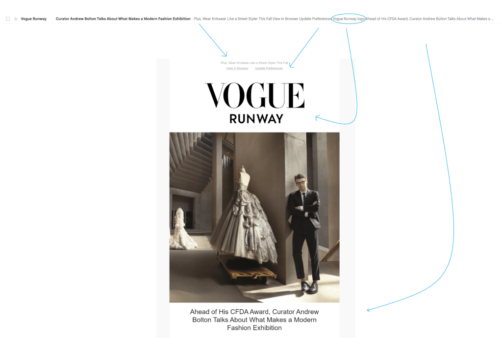
The copy in the inbox display and at the top of the email body reads, “Plus, Wear Knitwear Like a Street Styler This Fall.”
This effect is by design. The brand adds more traditional preheader content, “View in Browser” and “Update Preferences” in a second preheader row.
⚠️ Adding pre-preheader copy that says something other than “View in Browser” or “Unsubscribe” is one way to hedge against the unknowns of inbox display lengths. However, putting your preview text at the top of your email’s body might not be enough to keep your inbox display clear of interference.
I grabbed this example from a wide-view, desktop inbox display, so the preview text continues beyond the two preheader lines to include the alt-text description, “Vogue Runway” logo, and the copy of the email’s actual heading. This issue probably wouldn’t reveal itself when testing the display on mobile.
I’ll explore some better alternatives to allowing your preheader copy to appear in your preview section later in this article.
Why is email preview text important?
According to research from SuperOffice, the sender name and subject line of an email are the main influencers of whether someone will open a message–nearly 80% of those surveyed said these were their deciding factors.
This makes sense. We’re more likely to open a message from a sender we recognize, and, of course, we look to the subject line to find out why they are messaging us.
So why bother with your email’s preview text?
Why do movie studios bother with posters, banner ads, activations, or television commercials?
Because it gives you a second chance to make a first impression and earn those essential opens.
Email preview text (or the lack thereof) contributes to the whole of your inbox display.
Along with a recognizable From name, a BIMI logo that adds credibility and catches the eye, and a compelling subject line, your preview text is part of the persuasive inbox message that gets people to take the next step, opening your email.
Why designate and customize preview texts for marketing emails?
Intentionally composing preview text to complement the other elements of your inbox display enables you to:
👓Prevent confusing or uncompelling default text from appearing in the preview space and being read by screen readers.
“Save 20% today only – Click here to unsubscribe” isn’t what you want subscribers to see or hear.
In the inbox display pictured below, the sender didn’t designate their preview text, resulting in a rough transition between the subject line and preview text and a missed opportunity to encourage opens.

What subscribers see in the inbox is, “New! Valley Yarns Hardwick is HERE! – Can’t see the email? View in browser. Buy more. Save more. Save up to 25%…”
There’s a good promo message in this display, but the unwanted preheader copy interferes with its delivery.
👓Present a professional, cohesive inbox appearance with intentionally selected preview text.
If you want to control your look and appear as if you’ve put thought into your message, you need to control what shows up in this section of your inbox display.
Fallback preview copy can be unpredictable. Leaving your email preview text to chance can cost you opportunities and credibility with consumers.
In the following example, the sender is off to a good start with a subject line that highlights the expert advice recipients will find inside.

But then, alt-text referencing the ad and logo images extracted from the preheader data takes over the preview section. The intended effect is spoiled: “Jeremiah Brent on Creating Sophisticated Kids Rooms – ads1 [Reacted] Logo post_image Today’s top story…”
Failing to follow-through in the preview field reduces the impact of a subject line’s persuasive appeal.
👓Capture attention in the inbox with creative use of preview text copy, characters, and emojis.
Standing out in the inbox is always on email marketers minds and the right preview text can help you make that happen. Use the tools at your disposal, including emojis to catch peoples’ eyes.
Emojis at the end of the subject line are useful for drawing attention to your preview text. An emoji at the end of your preview text can serve as a separator between your “official” preview copy and any spillover copy from your email’s body.

In the preview text example (above) from knife seller Imarku, seasonal star emojis bracket the preview text, distinguishing it from the subject line and the preheader “View in browser” copy that follows.
Using numbers, special characters, and punctuation in your preview text or subject line can also cause subscribers to pause as they scan their inbox queues.
In mobile inboxes, your preview text will fill the space beneath your subject and can help it stand out. In a wide-screen view, your preview text or emojis catch mid-screen gazes.

The subject line and preheader for this Nike message each end with an emoji, doubling up on the visual impact.
The brands appearing in the inbox example below use emojis, discount amounts, and sometimes a combination of both to attract attention.

Waves Audio asks a question in the subject line, while its preview text uses capitalization, numbers and symbols to continue the conversation,
“Not sure which plugin to choose?”- Early Bird Black Friday: Up to 50% off ALL plugins | Don’t miss out >>.”
💡No worries about confusing preheader copy appearing in the inbox for Waves. The brand uses the same copy for both its preview and preheader text.

Kidsbooks.com’s subject line states: “Popular characters as low as $1.51!” and adds a sparkle ✨ emoji. The preview text adds digits to the details: “- Bonus 25% off sitewide!”
OffCourt uses an emoji in its From name (🌐 OffCourt) and at the start of its preview text.
The subject line preview text appearance: Come for the clean, stay for the smell –⚠️ may cause locker room envy”
Kidrobot puts its emoji 😍 at the end of the preview line where it’s a standout.
Our Place covers all the bases by placing an emoji at the end of its subject line and two more at the end of its preview text: “A guide to tableware 🍽 – Lowkey the biggest holiday unlock 👀👀”
You have a lot of options for combining character, text and emojis in the inbox. Use what you’ve learned from A/B testing your email subject lines as a starting point for deciding what elements to include in your preview text.
👓Expand and enhance your subject line’s messaging.
Especially on mobile devices, subject lines don’t have much room. Preview text gives you more characters to make your case for the open. Not using this space is just leaving characters (and potential conversions) on the table.
Glossier’s inbox display is a perfect fit for small screens. But that doesn’t give the brand much room to earn the open. Its subject line (32 characters) inspires curiosity while the preview text (16 characters) offers an extra hint to what the email is about.

“A lot can happen in 6.31 seconds – before and after”
Inside the email, subscribers see before and after images of a brow reshaped using the message’s featured product.
Jewelry retailer Monica Vinader uses the preview text of this holiday email to overcome a potential obstacle–cost. The subtle message is that subscribers shouldn’t let budget worries keep them from opening this email (and indulging in a purchase).

“Out best selling gifts, picked for you – Shop Luxury You Can Afford”
👓Gives you space to add personalization, a brand or product name and set the stage for the message that follows.
Prepare your subscribers and set the tone for your email’s message preview text that adds context or builds anticipation.
New Museum announces what its email is about in the subject line and clarifies what’s inside with the preview text.

Artist talks, workshops, tours and more! – Browse upcoming events at the New Museum.”
The preview text also restates the museum’s name, keeping the focus on its brand.
This email subject line and preview text combo from NuNaturals sets the stage for building relationship marketing by communicating that the email is conversational rather than promotional.

“A ‘Thank You’ from Our Founder – Read more about our founder inside..”
👓Communicate your message to subscribers who don’t open your message.
Sometimes, your email recipient can get the gist of your message without ever opening it.
Adding relevant information in your inbox display allows subscribers to rapidly scan their inbox and find what they are seeking. A person who is ready to shop will scan for sales from their favorite brands. Someone else might be looking for their favorite travel newsletter.
Depending on your goals, this may be a good or a bad thing. Sure, you’d like for your subscribers to see your entire message. But being able to get the message without opening the message can help keep you top of mind with busy people.
During the 2022 holiday shopping season, economic concerns and supply chain issues caused consumers to shop early and look for deals. Many retail brands used their inbox display to ensure that they capture the clicks of these shoppers by disclosing discounts, and even sharing discount codes directly in the inbox (see examples in our holiday email marketing guide).
In the selection below, clothing and shoe retailers Wolverine and Ashley Stewart reveal the savings and the code to get them in their preview text.
Ordinary Habit offers 15% off in the subject line and explains that subscribers can get it by signing up for SMS in the preview text. (📲 Combining email and SMS marketing tactics helps brands stay in front of today’s omnichannel consumers.)
Food52 inspires curiosity with a subject line that promises to tell what fall item they always buy at Trader Joe’s. The preview gives away the secret, “3 words: cinnamon bun spread.” I bet there are more great recommendations inside the message.
Guerlain and scotts tell viewers enough about their offers that some recipients might head straight to the website to start shopping.
SUAVS sent a back-in-stock notice to its subscribers, using the preview text to disclose the product “The Ziker in grey on red.” If I’m not in the market for a Ziker, I can skip opening this message.
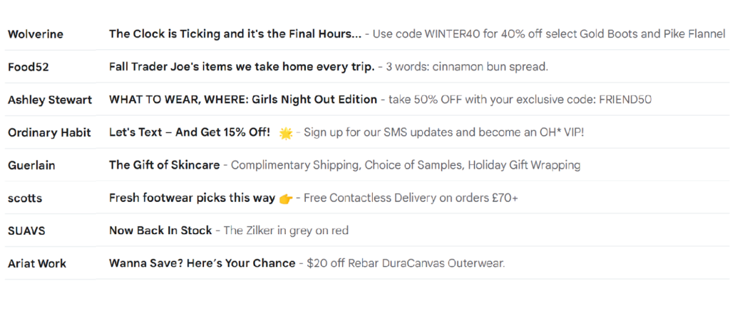
💡 That fact that subscribers may be scanning their inboxes for intel instead of opening each message emphasizes the importance of a subject line and preview text display that makes your email’s purpose clear.
If your inbox copy communicates that your message is about a webinar when it’s about a webinar plus several other resources, someone who doesn’t like webinars might never open the email to find these other options.
Use your preview text to add secondary information and get another chance to earn your subscriber’s attention.
What to write in an email preview text: Examples and best practices

Your preview text is part of a team that includes the other elements in your inbox display, your email’s body copy and design, your email CTAs and the destination pages where click-throughs land your subscribers.
Use your best copywriting techniques and follow these nine preview test best practices to create an inbox message that complements your other funnel assets and moves your subscriber toward conversion.
- Add dynamic content in your preview text to personalize your inbox message.
Using a person’s name in the subject line or preview text of your message may stop their inbox scan, giving you a chance to earn their continued attention. Plus, personalized messages appeal to today’s consumers who expect brands to know who they are and what they need.
Don’t limit yourself to only name dropping when creating customized messages. If your CRM has a field for it, you can (probably) integrate the data to personalize subscribers’ preview lines using dynamic email fields.
Check out these ideas:
Ready for spring break? – Find the best deals on flights from {{City}} and book now!
The results are in – {{data}} of {{industry}} professionals believe a recession is on the way
We’re saving this for you – {{name}}, that {{product}} you had your eye on is still available. But don’t wait too long to snap it up!
- Use numbers to convey certainty and create visual interest in your email subject line and preview text combinations.
Numbers and symbols such as dollar or percentage signs are visually distinctive. As such, these characters are another way to capture attention in the inbox. Assigning a number to an offer or proposal also adds a level of surety that a vague promise doesn’t.
Consider using “Save 45% on our top-selling T-shirts,” versus “Save big on our top-selling T-shirts.” Giving your subscribers the number allows them to decide if the savings are big and worth their attention.
Nordstrom goes for the one-two punch with numbers in the subject line and preview text of this promotional email.

“Just added: 1,000+ new markdowns – Up to 60% off styles for your fall closet. 🍂”
- Ask a question or suggest a partial idea in the preview section to stimulate engagement.
Engagement is critical to continued access to your subscribers inboxes. Use your inbox copy to encourage your subscribers to communicate with your brand or seek more answers from within (your email).
Here are a few examples of what I mean.
How do you like to enjoy your hot cocoa? – Tell us about your cocoa style inside
Millions of gallons of seawater could alleviate drought – Are experts close to a solution?
Whoa, kinda took you on an emotional journey there. Consider this a reminder to stay on-brand when you use your preview text to start a conversation or invite your subscribers to participate in one.
⚠️Not every subscriber will see your email preview text because of their individual inbox settings and provider. If you ask a question in your subject line, answer it in your preview text and in your email’s body.
You don’t have to use the exact same copy in both places. Just make sure you don’t leave your subscribers hanging.
- Use the email’s preview copy to tell your email recipients what’s in your email for them.
The inbox is your audition. Make your best case for why they should open your message.
In the example below, Licorice uses its email subject line and preview copy to tell subscribers about a tasty and tempting offer.

“Would you like a sample? – 6 tubes filled with glorious flavor”
MarketingProfs’ email offering a course on automation using the subject line and preview text to explain what subscribers will gain by signing up.
“How to Get Started With Marketing Automation – Learn how to choose the right marketing automation platforms and channels”
Here’s how Mad Rabbit Tattoo does it.
“Going somewhere? – Get TSA-friendly tattoo-care ✈”
The brand starts with a question then adds context with the copy and emoji in the message’s preview text.
- Offer a solution to an audience-specific pain point.
This is a granular approach to the ‘what’s in it for me’ strategy. In your subject line, hint at or directly reference an audience pain point. Then follow up with a promised solution in your preview text.
Try something like this:
Maintaining productivity while working from home can be a challenge – Cut out the interference with Blows noise-blocking headphones 🎧
Favorite foods out of stock? – Groceries R Us has the largest in-stock inventory of food items ready to ship now
(What? Me? No… those are purely hypothetical pain points. Really, I’m fine. It’s fine.)
- Use your preheader or preview copy to expand upon the theme started in your subject line.
I mentioned added character count as a benefit of using preview text, and it is. You can expand the points made in your subject line to engage your subscriber’s attention.
Skyscanner introduces this newsletter with the subject line, “The best affordable destinations for foodies right now.” Then adds enticing details with preview text that says, “From tacos to takoyaki, the most authentic flavors are often in the most unexpected places.”

Do you think they meant to trigger the FOMO with this one? 🤔
- Describe the type of content your email contains or is about.
This is a “what’s in it” rather than a “what’s in it for me?” approach to using your preview text. A “what’s in it” description might be a list of the topics subscribers will find inside or a summary of the email’s purpose.
You may recognize the format American Shipper employs in its subject line and preview text. The publisher uses its newsletter’s title to introduce the most recent edition, then names the top story. The email newsletter’s preview text describes additional stories that can be found inside.

“Week in Review 11.5 | Trucking costs should stifle Biden’s off-site container storage plan – Shipping line ONE posts blockbuster quarter but warns on future | Freighter frenzy…”
💡 Giving your email a recognizable name can enhance its visibility in the inbox. Look for more tips for creating newsletters that subscribers will look forward to receiving in the article, 29 Newsletter Examples and How They Activate Subscribers.
Good Eggs keeps its inbox appearance concise for its weekly newsletter but still communicates what’s inside with the following inbox set. “What to Cook This Week – Your Sunday shopping staples”
Each of the senders in the preview text examples below takes a different approach to promoting their webinar.

QSRweb opens its preview text with the copy, “[LIVE WEBINAR]: Learn how …”
BigID Team goes with sentence case and no brackets for its “Live Webinar: Avoid a Breach …” preview copy.
Brackets and capitalization are choices to put on your A/B testing to-do list. Can a simple formatting change increase your open rates?
- Show your brand’s personality with your preview text content.
Adding a touch of personality to your preview text gives you another way to show consumers what your brand is all about. You can use this space to share your brand’s values, sense of humor or essence.
Environmental design and architectural consulting firm Gensler isn’t shy about telling subscribers where it stands on workplace environments.
In the newsletter example below, the subject line, “Designing a Resilient Workplace,” is followed by “Workplaces should encourage well-being for people and the environment.”

Lazy Oaf isn’t shy about showing off its personality in the following email preview text example, either.
“SOMEBODY WAKE UP GREENDAY, SEPTEMBER HAS ENDED – Your wormhole of obscurity,” is the inbox combo for its October newsletter.
- Incorporate persuasive appeals in your email preview text.
Copywriting is replete with devices that nudge, hint, urge and convince. Use all the tools in your email copywriting toolkit to create an interesting inbox appeal. Positive appeals include social proof, authority, belonging, curiosity, and exclusivity. Employ urgency, scarcity, and fear of missing out with a light hand, and always make sure your email offers relief.
In your preview text, introduce a customer testimonial, reference a community project, or alert customers that “Supplies are running out!”
The examples of email preview text displayed in the image below illustrate the various ways retailers use inbox displays to urge readers to take action (and open their emails).
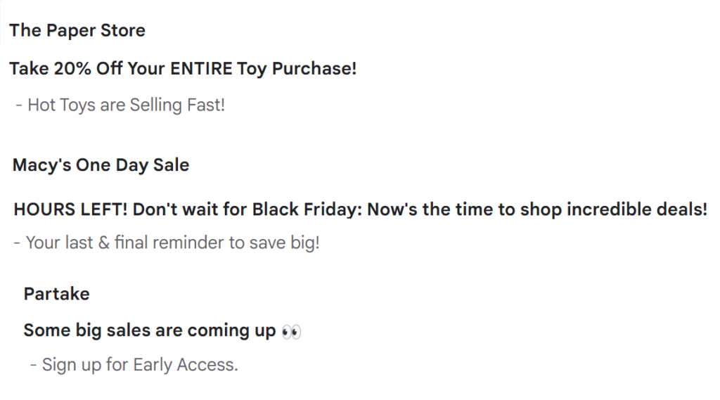
The Paper store’s preview text warns that “Hot Toys are Selling Fast!” Macy’s tells subscribers that it is “Your last & final reminder to save big!”
And, food retailer Parktake uses exclusivity as its nudge, encouraging subscribers to “Sign up for Early Access.” to the “big sales” it mentions in the subject line.
Using social proof as a persuader, beverage brand Free Rain shows off its reviews in an inbox introduction that promises the real deal.
“Meet the free Rain Fan Club. – Made with real ingredients that real people love.”
Enjoy Life Foods combines vulnerability and humor to appeal to consumers with its inbox copy. “And guys… we found out about TikTok!” reads the preview text.

Of course these are just a few of the tactics you can tap to encourage your subscribers to open your message and engage with your brand. Find your brand voice and use it in your preview texts to earn more opens for your email campaigns.
How long should the email preview text be?
The length of your email preview text should be guided by what you want to achieve and where your subscribers are most likely to view the emails you send.
Email service providers vary regarding if and how preview text is displayed. The device your subscribers use to view your emails and their personal setting also affect whether they will see a preview of your message.
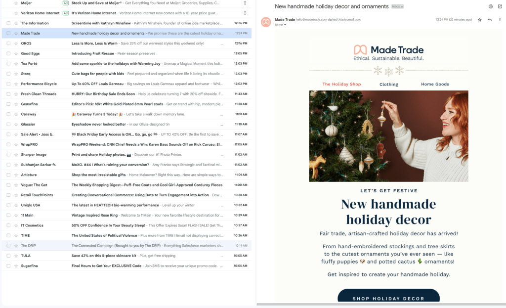
For example, below is a wide-screen desktop view of a Gmail inbox with preview text (snippets in Gmail parlance) enabled:

With the right-side reading pane enabled for the same Gmail inbox, the sender’s preview copy is crowded out.
Mobile email inboxes usually display an email’s subject line and preview text on two separate lines. But because of limited space, senders have fewer characters to get their point across.
In this example from a Gmail inbox on an Android device, only a few subject lines are short enough to avoid truncation and the space for preview text is similarly limited. ⤵️
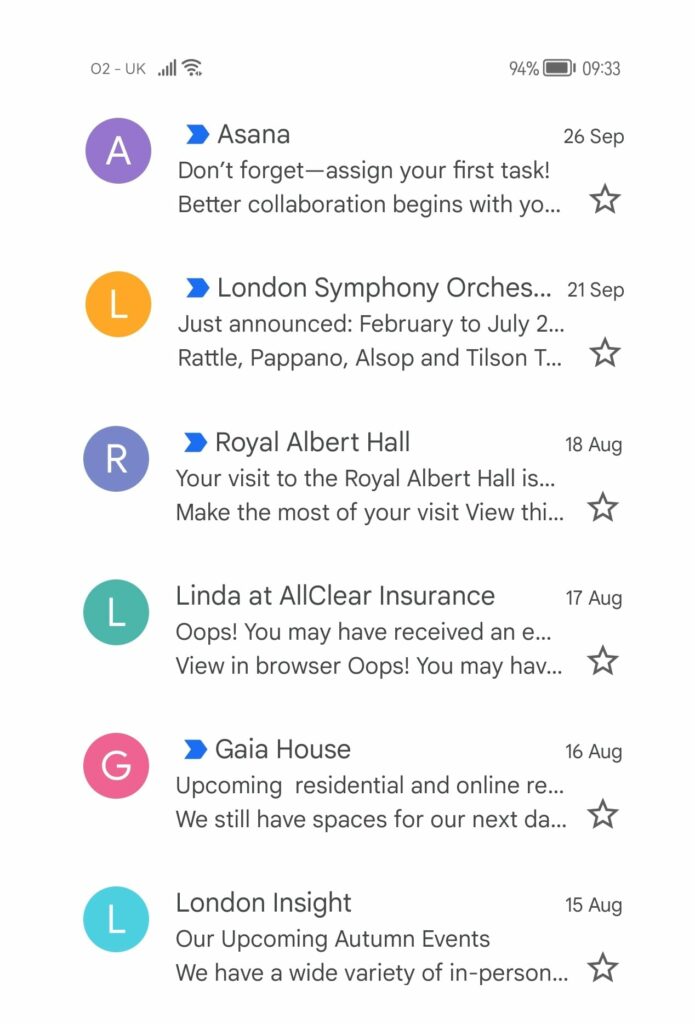
⚠️ While some email marketing platforms allow you to glimpse into the device and email client your subscribers are using to view your messages via their email analytics features, you won’t know which view your subscribers choose. That’s why your subject line still needs to stand alone as your representative in the inbox even when you use preview text.
Is there a character limit for email preview text?
Most email clients allow up to 256 characters in subject lines. However, we recommend aiming for 40 to 70 characters to ensure that your message is readable and displays well in mobile inboxes. If you decide to make your preview text greater than 40 characters, be sure to put the most important information at the front of the line.
💡According to UX consulting and research firm Baymard Institute, the optimal line length for readability in body text is 50 to 75 characters. Baymard’s research indicates that when viewing content online, people will avoid reading lines of text that are uncomfortably long.
Because character limits vary, you may encounter situations where an email client picks up extra text from your email’s body to fill out the preview section–leading to unwanted content such as your “view in browser” message or an image’s alt-text showing up in the inbox line.
I’ll share some techniques you can use to compensate for differing email client’s preview text display practices later in this article.
How to add preview text to your email templates

You don’t have to be proficient in HTML to use preview text effectively.
While email preview text must be added to your email’s HTML code to display properly, email marketing platforms do it for you. When using their WYSIWYG or other template builder tools, they’ll handle the coding for you.
If that is the case, you’ll usually see a field to enter preview text near the field where you enter your subject line or other details about your message.
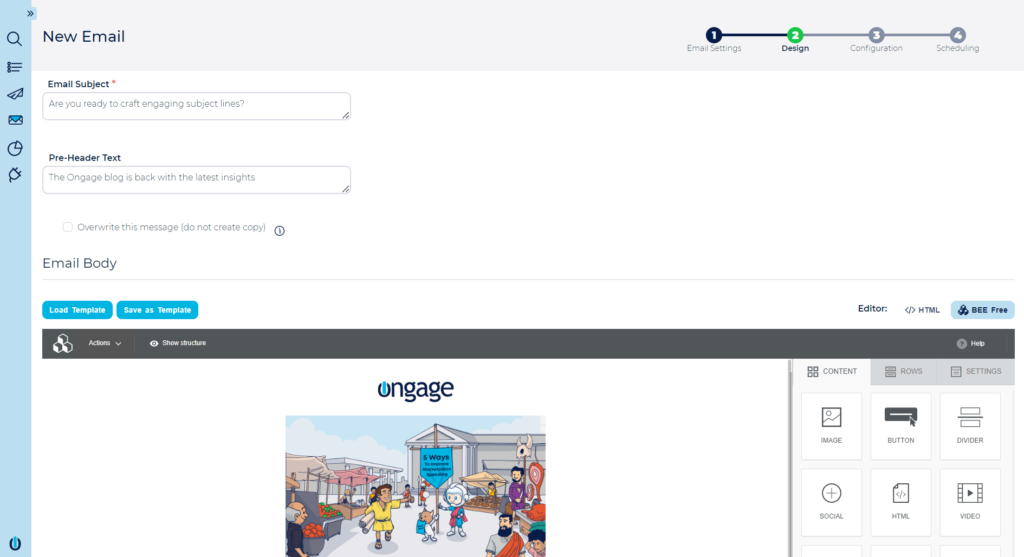
⚠️In this version of the BeeFree editor, the preview text is referred to as the preheader. When in doubt about where the text you enter in a field will ultimately appear in your message, use an email preview tool to check.
You can also designate or modify your email preview text using HTML code in your message template. Manually modifying your template’s HTML allows you to control when and how your copy is displayed.
How to add email preview text HTML code to your email templates manually
If you wish to bypass the template builder’s coding and designate your messages preview text in HTML, use the <div> element at the top of your template’s <body> code, just as you would to create preheader text.
Then define the style of the section using the “hidden” attribute to prevent your preview text from appearing in your email’s body copy or use the “display: none” attribute.
This code instructs the email client to grab the designated copy for the inbox preview section but not display it in the email’s body.
If you want your preview text to show as the preheader for your message, leave the hide instruction out of your code.
A simple version of the HTML code might look like the following:
<div style=”display: none; max-height: 0px; overflow: hidden;”> Your preview text here </div>This code snippet from a Riff Raff email includes a few more elements, but still gets the copy where it needs to go.
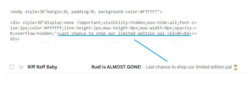
💡 What are those letters and numbers (=E2=8f=83) at the end of the preview copy in Riff Raff’s code? They represent the hourglass emoji. When inserting copy with emojis into your HTML code, use the emoji’s UTF-8 symbol.
How to format your preview text to deal with different email clients’ character limits
Here are four strategies to address the ugly inbox display problem.
✂ Go with the flow by letting your body copy display in your preview line
In the inbox preview field, the next available copy or HTML code will fill any space not used by your designated preview text.
One method of handling unused space is to allow that copy to fill the void. This isn’t ideal if your next available copy is alt-text or browser instructions. But it can work well if your email’s body text flows straight into your message.
Allowing the preview text section to fill with your email’s copy may make it appear more like a personal note. Whether that results in more opens for your brand is something worth adding to your A/B testing list.
Editorial publication, The Information, uses a go with the flow appearance in the inbox but doesn’t leave the copy to chance.
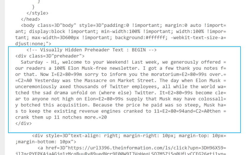
In the example below, what looks like an automatic selection taken from the first lines of the email’s message is actually a snippet of that message designated as preview text using HTML code.
The copy that would have appeared in the preview text absent this designation is the newsletter’s header text and a sponsorship disclosure.
Here’s how it all comes together:
1. The newsletter’s inbox preview text indicates the weekday followed by the first few lines of the body’s main message, “- Saturday – Hi, welcome to your weekend! Last week…”

2. The arrow in this image shows the location of the corresponding body copy.

3. The copy from the body message was entered in a <div> “preheader” block in the HTML code to force its appearance as preview text in the inbox display.
✂ Extend the character count of your email preview text display by repeating the copy
Hotjar uses the double copy strategy to fill its inbox display. The message’s HTML email preview text entry includes a repeat of the preview text.
Senders select this double tap method to fill gaps with copy instead of white space. Making your preview text longer by repeating it allows your brand to take up all its available inbox space without risking portions of a single long message being cut off.
Despite the dual insert, Hotjar’s full inbox display on a super wide screen extends to include content from the message’s body:
“Get inspired by our fave customer stories – Here’s what you can do with Hotjar Here’s what you can do with Hotjar View online version 🔥 Team looking at recordings image”

Cricut handles the issue of variable character limits and spacing by doubling up on its preview text and using an HTML email preview text spacing hack that I’ll describe next.

The email subject line preview text combo reads:
“ENDS TONIGHT: Up to 50% Off Cricut Bundles – Don’t Hit ⏰Snooze⏰ on These Cricut Bundles Don’t Hit ⏰Snooze⏰ on These Cricut Bundles”
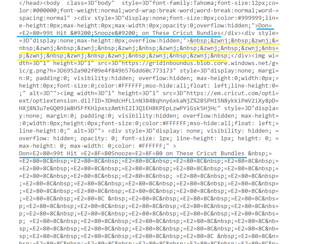
To achieve this effect, Cricut first enters its preview text as usual. Then it adds a few character strings to put some space between its preview text and what comes next. Then it repeats the preview text.
Following the second text set, this message includes a much longer block of spacing code to make sure its inbox line includes preview text only. (The image below is what the HTML code looks like for Cricut’s preview text designation.)
✂ Use the email preview text HTML spacing hack to keep preheader copy out of your inbox display
Adding blank spaces after your preview text can prevent preheader copy or miscellaneous code or content from your email message’s body from appearing in the message’s inbox display.
But adding blank spaces in HTML isn’t simply a matter of tapping the spacebar.
Remember that Riff Raff email inbox display I shared with you earlier that had a nice clean space after its preview text?

Riff Raff’s email team created the space behind the preview text by adding HTML code commonly referred to as the “preview text hack.” This code is a <div> set consisting of a string of seemingly nonsensical letters, numbers, and symbols that tell computers to make some room.
Here’s what it looks like:
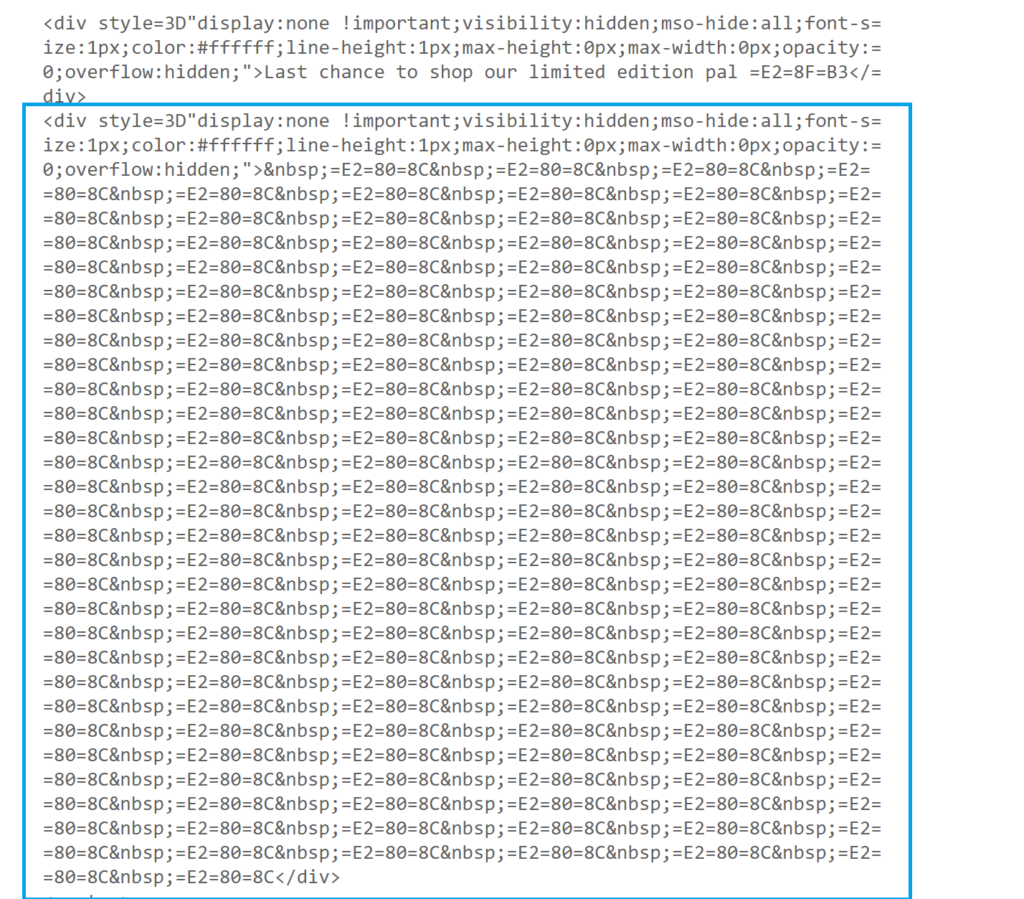
The code strings actually represent invisible characters or spaces. Adding a section of these invisible elements after your preview text copy fills any unused space in the inbox display field and prevents your preheader content from showing up where it isn’t wanted.
How many of these strings you’ll need to add to keep your preview text isolated will depend on how much space went unused.
When in doubt, it is better to overestimate your spacers than to underestimate. If you don’t add enough spacing strings, your preheader text may still appear after a gap in wide-screen inbox displays.
⚠️ Older preview text spacing hacks like the one pictured above may not work with every email client. Check the latest preview text code best practices to make sure you use one that does the trick.
✂ Mark the cutoff between your email preview text and preheader copy with special characters or emojis
If you don’t want to mess with adding invisible characters to your preview text, you can choose to go with the flow but add some visual cues to separate your preview text from what comes after. Use an emoji, vertical bar or other simple characters to mark the end of your preview text.
Here are some examples of email preview text displays that rely on visual cues to create distance:
Christopher S. Penn marks the end of his industry newsletter’s preview text with two colons (::).

IT Cosmetics employs an ellipse (…) to create a visual boundary between the inside and outside of its message.

Meanwhile, Kohl’s goes with the classic vertical bar (|) to separate its preview text from the preheader continuation.

Ending your preview text with an all caps discount code, the end date of your sale or other distinctive symbols can help your message stand out in the inbox and avoid reader confusion.
More email preview text tips and best practices to maximize your email opens and boost engagement
When preparing your preview text, use all your available tools and data to maximize your impact. Study your audience and list segments for clues as to what content will appeal to them.
Take a note from movie marketers’ playbook and create different text for various subscriber segments.
Use your CRM’s merge capabilities to add dynamic content to your preview text. This will further customize each subscriber’s experience and maximize the chances that they’ll open your message.
Also, stay attuned to changes in consumer behaviors and preferences and shift your strategy to take advantage of new opportunities. Monitor social media, track current events and review your proprietary data for insights into what topics are likely to resonate with your subscribers.
Once you’ve selected your copy, use a preview text tester to see what the latest algorithms think of your strategy.
Use a preview tool to view how your preview text (and other inbox elements) will look when displayed in each of the major email client inboxes and on different devices. Tap into the other design and testing tools from our Best Email Marketing Tools Stack to achieve maximum impact for your messages.
Then A/B test your preview text along with your other email elements, beginning with those campaigns that will have the most significant financial or growth impact on your business.
Continue to monitor your performance for opportunities to improve, too. Of course, for your subject line and preview text to be a real blockbuster, you’ll need to combine them with an irresistible call-to-action that convinces subscribers to take the next step on their buyer’s journey. Check out, Email Call-To-Action Examples: A Guide to the Click Now, for tips on writing the perfect ending to your email messages.

