It’s a long-standing debate among sales professionals, communications strategists and email marketers: Should you format your emails to subscribers and customers using plain text or hypertext markup language (HTML)? Everyone has an opinion on the topic, and everyone’s opinion is backed by data. What’s the best format for your email campaign? Decide after you read this article.
There’s plenty of information to help email marketers choose whether they want to use plain text or HTML formats for their email campaigns. So why is choosing between them still an issue? Because which data matters and what it means is still up for debate.
The situation reminds me of the fierce debates among sports fans about which players are best. Sure, some people pick a favorite because they like the player’s personality or because that particular athlete came from their home city. But for serious sports fans, it’s all about the data. They choose their favorites because of what the athlete has achieved as an individual and what they can contribute to the fan’s team.
These fans are looking at the data and choosing the pros they think are winners. Yet if you ask your friends who their favorite athlete is, you’ll discover quickly that the same set of facts can lead to wildly different conclusions! Maybe one of your friends values teamwork and supporting plays while another looks at a player’s individual points per game. Everyone has a favorite, and every favorite has a reason.
Now ask a group of email marketers which format they like best and why. Wait. Don’t do that. We don’t have enough time for that discussion. Let’s just move forward and have our own discussion about the differences between plain text and HTML formats for emails and how you can form your own opinion about which one is right for your email campaigns.
What’s the difference between plain text and HTML in email?
That’s like asking what’s the difference between a center back and a midfielder. Or… maybe not. Anyway, there are big differences between plain text and HTML formatting for emails. These differences affect not only how your messages appear but can also impact their deliverability and accessibility.
But before we tackle those details, let me start by explaining what plain text and HTML email formats are.
What is plain text email formatting?

You may be thinking, “Well, that seems pretty obvious,” a plain text email just has text (that’s plain). Okay. You’re right. But most of us have become so accustomed to the convenience of HTML and Rich Text formats, that even though you know what plain text means, you may not realize just how plain it is.
I mean, it’s really… plain. As in no formatting. None.
Plain text format is an encoding system for email text that uses one of several basic character sets such as UTF-8 or US-ASCII. Copy written in plain text format is accompanied by no instructions regarding typeface selection, fonts or other details.
American Standard Code for Information Interchange (ASCII) is OG character sets from the early days of digital communication. It didn’t come with bold or italic, colors or other design options to make it compatible with the maximum number of devices and systems.
Unicode Transformation Format – 8 bits (UTF-8) is a more modern text encoding system that translates between Unicode and binary. UTF-8 is able to encode more character types than ASCII and creates smaller files because of the way spaces are represented in the system. Because US-ASCII was the initial default encoding format, you must designate UTF-8 in the charset parameter of your email’s header if you want to use this plain text format.
What email users see when you send a plain text email
When you type your text to create a plain text email, you may see it displayed in your email pane in your inbox’s default font. That could be 8-point Times New Roman or 12-point Courier.
With plain text emails, what you see is what you get–and all you get.
But what you see is not what your recipient does.
Their chosen or default viewing preferences govern how your text appears in their reading pane. It will be plain text with no extra formatting but their display font may be different from yours.
All you control in a plain text email is the copy, and it’s spacing.
In addition to the lack of formatting options, plain text really is just “text.” Your copy may include your character set’s letters, numbers and other symbols but you won’t be able to add images or hyperlinks to your message. These features require HTML to execute.
Here, I need to note that you probably haven’t entered text to create a plain text email for a very long time, if ever. Most email clients’ editors support HTML formatting. To create a plain text or rich text email (a format based on email HTML, but with even fewer features), you would have to select that formatting option in your email editor.
Viewing emails in plain text is no slam dunk either. To design and preview email templates in plain text, you’ll need to find an editor that supports the format.
Not every email client allows you to choose plain text as your default viewing option, and you have to select plain text to create emails in this format in most email inbox editors.
For example, Gmail users can’t set their default view to plain text. If you want to see what an HTML email looks like sans code, you have to choose the “show original” option that displays the header content, transfer records and the message’s plain text and HTML versions (assuming the sender included a plain text version). It’s not pretty.
If you are using Gmail and want a no-code way to see what your favorite brands’ or your biggest competitors’ emails look like in plain text. I found a solution. Select the email, then select the forward option. Once you have the message in your editing pane, tap the kebab menu and choose “Plain text mode.” (This is the menu you’ll need to access to build an original plain text message as well.)
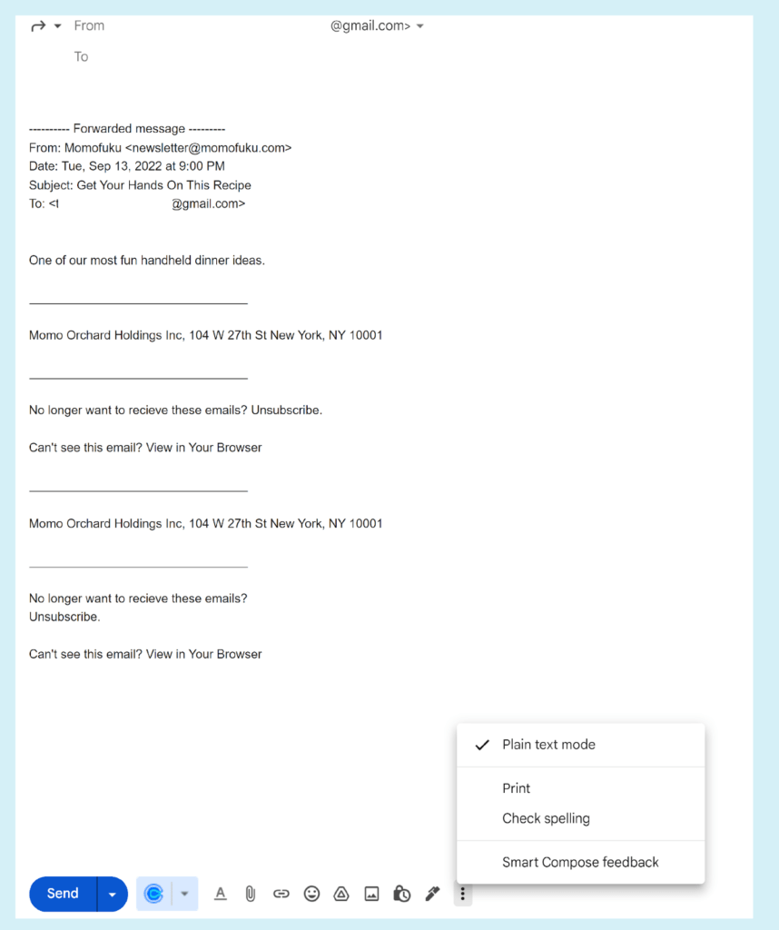
Voilà! A plain text view of the message.
The image below is what the HTML version of the same message from food purveyor Momofuku looks like in my inbox.
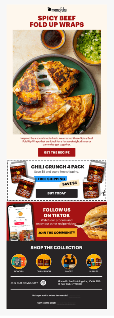
Whoa! Big difference. If you’re planning to show off your gorgeous products in an email, plain text might not be the best choice.
The example above shows you what a non-plain text email might look like when converted.
But an email that was plain text from the start should look much better because it will be built to look good in that format. In the example above, the plain text version of the email doesn’t include any links!
Alas, I could not find a true plain text email in the wild. So, I recreated one of Haim’s emails in plain text so you could get an idea of the results. Below are images of the original HTML message and a version designed for plain text viewing.
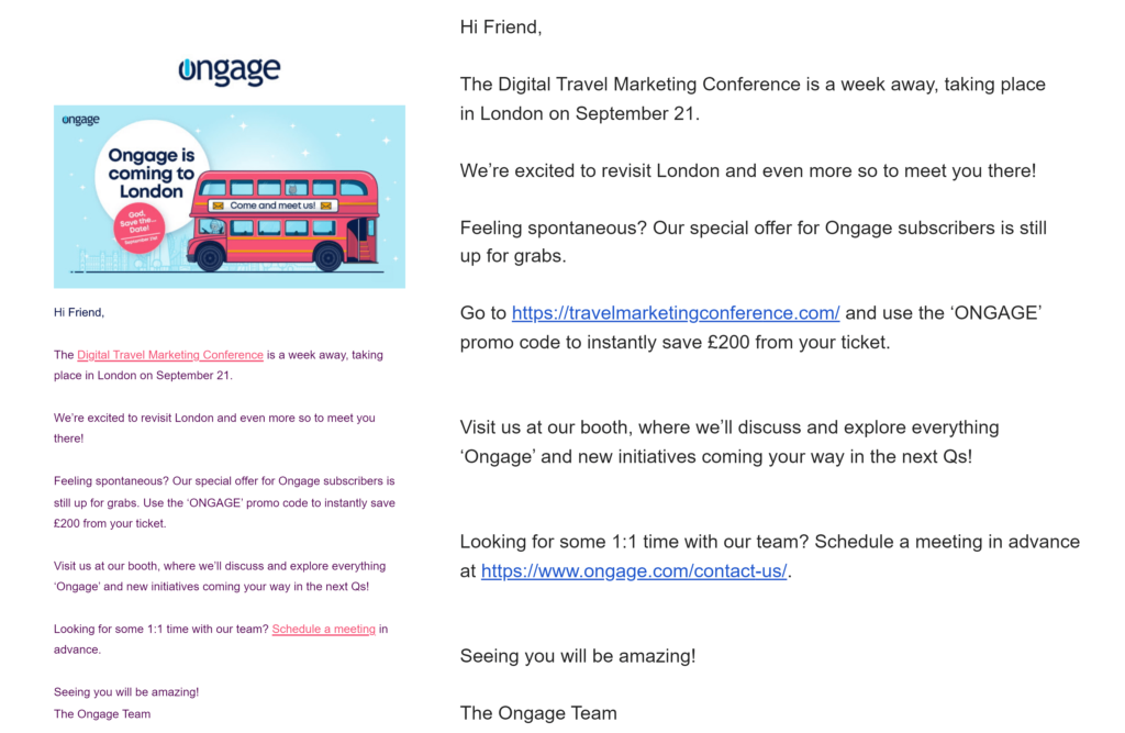
As you can see, I had to sacrifice the branded header and hero image and our signature purple and pink color scheme. Plus, the plain text email isn’t personalized, and of course, no hyperlinks.
Even though the plain text version doesn’t look too bad, you may still be wondering, why would anyone still use plain text for emails?
Well, I’m going to tell you why.
Plain text vs HTML emails: Why use plain text emails when sending messages on behalf of your brand

Oh, alright. I’ll just go ahead and admit it, plain text is definitely the underdog in this battle of the email formats. But there are some use cases for the use of the plain text email format in branded messaging.
Take a look.
6 reasons to send plain text email campaigns
- Accessibility. Most email clients support HTML and many email users accept HTML-formatted email messages. But most is not all. Plain text is universally accepted by all email clients and every user can receive plain text emails (even if they’d rather get their emails formatted in HTML). In the article, How Engagement Boosts Email Deliverability, we detail how formatting choices such as background and font colors, as well as other features affect the accessibility (and engage-ability) of your messages.
- Cross-device compatibility. You might think, it’s 2023! Plain text was for when we didn’t have better options. We need to embrace modern tools like HTML and enjoy their benefits. But the modern age has brought us a whole new set of devices that may not support HTML. Smart assistants, wearables and other new members of the IoT revolution may display messages in plain text. Plain text emails take up a lot less room than heavy HTML files.
- Corporate IT gatekeepers. HTML allows email designers to choose the perfect typeface, select on-brand colors, employ bold, italics and different typefaces and font sizes to create visual hierarchies, embed tracking pixels… the list goes on.
Cybersecurity specialists hate HTML for these same reasons. Malicious links can be camouflage against a color–matching background. Inappropriate images can slip onto their corporate servers. HTML code can facilitate scammers’ phishing attempts and malware attacks. Nice clean plain text puts everything a sender is trying to bring inside the corporate fortress in plain view.
Sending a plain text version can help your emails get past corporate firewalls and email service providers’ spam filters.
- Efficiency. Creating a plain text email is as simple as typing, hitting the spacebar to create paragraphs and, maybe, adding a few dashes to serve as bullet points. There’s nothing more “what you see is what you get” than a plain text editor.
Brands that use plain text emails don’t have to spend time creating graphics, inspecting hyperlinks to make sure they go where they are supposed to or worrying about what font size or color to choose.
- Readability. Eh. This one can go either way, really. For the visually impaired, including those who are color blind, an HTML that relies heavily on colors, various typefaces and images to convey its message may not communicate well at all. Meanwhile, a simple, well laid out plain text message removes all the visual noise and lets the copy connect.
A colorful image-heavy email template can be an excellent vehicle for displaying your brand’s featured products but still lack in the readability department which will limit your ability to communicate with your audience.
- Perception and engagement. I love seeing well-designed HTML emails with attractive graphics. I admire a visually compelling product presentation. But carefully orchestrated, professional looking graphics can sometimes make a brand seem inauthentic and distant. It reminds people that an email’s sender is an enterprise with vast resources.
A bare bones plain text email on the other hand can convey a sense of closeness and authenticity. This, in turn, may improve your engagement rates among subscribers who want to feel like they’re communicating with a real person on the other side.
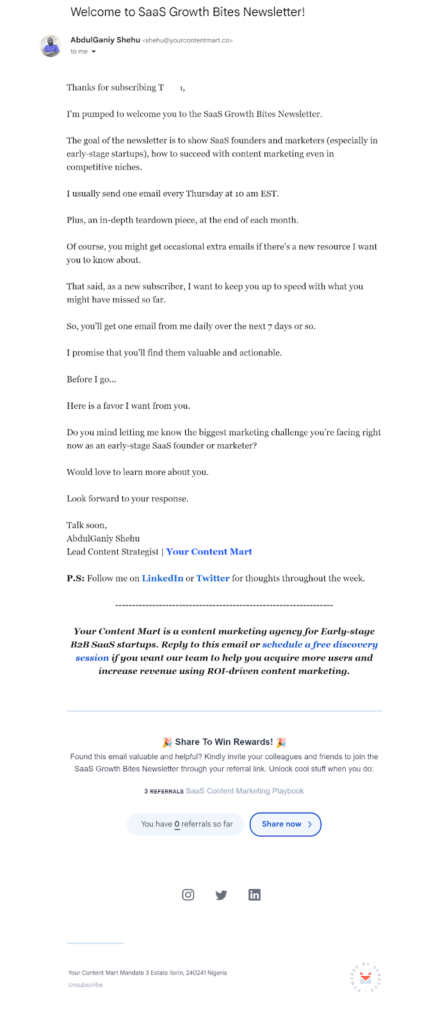
As an example of simplicity to convey authenticity, the email from AbdulGainy Shehu of Content Mart, pictured below isn’t formatted in plain text. But the author has chosen to limit their use of HTML features to give it a more personal and intimate feel.
Many email marketers choose this compromise of almost-but-not-quite plain text using HTML to craft their messages.
Is it always true that simple text messages boost engagement by appearing more authentic?
No way!
There are studies indicating that plain text messages get more engagement and other studies that say the opposite. You know what that means for you, right? Get the data. Collect subscriber preferences and feedback and do some A/B testing to find out how your email recipients respond to each format.
Creating a plain text email doesn’t mean you won’t need to apply design skills to craft a compelling message. If the circumstances of your campaign make plain text the best choice, use the following best practices to optimize your subscribers’ email experience.
Tips for crafting plain text emails that resonate with your audience
- Use capitalization, plain text symbols and white space to build a visual hierarchy.
In HTML, you can guide your readers’ eyes using both graphics and font selections. For example, you can create headings in a bold, thick font and make your CTA a different color. In plain text format, you still need to guide your readers with using visual cues but your choice of elements is limited.
Some ways to distinguish parts of your copy include:
- Using all caps or title case in your headers
- Adding space between lines and paragraphs to indicate a new section or topic.
- Using a row of dashes to separate different sections of your email.
- Create bullet lists using numbers, asterisks, dashes or other symbols available in the plain text character set you’ve chosen.
⚠️Be cautious when creating lines using dashes or underline characters and when attempting to create content blocks with forced line returns. The spacing of these elements will appear different in your recipients’ depending on their plain text formatting choices. (See example, below.)
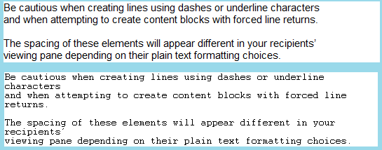
This issue may also arise if you attempt to create large-scale ASCII emoticons. Remember those? They started out as simple expressions such as 😀 or 😉. But some creations can get pretty fantastic.
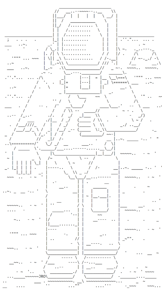
Yeah, you probably don’t want to try to add an ASCII astronaut to your email messages.
- Prepare a plain text version for inclusion in your HTML packet.
Usually, your email service provider will use the Multipurpose Internet Mail Extensions protocol to add a plain text version of your message to your HTML campaign before sending it. This ensures that some version of your message reaches those inboxes that block HTML.
When your message arrives, it will include both versions and the receiving email client will choose what their subscriber sees. (This dual-version package is what allowed me to view the plain text versions of HTML messages when preparing this article.)
The problem with relying on this auto-generated plain text version is that it represents only the text your ESP could identify in your message and the spacing represents the application’s best guess as to what will look good. This automated version also won’t include your links.
Here’s an example of an HTML email from GoPro alongside the auto-generated plain text version.
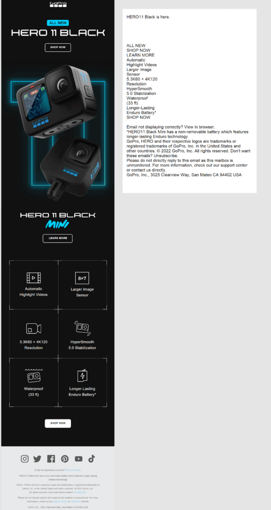
The words are there… but the message isn’t being communicated.
Now, here’s what a plain text version of a similar message (for my imaginary video hardware equipment company) might look like:
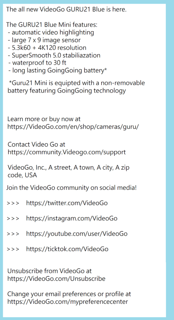
You can (and should) replace the text section in your email’s code to ensure the final appearance is appealing. In the plain text example above, I used dashes (-) and the greater than symbol (>) to create bullet lists and provide a visual hierarchy in my plain text version since I can’t rely on the graphics to guide readers through the content.
I also added raw URLs and adjusted the copy to introduce those links. Don’t forget to include your standard email footer links, too.
- Limit your link count.
Too many long URLs in your plain text email can overwhelm your copy. Visually, the whole effect becomes messy and confusing. Plus, if your subscribers are viewing your message on a small screen, tapping the right link in a stack can be a challenge. Maintain a crisp appearance and positive UX by adding only your most necessary links and putting some physical space between each one.
- Use typography to focus attention on your CTA.
Use your ‘symbols and characters’ bag of tricks to draw attention to your CTA. Type the CTA in all caps, surround it with ***asterisks*** or >>>arrows<<< and try other plain text formatting methods to make sure it stands out.
- Make your copy the star of the show.
I mean, it’s all you’ve got, right? Despite all the visual elements that HTML brings to email marketing, the goal of your campaigns is communication. Put all your best copywriting methods to work to create an authentic, value-adding message that makes your subscribers eager to take the next step in their buyer’s journey.
So now you know what plain text emails are, when to use them and how to make them amazing. Now, let me introduce you to the rival format, HTML.
What is HTML email formatting?
HTML is the Cristiano Ronaldo of email formats. It’s got it all: power, flexibility, style.
HTML for email is a truncated version of the Hypertext Markup Language used for website design. Supported by most email clients and email template editors, HTML for email allows creators to add code to their email designs that designate and alter the appearance of the message’s typefaces (fonts), add images or other graphics, and embed hyperlinks, among other functions.
The HTML email below from Dior delivers stunning visual impact with graphic detailing color-coordinated with the featured product images. I can feel the cold.

HTML coded emails can be highly stylized, including multiple layers of images and graphics, hyperlinks, colorful CTA copy or buttons and animated GIFs. But email marketers may also use a light touch when applying code to their emails, creating hybrid format messages that look like text but retain the benefits of HTML.
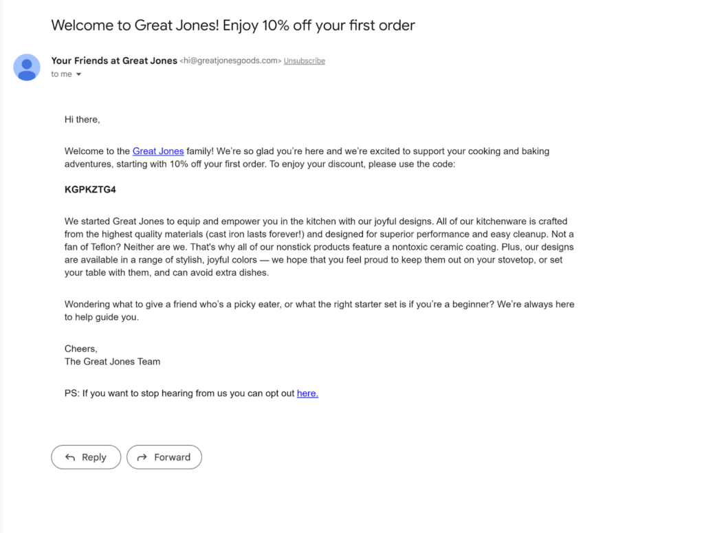
This email pictured above from cookware company Great Jones may look like it is plain text, but the hyperlinks and bold typeface tell us that the message is encoded in HTML.
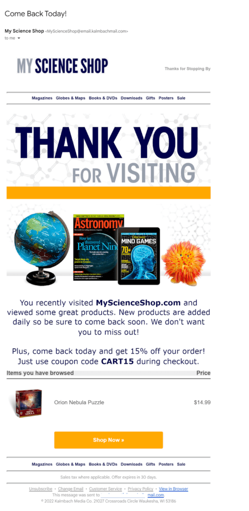
The capability to incorporate dynamic content like the content of my shopping cart that My Science Shop included in this recovery message is a key advantage HTML has over plain text for email marketing applications. Being able to create attention-grabbing and clickable CTAs doesn’t hurt either.
Is it difficult to create HTML emails?
HTML formatting affords email creators as much or as little complexity as they can handle.
When creating emails using your inbox editing pane, HTML is usually the default setting.
Using these editors, it’s easy to change your typeface and its color or style. Elements such as bullet points and alignment are just a click away. Power users can customize nearly every part of their email, creating responsive designs with animated images and embedding dynamic or interactive content.
Stand-alone email template creation and editing tools may offer you easy-to-use drag-and-drop tools to make adding HTML functions to your emails simple or allow you to build your HTML code from scratch. Most WYSIWYG editors will automatically convert your template to an HTML file for ease of transferability.
But wait, what was that I mentioned earlier about HTML for email being a truncated version of HTML?
Isn’t all HTML the same?
Of course not. What would be the fun in that? We email marketers need something to keep up on our toes, right?
Difference between email HTML and web HTML
Well, first, website builders are much better at playing together nicely than email clients. The World Wide Web Consortium (W3C) has defined a set of standards for HTML use on the web and all the browsers use them–because no browser wants to be the one that doesn’t accurately display websites, explains Pat Kelly at iMedia.
Email clients haven’t quite got it together yet. Nearly every email client supports HTML but each of them supports it in their own way. Each email client still uses its own rendering engine to translate and display incoming encoded messages.
Although most inbox providers support the basics such as font formatting and hyperlinks, different inbox providers support different elements of HTML and CSS code. The non-use of some web HTML options in email HTML can be linked directly to specific email clients that don’t support the feature (looking at you, Outlook).
Speaking of CSS, a website’s Cascading Style Sheets code is usually stored externally in one big file. The “this is our style” file. In email, referring to an outside file isn’t a great plan. For email CSS instructions are usually placed inline. Not all email clients support embedded CSS, and some filters may strip CSS code from incoming emails.
Another huge difference between web HTML and email HTML is that for years, email designers had to use the HTML <table> element to ensure that their email content was positioned as planned. In email HTML, floats and grids are right out and results aren’t always consistent when relying on CSS. Table attributes include alignment, background color, border and cell padding options that help you organize the parts of your email.
More recently, some email clients have begun offering better support for CSS and many (but not all) support the <div> tag.
The website, CanIEmail, tracks where email clients stand on various features including support for specific HTML and CSS codes. (See a screenshot of the features index below.)
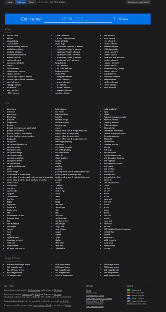
Email HTML doesn’t enable you to use JavaScript in your messages (like you can on a website). You can use JavaScript if you create your messages using Accelerated Mobile Pages (AMP) for email. But… let’s not go there. Like other fun tools, including media queries, not every email client supports this one.
Email clients can’t even agree on how to describe colors in HTML. On a website, you can use RGB (red, green, blue) and RGBA (red, green, blue, alpha) values, 3-digit, or 6-digit hex codes, HSL (hue, saturation, lightness) or HSLA (hue, saturation, lightness, alpha) values to designate color using HTML code. In email HTML, stick with 6-digit hex if you want to make sure every email client gets your color choices correct.
Also, when coding for emails, you can select a variety of fonts. But you should always include an acceptable email-safe font in your font stack. The list of safe fonts for emails is slightly shorter than the one for websites. Similarly, when you designate a background for your website using HTML, it shows up on your website. In email, your background might not make the email client’s cut, so you need to designate a backup background color.
Finally, different email clients treat HTML code to fetch images, GIFs or execute videos differently (or just plain block them). So, again, add code for backups.
How to add web page, email and phone links to your HTML emails and email signatures
Most inbox email and template editors make adding links to an HTML email easy. You just look around for the link symbol 🔗 and click or use a keyboard shortcut to open the link form.
If you want to add your link manually (or need to edit a link in your email’s HTML code) use the <a> tag with the href attribute. Along with the link, you can add other information to this tag that directs how your link is displayed in the email.
The HTML email code we used to add a link to our article about email blocklists to a recent Ongage newsletter looked like this:
<a href=3D"https://track.ong-mail.com/?xtl=3D153genpw30ibv3mtpjdv4suztav1dy=
x2gmulmddwsathmlr0s1u7j0ewgpponsn7ck54l8sw94eqp2cxwfha5jt267fculpwozx3ttexd=
eha2k0wo7a1qpmf928rdb4m7yu24vi4d3y4pizs4x94nx8qtbhkw3rdmwfvennm7jkg1gutxpxn=
i4msgrt4exsviy3or57uue6bam8j3dqi2dglctpjx76z017upslvfrbipabco9i9tz353c0lutj=
zsdteanuu7rklv3mre0alvv4zf4mbzm6hyy2j6onppo1ar14pn&eih=3D3adcm796hppxqnr77b=
vic36cnazi70a2ypcy2" target=3D"_blank" style=3D"text-decoration: underline;=
 color: #f65275;" rel=3D"noopener" data-id=3D"4451740101"><span style=3D"fo=
nt-size:16px;">This is a must-read for any email marketer.</span></a>
Here’s what the link looked like to our subscribers:

Use similar code to add clickable email addresses, phone numbers or other content to the body of your email or in your email signature.
Here’s the HTML code from a recent email from Haim inviting subscribers to contact Roy or Haim that includes the <a> tag and the mailto: attribute.
<a href=3D"mailto:haim.pekel@ongage.com,roy=
.zelinger@ongage.com" target=3D"_blank" title=3D"haim.pekel@ongage.com,roy.=
zelinger@ongage.com" style=3D"text-decoration: underline; color: #f65275;" =rel=3D"noopener" data-id=3D"4452044039">Contact Roy & me now</a>
And the display:

To create a click to call link, replace your “mailto” or “href” attribute with “tel:” followed by a phone number, or use “sms:” to enable subscribers to click to text.
You may be able to use these methods in your email signature editor to add linked phone numbers, email addresses or other HTML supported content as well.
However, there are several signature block builders that enable you to create your code easier and with more options such as adding social media icons. Some even enable you to add small videos to your email’s signature block.
Can you change a plain text email template into a HTML one?
Although, usually the conversion path is reversed, you can convert a plain text email to an HTML one by using the tools in their email editor. In Gmail, for example, you can create your email in plain text by selecting this option from the “three dot” menu in your editing pane. If you want to reverse your decision, you simply uncheck “plain text mode.”
There is a catch though, if you’ve entered full URLs in your plain text version. You’ll need to edit the new HTML version of your email to convert those raw URLs to clickable text or images. Likewise, you’ll need to add any font, formatting or other HTML-only details to the code of your converted email.
⚠️ While most email template editors enable senders to select between plain text, rich text and HTML formats, changes made to one format may not be automatically transferred to other formats. Be sure to check each format type for accuracy after you’ve finished preparing your templates.
HTML vs plain text emails: Why send your marketing messages in HTML format
I’ve already hinted at many of the reasons why HTML formatting is usually the best choice for email marketing campaigns. You should use some of HTML formatting features like hyperlinking and bold fonts in your mostly-text emails unless there’s a compelling reason to use plain text. Why? Because of all the things you can do with a little code by your side.
8 reasons to send HTML email campaigns
- Branding and visual impact. Your brand is more than just a name. The typefaces and font formats, colors, design and images that you include in your emails conveys your brand’s personality and helps email recipients identify your company.
That’s one of the reasons we recommend implementing Brand Indicators for Message Identification (BIMI) for your sending addresses to help you stand out in the inbox. Without HTML, your messages can convey your brand identity only through words.
- Interest and engagement. There have been studies throughout the years indicating people respond favorably to plain text. Simple messages without lots of bright colors, distracting graphics and other sale-focused elements do have a distinctive appeal. But an attractive product image, especially an animated one, is pretty sweet, too.
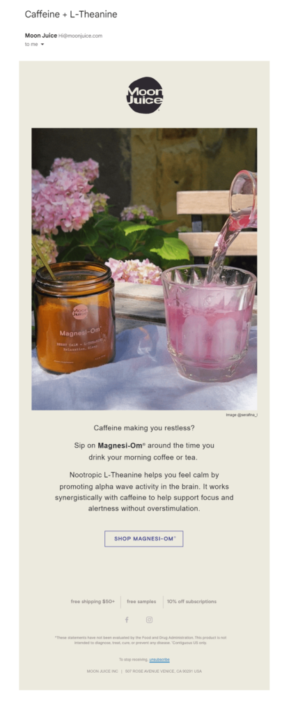
Moon Juice keeps it relatively simple in this promotional email featuring its Magnesi-Om product.
- Non-marketing emails that require customization. Transactional messages and customer service and support emails are an obvious candidate for plain text. It is important that these messages make it past spam filters and reach their destinations and their official tone makes a text heavy approach appropriate.
Without HTML though, your ability to insert specific information in these messages automatically is severely limited. HTML code enables you to add a dynamic block that displays personalized information such as an image of a delivered item. HTML is also necessary if you want to personalize automated responses to customer service requests to convey a more human-to-human tone.
- Personalization and dynamic content. Of course, personalization isn’t just for transactional messages. Customizing your email marketing communications at scale is the core of a successful email marketing program. From calling your subscribers by name to embedding personalized product recommendations, dynamic content is where it’s at and to get there you need HTML.
- Interactivity. You can add some amazing interactive elements to your HTML encoded emails. Real-time countdown clocks, product recommendation quizzes, feedback polls and customer surveys. These innovative and engaging elements use colorful graphics and pull resources from outside your email to operate all using HTML.
Entice subscribers to play along with games they can play right in their inbox like the scratch off feature in the message below. (Source: Really Good Emails)
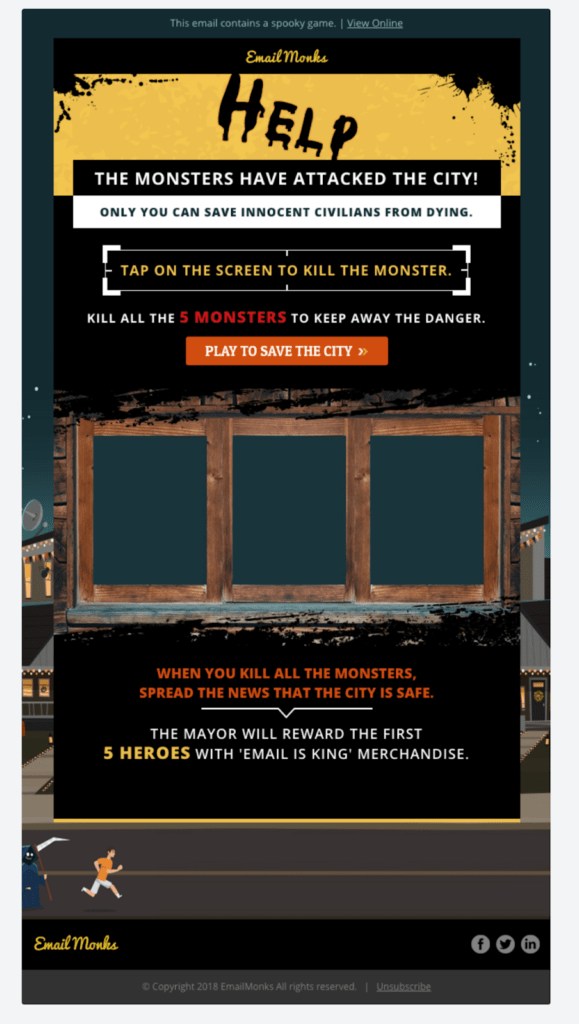
Brands can tap a growing number of providers to create customized, interactive elements like the ones below that can be embedded into emails using HTML.

- Better looking links. Yeah, I know, I’ve mentioned hyperlinks a LOT in this article. But raw URLs are ugly, especially when you’ve attached some 100-character UTM to the link. And shortening your links looks sketchy.
While some spam filters may not trust a nice, neat hyperlink, most consumers are used to seeing them and don’t object to clicking on a hyperlink in your message if they trust you as a sender.
- Better looking and more varieties of CTA. Technically, you can wrap any of your links in an attractive, colorful background or turn it into a button. But CTAs are the links you want to draw attention to, and HTML lets you do that.
Big buttons, little buttons, buttons in different shapes or text-only hyperlinks in bright, bold colors. However you want to make your CTA standout, you have choices when you use HTML.
In the image below, an email from Milk Bar explains how it delivers cakes without crushing them in this engaging email that includes both button and text click-throughs and CTAs using the brand’s pick and black color palette.

- Ability to track metrics. Can you believe I saved this one until last? We track subscriber engagement with our emails using pixels and plain text emails don’t have any. That’s a pretty good reason to use HTML even if you don’t want to use any other HTML feature.
Sure, Apple’s Mail Privacy Protection has skewed open rates for some subscriber segments. But I still want to get the data I can about whether my messages are being opened. How about you?
Tips for crafting HTML emails that will delight subscribers and keep them clicking

Most of the advice you’ll find online for building email templates for your transactional or marketing message assumes that you’re going to create an HTML formatted message. The guidance in our other blogs articles does, too.
Here’s a quick rundown of our top HTML formatting tips to give you a jumpstart:
- Remember to always include both plain text and HTML encoded versions in your email messages and don’t rely on auto-generation to create your plain text version. See the plain text tips above for details and don’t forget to designate your character set if you don’t want to use US-ASCII for your plain text source.
- Ask your subscribers what they want.
Include a question on your email subscription sign-up form or in your preference center that allows subscribers to indicate whether they want to receive HTML or plain text messages from your brand.
- Design your emails for readability and scannability.
Regardless of format, make it easy for your subscribers to scan your email and decide whether they’re interested in reading more. Use color, font selections and graphics to designate different sections of your message and help subscribers “get the picture” fast.
- Don’t include deceptive or hidden elements in your message.
Spam filters are on the lookout for scammers and subscribers don’t want to feel misled. So don’t use HTML code to hide images or text under other elements or with color-on-color content.
Including hyperlinks is okay. However, make sure you aren’t using link shorteners, forwarding tools or other methods that obscure the link’s true destination.
- Build mobile-first email templates that are responsive and incorporate UX for small screens. Many of your subscribers will view your messages on the go using their mobile device. For small screens, single-column designs are easier to navigate.
- Make sure your content is accessible. Include alt-text for images that aren’t merely decorative and include the text of any sales or other critical information that you’ve displayed as an image.
- Perform quality assurance checks at multiple stages. Preview your templates across devices and email clients. Double-check all of your links. Including your links for fetching images, dynamic content and interactive elements as well. Review your header and footer content to make sure it is accurate and represents your brand’s current style and policies.
- Watch your metrics. Deliverability metrics can be an early warning sign that something isn’t quite right with your HTML emails. Keep an eye out for sudden changes in your bounce rates or spam complaints. Evaluate your performance and engagement metrics to supplement your preference center data about your subscribers’ format preferences. Sometimes people don’t know what they like until they actually see it.
You know what to do and how to do it. All that’s left is to decide which format is best for your email campaign.
Factors to consider when choosing between plain text and HTML email formats
Just like the best player for a particular team or event may change, so can the best choice of an email format. Sometimes, the best strategy is to have both players, er, formats, at the ready. Think of it like assembling an All-Star or Olympic team. You get to select from the best of the best, even if they are rivals.
Like a good coach, use what you know about the pros and cons in the context of your email campaign’s specific characteristics to decide which email format is best for each campaign.
Start by reviewing the message’s purpose. Is it a transactional email or a promotional one?
Next, narrow your campaign’s purpose down to its primary objectives and how you plan to achieve them. Are you trying to gain recipients’ trust by making an intimate connection? Is the email intended to surprise and delight recipients and move them toward conversion? What emotions do you want the message to evoke?
Also evaluate the target audience for your campaign. Does your data indicate differing engagement levels between previously sent plain text and HTML formatted messages?
Analyze different audience segments’ behavioral and psychographic characteristics as well as more practical factors.
While your audience might prefer an HTML message with interactive elements, if the majority are locked behind hyper-vigilant corporate firewalls they may not get your HTML email–even if you try to send it.
Is there an expectation among members of your industry that favor one format over the other? Maybe you want to stick with what’s expected of you. Or maybe… you want to break out from the mold.
Finally, look at your deliverability metrics. If you are experiencing global deliverability problems or notice signs of trouble such as bounce backs or throttling from a single email client, you might give low-code HTML or plain text emails a try to see if it helps your rates recover.
Now, I have one last piece of advice for you.
How spectacular your email message looks or how compelling its copy is doesn’t matter if no one ever sees it. You know what that means, right? It’s all about the inbox.
If you don’t draw subscribers’ attention and persuade them to open your emails, your message can’t score.
Check out the tactics and strategies in The Complete Guide for Fantastic Email Subject Lines to develop a game plan for your email campaigns that’s sure to put your team on the winner’s podium.

