Email newsletters connect, inform and convert your subscribers to so much more–but first, they have to get and keep your subscribers’ attention. This article will explore the best strategies and tactics for maximizing your newsletters’ engagement and conversions. As always, this is bookmarking material!
As a marketing channel, few options match the good’ol email newsletter in terms of efficiency, reach, and effectiveness. Email newsletters allow businesses to communicate with large audiences, keeping those audiences engaged and informed, which drives business decisions because you’re top of mind.
Nearly every brand with an email marketing program employs email newsletters to stay in touch with subscribers and customers.
But fighting for that placement in the inbox is tough. And as you know. Everybody is aiming for that spot.
Build your newsletters right and engage your audience, and you will win. It’s the law of the inbox.
To achieve that:
- You’ll have first to get into the inbox.
- Then, to get that engagement going.
- And to keep at it continuously.
This guide has everything you need, including examples showing you how to fine-tune your process from beginning to end. From attracting ideal subscribers to delivering a superior newsletter experience, it’s in here. Take a look!
The Content Marketing Institute reports that email newsletters rank as the 2nd most popular content type, with 87% of B2B and 76% of B2C marketers sending email newsletters.
It’s quite a popular channel to attract attention. But as we all know, that attention is fleeting at best. Lucky for us, there’s nothing new about using your content to grab attention to stand out.
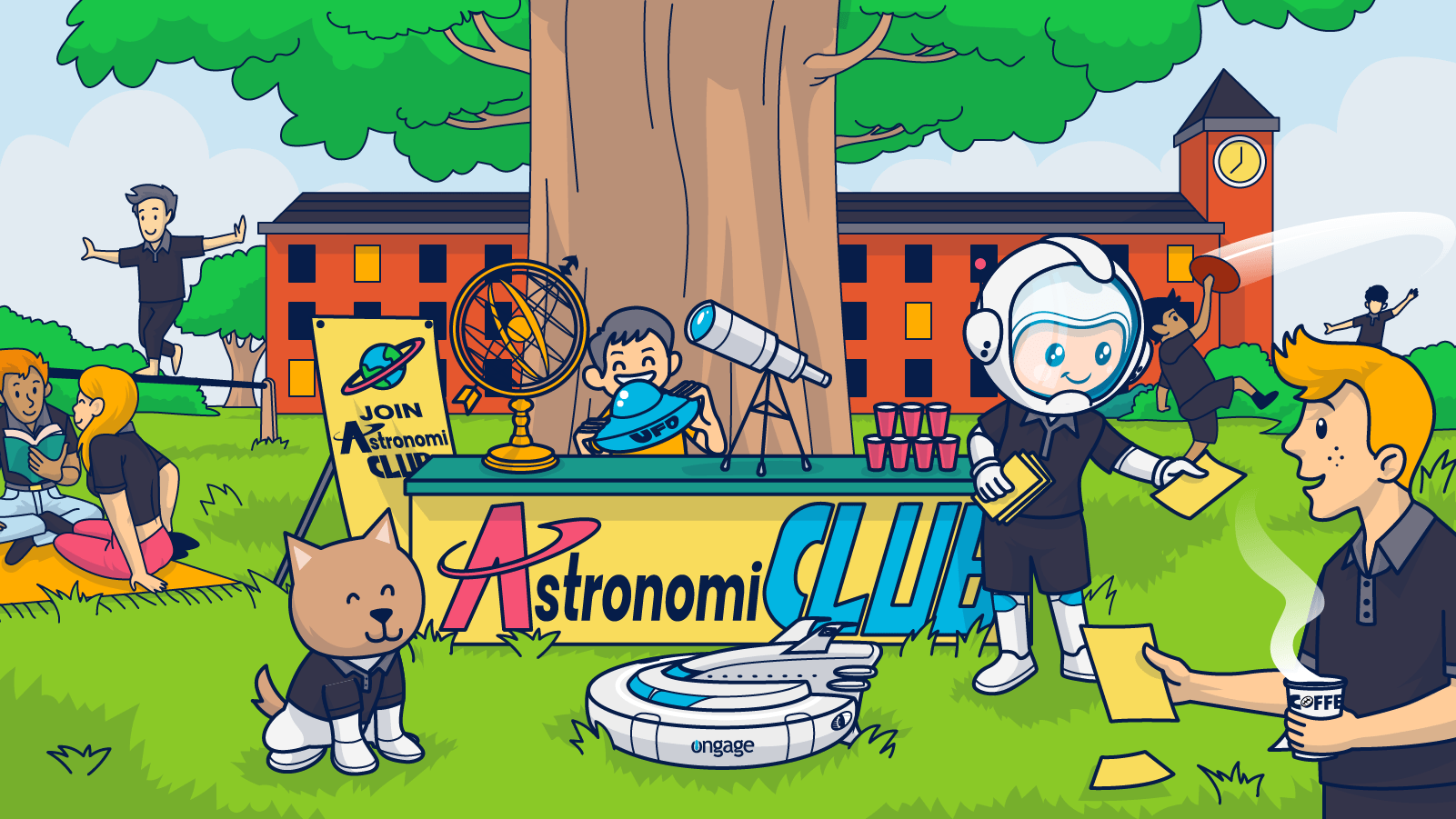
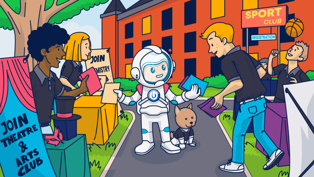
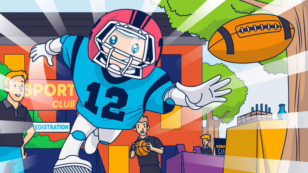
I remember attending orientation events as a fresh college student. So many interest-based organizations, social groups, academic sections, and other entities were vying for my attention.
When they were all assembled on the campus quad or in an auditorium, the number of people competing for new students’ time was a little overwhelming. To stand out, each group would decorate their table or booth to communicate what they were about and get students to take a closer look.
Sometimes members of the group would walk around campus, passing out flyers and inviting students to visit their booth at the event. They offered students gifts or swag to get them to stick around and hear a group’s pitch. Most organizations passed out information sheets or brochures that explained more about them.
Email marketers use many of these same strategies. Of course, you aren’t decorating a physical booth in an auditorium on a sleepy Saturday morning. But you do create inside your digital conference hall (a.k.a., the inbox) subject lines that get subscribers to stop and read your message and email copy that brings them in.
Earning the opportunity to introduce yourself is just the start. Each of those campus groups was seeking student sign-ups for a reason.
Sound familiar?
Having an active student as a member of their organization and supporter of their cause is quite worthwhile.
Let’s start by understanding the laws of attraction, retaining subscribers, and converting them to loyal customers using your email newsletters.
Getting started with basic newsletter examples
An email newsletter is an email that you send to your subscribers regularly. It keeps them informed about everything that matters to your company, product, or brand, and the best ones share news that provides value according to data collected.
Your newsletter can be anything from and have a frequency of:
- A monthly summary of your business landscape with important updates.
- It can be a weekly assembly of products that are a great match for their taste.
- A daily update about which celebrity did what and with whom.
- Industry news or updates that reflect the subscriber’s preference center choices.
- Community interest or other news, or curated content from multiple sources. And much more.
Let’s dive into some examples that I like.
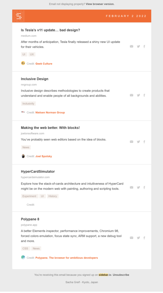
Sidebar shares a curated collection of articles about design with its subscribers.
Other newsletters are equally informational but less “newsy” and more educational. These include how-to or onboarding guides, explanations of new products or features, or pieces designed to teach subscribers about topics they care about.
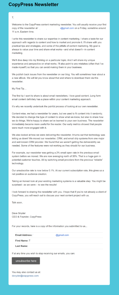
This onboarding newsletter from CopyPress below welcomes new subscribers and offers both what-to-expect and practical advice to readers.
Finally, some email newsletters are more like promotional brochures or catalogs. They tell subscribers about new or popular products and upcoming sales, invite them to events, or are otherwise closely linked to a bottom of the funnel action.
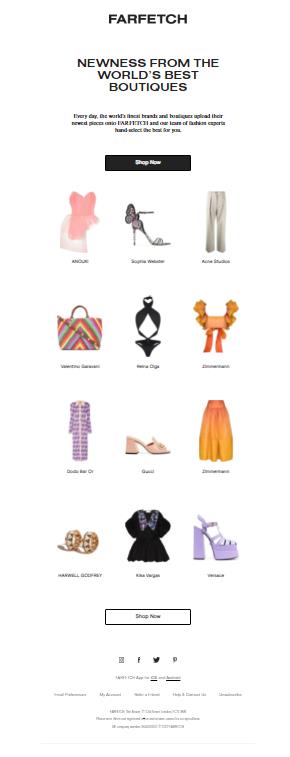
The product-focused email newsletter sent by Farfetch captures subscribers’ attention with a crisp design that maximizes the visual impact of each item. The newsletter provides a quick snapshot and invites readers to learn more.
The type of newsletter (or newsletters) you send depends on your newsletter campaign objectives and your audience’s preferences.
For example, if your goal is to enhance your reputation with subscribers by demonstrating your credibility and expertise, then an informational newsletter might be the best type to send. On the other hand, if your purpose is to build customer lifetime values by increasing your subscribers’ purchase frequency, then a promotional newsletter would speed that process.
Of course, if your audience doesn’t want to receive promotional news from you, then your newsletter won’t have the desired effect. If they are looking for deeper connections, you’ll need to publish content addressing their interests and desire for community.
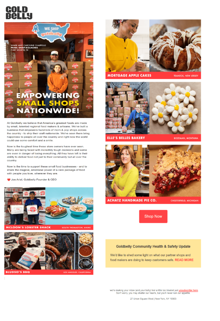
Goldbelly finds and distributes products from small businesses. This human-to-human newsletter explains its purpose with a personal letter and highlights some of the small businesses it supports.
But hey, sometimes what makes subscribers happy is getting the inside scoop on a really good sale!
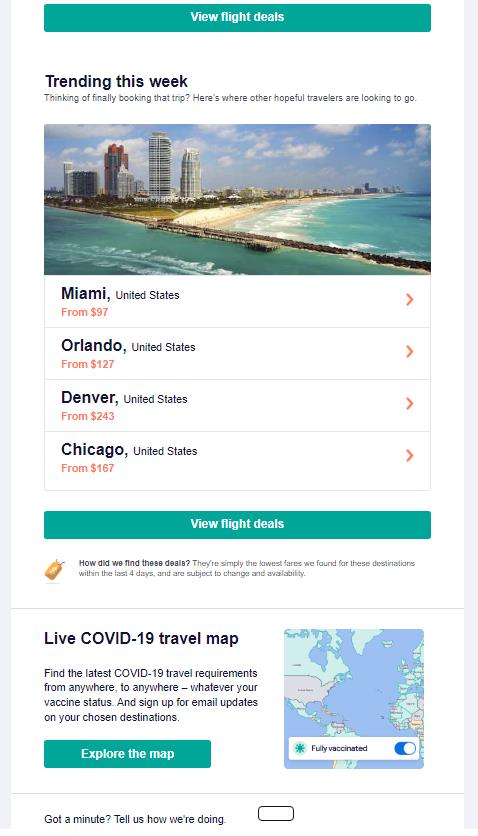
Skyscannner’s newsletter features top travel deals to keep its subscribers on the move in the know.
I haven’t even started to scratch the surface of the types of newsletters there are and their goals. And as you can see, the definition of an email newsletter is not static.
As you develop your email newsletters, think less about tradition and more about what the concept means to your brand and your customers. And always, always, let your data be your guide.
Your step-by-step guide to building better email newsletters
As mentioned, to create outstanding email newsletters, you need to create a plan, execute it with precision, and become religious about the consistency in which you send.
Follow the steps below to choose your newsletter’s purpose, audience, message, and continue through testing and improvement.
Let’s start with step No. #1!
What’s your email newsletter goal?
What do you want to achieve?
Creating compelling email newsletters that grab subscribers’ attention in the inbox starts well before you begin selecting content and designing elements.
- Start by defining a primary objective for each email newsletter campaign.
- Determine the KPIs for the campaign and what measure will indicate that the campaign has been a success.
- Look at the performance of past campaigns to guide your performance targets.
This is an area where email marketing has a marked advantage over meeting in that student convention center I mentioned above. You can create different newsletters-with different goals and content–for different segments of your subscriber list.
For instance, you can create separate newsletters for subscribers at different stages in their buyer’s journeys, based on their interests or stated preferences, or by audience type.
An example of this segmentation strategy would be a job search platform that sends recruiters and hiring managers a newsletter that curates talent management news and links to its blogs while sending job seekers a list of relevant job listings and job interview tips.
Each newsletter nurtures the brand’s subscriber relationships and encourages click-through from different audiences.
Somewhere down the line, these audiences will meet on the website.
💡 Check out Ayal’s email analytics post to learn more about setting your KPIs and performing segmentation analysis to support your newsletter segmentation strategy.
Segmentation by stage in the buyer’s journey allows you to send the right message to the right person at the right time to encourage subscribers to keep moving on their journey. Plus, using dynamic content and automation, you can use similar content for each segment’s newsletter. It just takes a few tweaks here and there.
How can you do that? Send new subscribers a “get-to-know-you” newsletter introducing your brand and explaining your underlying values and mission. Then repeat this messaging through subsequent newsletters while transitioning to more promotional content as the relationship progresses.
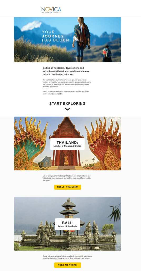
Novica shows new subscribers what the brand offers with this start of the journey newsletter filled with captivating imagery.
For your loyal customers, you can lighten up on the “who we are” content and replace some of those newsletters with mailings that emphasize rewards programs, exclusive previews, and similar VIP content.
This one-size-doesn’t-fit-all approach lets you warm up your relationship with new subscribers before you ask them to purchase your products or services.
Speaking of new subscribers, you can’t have an effective email newsletter campaign without‘em.
Building your subscription list is step No—#2.
Expand your subscription list with your target audience in mind
You may already have a list of subscribers you plan to send your email newsletter. But there’s always room for more! How many more is one of the first decisions you should make when designing your newsletter list-building strategy?
While growing your subscriber list is important to keep new leads coming in, not everyone is a member of your ideal audience. Subscribers who aren’t that into you can become a problem if you continue to send them emails and don’t get engagement. These non-engaged users can hurt your sender reputation and lower your deliverability.
Fight potential deliverability issues from the start by developing sign-up campaigns that target individuals who are likely to engage with your messages and practicing good list hygiene to remove lapsed subscribers.
To gain qualified leads for your email marketing campaigns:
- Place your paid lead generation ads where your ideal customers spend their time. Use customer personas, lookalike audience and keyword targeting to get your sign-up forms in front of the people who are most likely to respond favorably.
- Use behavioral signals to identify visitors’ level of interest in your website and only deploy a sign-up pop-up once that signal is received. Think about the experience from the consumer’s point of view. Do they know whether they want to hear more from you if they haven’t seen your website?

AppSumo avoids the pop-up conundrum by placing a static banner just below the fold on its home page. This non-intrusive form is inviting and on-brand with its “Gimme the goods” CTA.
- Give visitors a way to sign-up when they’re ready. Okay, if there’s no immediate pop-up, what do your visitors who know they want the newsletter to do?
Hopefully, you’ve got that handled with a sign-up form in your website’s header or footer. Add your form on other static pages, such as your Contact, Checkout, and FAQ pages.
- Encourage existing subscribers to share your email and include a sign-up link in your emails so people who received the message from a friend can subscribe easily.
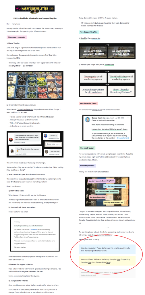
- This suggestion may be controversial, but consider adding a little friction to reduce your top-of-funnel entrants. Usually, we are all about reducing friction at every stage. However, if you want to keep your email list a little exclusive, add friction to your sign-up process.
Many B2B brands ask a LOT of questions when collecting email leads. This may cause some people to abandon the process but also signals the intent of those who stay the course.
Superhuman, the notoriously selective email app, is famous for its onboarding process that handpicks users to ensure that only the right ones are using their app and are onboarded seamlessly. And when searching for their newsletter, you’ll have to dive through to the footer to find it.
And it’s one of the fastest-growing email apps out there.
Of course, if you aren’t trying to be exclusive about who signs up for your email list, make sure your sign-up forms are low-friction, easy to locate, and don’t ask too many questions.
What else can you do to build a robust subscription list for your email newsletter?
Start with an attractive (and easy to navigate) presentation. Make sure your forms are accessible and responsive and function across various devices.
I recently tried to sign up for a newsletter from a very well-known sportswear company without success. The sign-up form required me to enter a birthdate using drop-down menus to select each field. Unfortunately, the interface didn’t work for me, and I left without joining the list.
Next, tell potential subscribers what they’re signing up for. This one can be a bit tricky. Many sign-up forms only address the immediate benefit of joining a brand’s email list. For example, the form may say, “Sign up now to receive 10% off your first order!”
Incentives aren’t a bad idea–in fact, they are one tactic I suggest in our post that reviews sign-up forms’ best practices. However, they don’t tell the whole story.
You plan to continue sending emails after you deliver that first discount code, right?
Tell subscribers what to expect throughout your relationship. Will they get product updates, blog articles, or exclusive deals? How often will you email them?
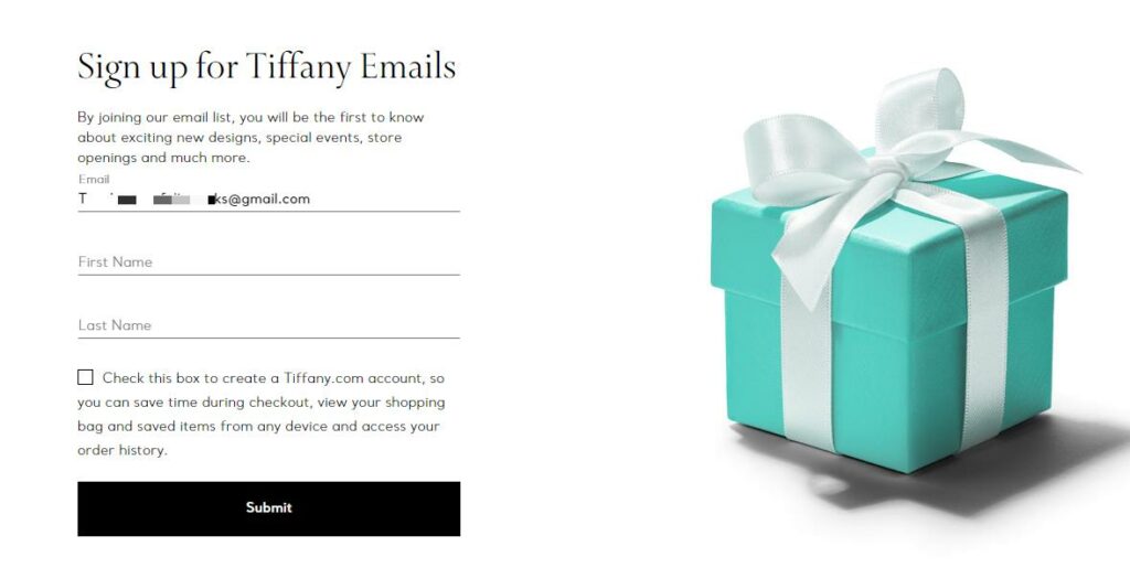
This sign-up form on the Tiffany & Co. website tells visitors what they’ll get by subscribing.
You might even send them directly to your preference center after they sign up so they can choose the frequency and content types themselves. Do some A/B testing with different forms and formats to see how much information is too much information for your website visitors and continue to optimize your list-building processes.
Whether your sign-up offer is a discount, access to exclusive deals, or the opportunity to become a part of a community, make your value proposition clear and consistent across your sign-up messaging.
And be sure to follow through on your promises promptly.
Ongage offers automation capabilities that will help you to ensure timely delivery of promised coupon codes or other sign-up incentives.
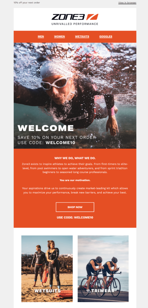
Zone3 follows up with new subscribers with an email featuring high-impact images of some of their most popular products and a special “welcome” discount code.
Did you launch your newsletter after you collected a subscriber list?
If you already have a list of emails you plan to target for your newsletter campaign, think about how you’ll introduce your newsletter to them.
Will you casually slip it into your email marketing flow or announce its arrival with a bit of fanfare?
Whether you keep things cool or give your new newsletter a special shout-out, be sure you also give your existing subscribers (and any new ones) a way to opt out.
Always include an unsubscribe link and a link to your preference center in your message footer. The more control over their inbox you give subscribers, the better your relationship with them will be.
Build a foundation to support a positive newsletter experience
Your newsletter’s success or failure will largely depend on what the subscriber sees once you’ve sent it–the subject line that makes them want to open it and the content that inspires them to take action. But you and I know there’s much more to creating a successful email than the subscriber sees.
Start with ensuring that you are working with an email service provider that can handle your newsletter sending volume and support your automation and dynamic content choices without worrying about being throttled because of volume constraints.
Then, prepare an email newsletter template that optimizes the recipient’s experience.
Follow these UX-boosting design tips to build a winning email newsletter template:
- Use a template made for mobile. As more consumers check their email on the go, mobile-friendly messages are a must for your brand—design with the mobile’s responsive screen in mind. If you choose an HTML template, make it a responsive one.
- Make it look good in dark mode. We mentioned the adoption of dark mode in our article about trending design tips to boost engagement in 2021. You can create templates that display different colors when your subscribers have selected the dark mode setting. Or take a shortcut and create a design that always performs well in low light.
- Aim for maximum accessibility. Some of your email recipients are visually impaired or use screen readers for other reasons. Add alt-text to your images, use text instead of or in addition to graphics to convey important information, and watch your color contrast so that everyone can enjoy your newsletter.
- Watch your file size. Newsletters can go on and on, but eventually, your subscriber’s mailbox provider may say enough is enough. If your code exceeds the maximum size, your message will get clipped. Check your measurements, add a “view in browser” option, and use an HTML code compressor to avoid being cut short. Keeping an eye on size will also help your mobile download speeds.
- Nail the navigation. Check your clickable elements. Are they big enough to locate and click on any device? Does every clickable element take the subscriber to a page on your website or other shared pages? (Don’t you just hate it when you click on a banner or product and it just opens the image of the banner or product?)
- Test everything. If you’re unsure how your emails will work on different devices and email clients, preview-test your designs before releasing them. Tools like Email on Acid will allow you to peer through the darkness and understand how your emails will render before hitting the ‘send’ button.
Select the design that delivers what your audience is looking for
Everyone has different tastes and interests. That’s one appeal of campus life. With so many organizations and opportunities to choose from, everyone could find a great match. Your email newsletter will not appeal to everyone. You’ll have to design it to match what your subscribers want to see.
- Are your subscribers looking for a fact-packed message with simple text formatting?
- Maybe they want every newsletter to deliver an exciting visual experience?
Use what you know about your subscribers to select your newsletter’s format. Then make adjustments based on your ongoing engagement metrics.
If you need inspiration, check out what other email marketers have created at GoodEmailCopy and Milled. You don’t have to design your email from scratch. Use the templates and design tools from BEEFree, Canva, or Venngage to get a head start on building an attractive, engaging newsletter to suit your audience.
Here’s what you can do to create a distinctive, memorable newsletter:
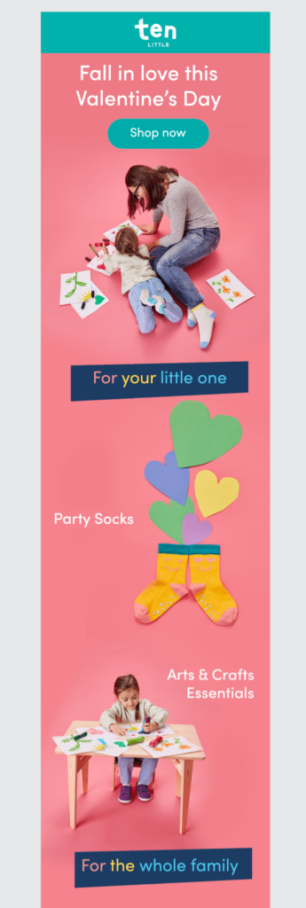
- Use colors and fonts representing your brand’s style so your newsletters are easily recognizable. That’s what children’s toy and clothing retailer Ten Little does in its product suggestion newsletter. The brand employs playful design elements and a bright, on-brand color palette to motivate click-throughs.
- Whether you use text, images, or both, keep the layout balanced, crisp, and clean. Use high-quality images with alt-text and a responsive design, or stick to a simple text layout to keep things uncomplicated.
- Give your newsletter a customized header to set subscribers’ expectations from the moment they open these messages.
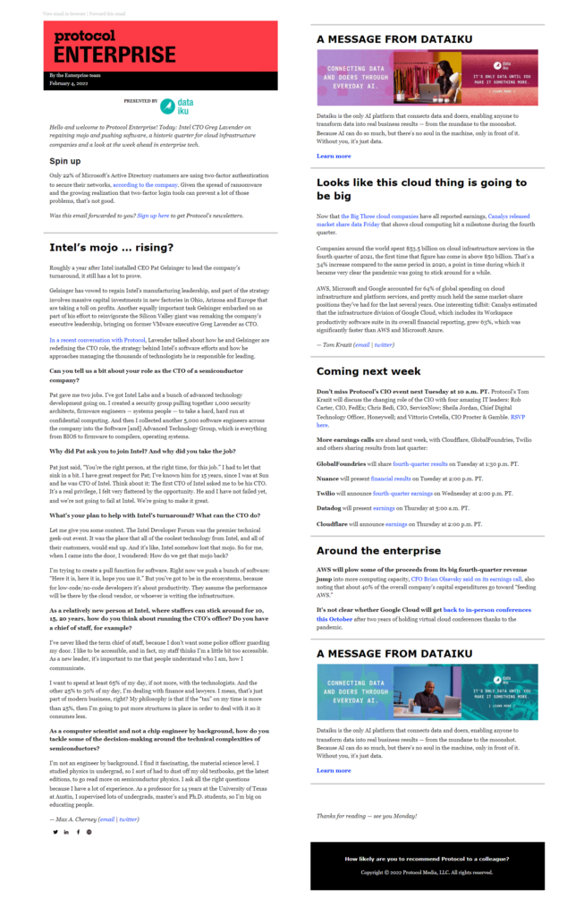
The Protocol Enterprise newsletter features a bold, distinctive header to announce its arrival.
- If your newsletter includes various content types or topics, create visual signals such as color changes or headings to help viewers transition from one segment to the next.
Consistently named sections each section of your newsletter while refreshing the content strikes a perfect balance between the familiar and fresh. Using consistent headings throughout a lengthy newsletter makes it easy for subscribers to find their favorite sections quickly.
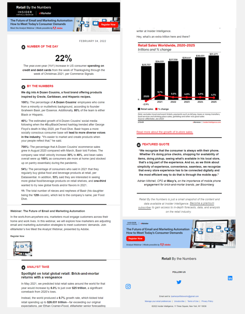
In a nod to the newsletter’s theme, eMarketer’s Retail by the Numbers updates always begins with a Number of the Day segment. Lines and headings separate segments.
- Don’t forget to add a footer with your unsubscribe, preference center, and “subscribe to this newsletter” links.
Make an irresistible appearance in the inbox
I mentioned earlier that all the different groups, organizations, and clubs at college orientation dressed up their tables and booths to draw the attention of new students. But why? Does anyone choose an organization based on its decorating skills?
It’s true that subscribers aren’t likely to dedicate a lot of your time and attention to your brand based on its display in the inbox. But, it’s also true that if you don’t catch subscribers’ eyes at this critical point, you might not get a chance to show them everything you have to offer.
Use your inbox presentation to convince subscribers that your message is worth their time and set the stage for what they’ll find once they open it with a compelling subject line and preview text.
A lot of subject lines cut right to the chase, including the name of one article subscribers will find inside. Others state the name of the newsletter. But you don’t have to follow these conventions. Test different variations of copy and other elements to find out what appeals most to your audience.
Then, complement your subject line with preview text that continues the story. You should always designate the text you want to appear in your pre-header. Otherwise, you can end up with preview text that says things like “View in Browser.”
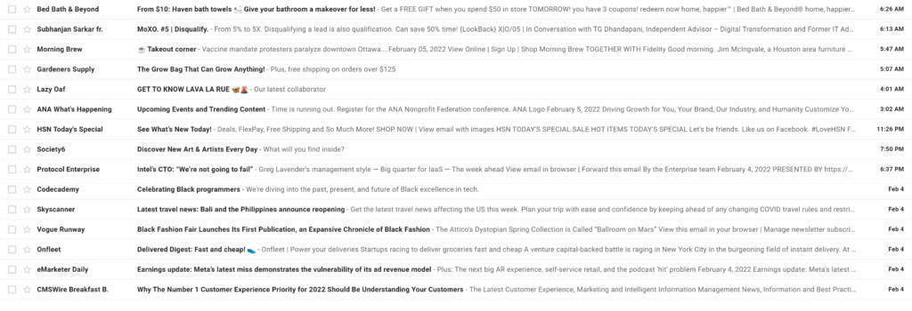
This inbox image illustrates a variety of subject line selections. There are discount reveals from online retailers and newsletter names from industry publishers.
Did you notice that the Sender names vary, too?
Some newsletters are sent from the brand. Others use the newsletter’s name for their From field. Using the newsletter’s name helps receivers keep track of which newsletter has arrived when they’ve subscribed to several different offerings from the same publisher.

Condé Nast sends each of these newsletters, but only one includes the brand’s name in the From field.

Vogue combines the brand and newsletter name to identify each of its different publications.
Should you use emojis to capture attention in the inbox?
Some brands do, and some don’t. This is another opportunity for you to conduct A/B testing to discover what works for your audience.
Annotations and BIMI
Google Annotations and BIMI are two more ways you can help your messages stand out in a crowded inbox. Google Annotations can be added to newsletters that are aimed at Gmail’s promotions tab. Enabling this feature gives you extra space to make your case with subscribers.
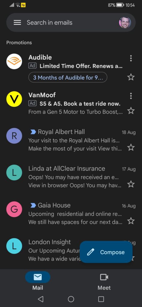
The BIMI protocol isn’t quite flashy as an Annotation but still helps your brand stand out by adding its logo next to the sender’s name.
Here’s Morning Brew’s logo in action.

Shore up your newsletter’s deliverability

Deliverability is pretty important if you want your newsletter to succeed. After all, your subscribers can’t open your message if it never reaches their inbox. We’ve created a complete guide to help you overcome potential deliverability obstacles. You can download it here.
If you’d like a quick review of the highlights. You’ll find them below, but the above is a 56-page must-read PDF for any email marketer.
Let’s start:
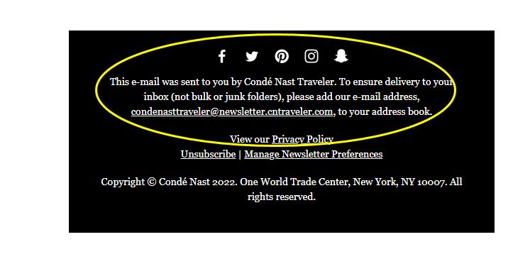
The best way to land in your subscribers’ inboxes is for them to inform their email service provider you are welcome there. So, ask your subscribers to add your newsletter sender address to their contact or safe sender list.
Next, ensure you are protecting your domain reputation by practicing good sender behavior so ISPs don’t treat your messages as spam.
Tools such as Mail-Tester can help you assess how likely your emails are to land in the inbox. It will also make recommendations based on your email’s spam score. Sender score and Google Postmaster can give you additional insights about your sender reputation. The better your sender reputation, the more chance your newsletter has of landing in the inbox.
Also, signal to ISPs that your subscribers like hearing from you with tactics to boost engagement through your email’s content. One easy way to encourage engagement when emailing a newsletter is to give subscribers a quick summary of an article and invite them to click through your website to read the rest.
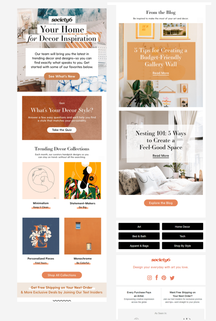
Links to product pages and special sales are also effective ways to grab subscribers’ attention. But you can also use quizzes, polls, and other interactive elements to encourage your subscribers to engage with your newsletters.
Society6 invites subscribers to click through and discover their decor style with a “Take the Quiz” CTA in its newsletter.
Finally, review your subscribers’ responses to past emails to identify the best times to send your email newsletters. Once you pick a time, stick with it. Send your emails on a predictable schedule, so your subscribers know when to look for them.
How to create email newsletters subscribers will look for in their inboxes?
Congratulations, you’ve made it to the content stage of developing your email newsletter! This is the stage where you can let your brand’s personality, creativity, and values shine. What exactly will your newsletter include every day, week, or month?
Three questions to get you started.
Will your newsletters feature varied content and categories or always keep things the same?
Some newsletters, such as blog distribution or job update newsletters, stick to one type of information that is updated with every send. Subscribers who know what they want and want to view it quickly appreciate the narrow focus of these newsletters.
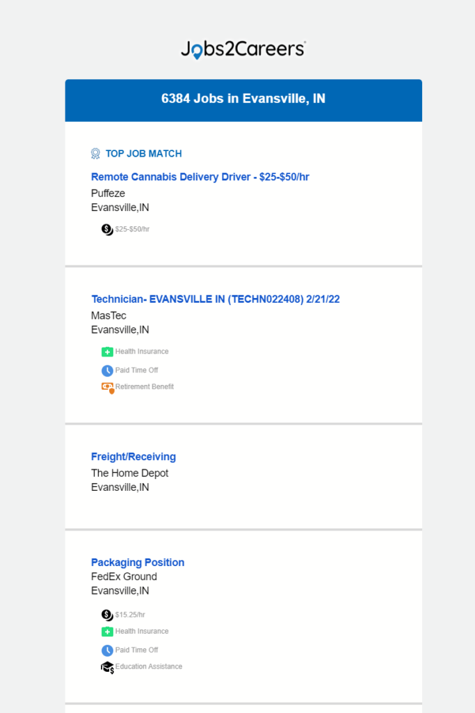
Jobs2Careers inserts dynamic content to send subscribers a personalized newsletter with local job listings in a clean, easy-to-navigate format.
Others, such as content round-ups and promotional messages from retailers, combine several types of content in a single newsletter.
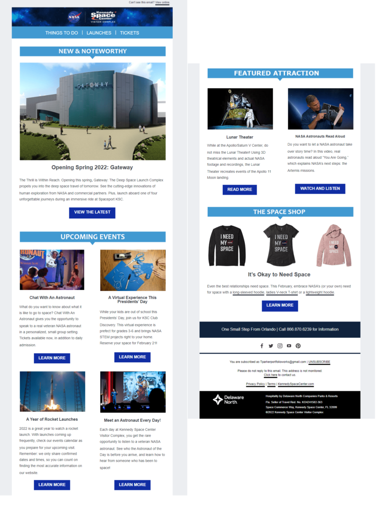
This newsletter from the Kennedy Space Center includes sections about the latest news, upcoming events, featured attractions, and items subscribers can purchase. The newsletter’s design brings together a clean, cohesive look for the brand.
Should you name your newsletter?
Giving your newsletter a name enhances its recognizability but may limit its flexibility. For example, subscribers receiving your “Deals of the Week” newsletter might be surprised if it contained press releases and an update from the CEO instead.
Will your newsletter always send the same type of content using the same format, or will it be something completely different every time?
The Jobs2Careers and Kennedy Space Center newsletters contain different content every time, but what that content will be and the appearance of the newsletters remains predictable. This makes the newsletter a recognizable mini-brand of the sender.
But, just as naming your newsletter limits its scope, so does choose a single-style or content type in advance. Once your format is fixed, you must separate newsletters and segments if you want to change things up.
Brass Roots’ newsletters contain different content each time but use a consistent design format to tie them all together. For example, the email below shares valuable information about a single product the brand stocks.

I’m a fan of consistent formats and separate segments for completely different newsletters because this provides flexibility while still delivering on your subscribers’ expectations. Plus, you’ll gain more data for reporting and analytics if you split your newsletters by type and content. However, let your data be your guide.
Besides, there are many ways to communicate with your audience using newsletters. Who says you have to choose just one?
Newsletter examples to engage your audience and achieve your goals

⮕ Content about your brand:
- Industry news summaries and updates.
- Blog, article, and opinion piece round-ups.
- Letters from the CEO, AMAs, or expert interviews.
- Behind-the-scenes articles or videos.
- Product launch, updates, or new feature announcements.
- Product or service spotlights.
- Employee, customer, or contributor spotlights.
- Press releases.
- Event sneak peeks, recaps, and inside look.
- Job openings and “what it’s like to work here” content.
- Survey and poll results, data-backed reports, case studies, and trends analysis.
Check out this example of brand-focused newsletters designed to keep subscribers informed and engaged.

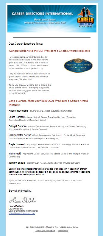
Career Directors International encourages community participation by announcing its Career Innovator Award competition in its email newsletter. The brand announces the winners in a subsequent newsletter.
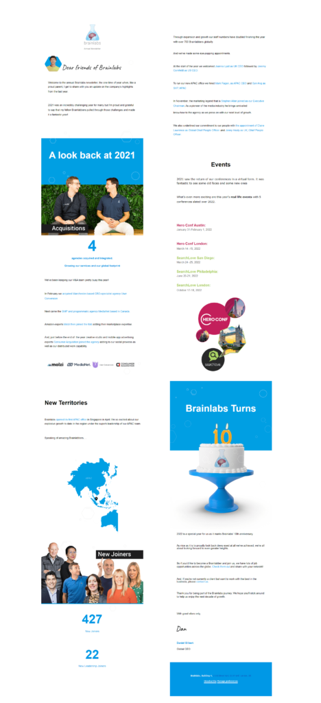
Brainlabs opens its annual email with a note from the founder before sharing various information and updates with readers.

Storq leverages its recent editorial mentions to build its brand in this “What people are saying about us” newsletter to subscribers.
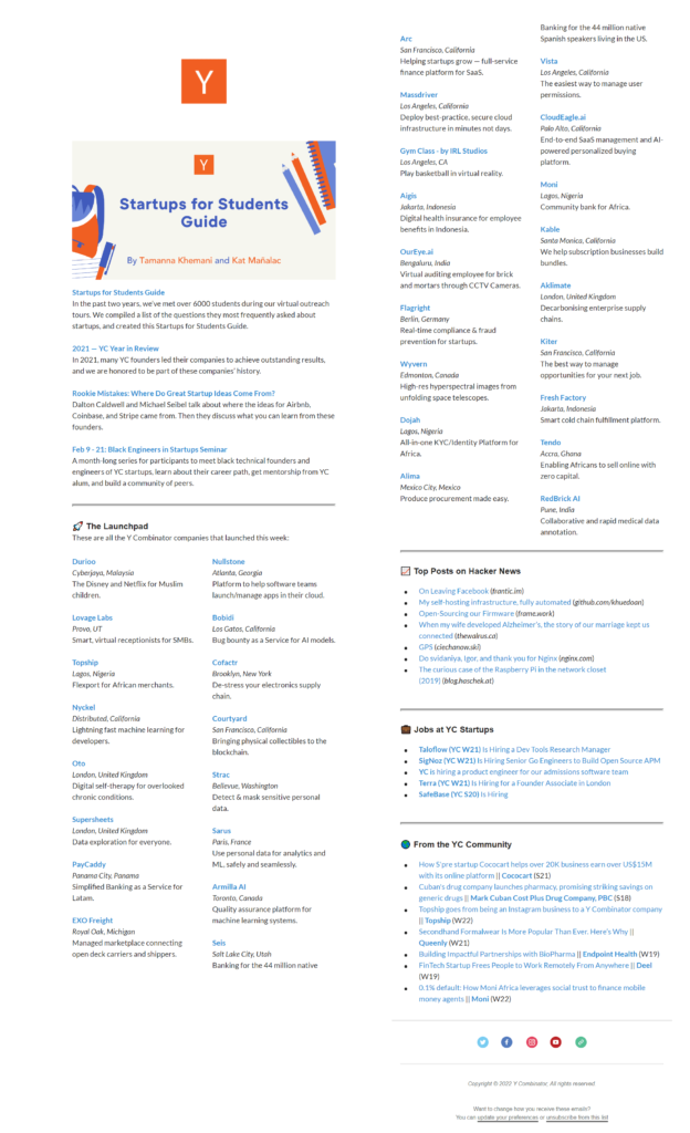
Y Combinator combines recent updates and community news with forum and job posts in its newsletter for student subscribers.
⮕ Content that serves your customers and subscribers:
- Welcome and onboarding information.
- How-to guides and tips for using your product.
- Guides and advice about topics related to your product or services.
- Public service and values or interest-themed content.
- Holiday- or event-themed newsletters.
- Contests, polls, and surveys (plus the results!).
- Special offers, limited-time deals, and exclusive product previews.
- Gifts and discount offers and sponsored giveaways.
- Loyalty program updates and incentives.
- User-generated content sharing and social media summaries.
- Customer testimonials and case studies.
- Feedback requests.
- Customer appreciation announcements.
Here are more newsletter examples to inspire you.
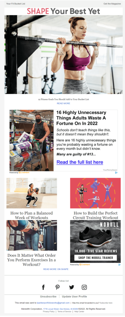
Shape Magazine’s “Your Best Yet” newsletter delivers useful advice to help subscribers achieve their personal goals.
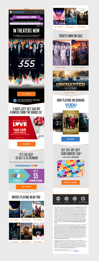
Fandango presents subscribers with a colorful update about upcoming movies interspersed with special promotions in its product-first newsletter.

This newsletter from Lovecrafts is clearly designed to drive deeper engagement by directing subscribers to several channels where they can connect with the brand and other crafters.
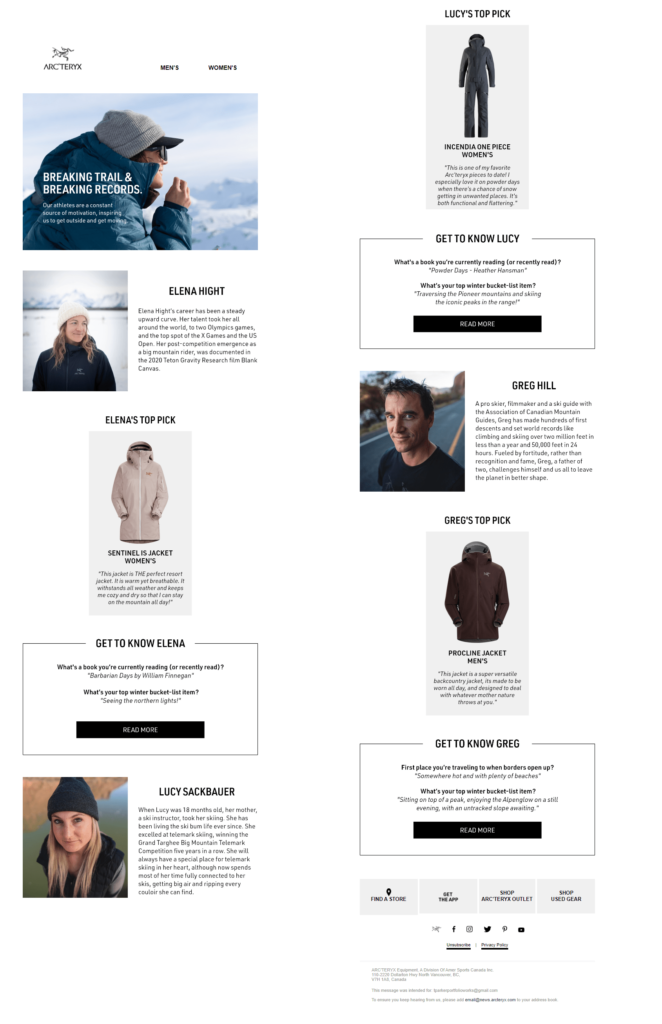
Arć Teryx’s message brings products and people together to lend social proof and a feeling of community to its products.
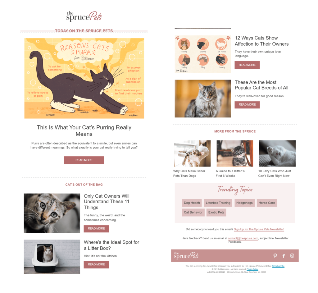
The Spruce Pets curated blog articles and other themed content for this all-about-cats edition of its newsletter. Will it drive conversions? It is a safe bet that many of those blog articles include links to The Spruce Pets products.
Further boost your newsletter’s impact by using text, images, and videos in your newsletters. (Just keep bandwidth limitations in mind.) Plus, add personalization to make them even more engaging and make new subscribers feel like old friends.
Employ your top creative copywriting skills for your newsletter, too. Use persuasive devices such as urgency and exclusivity to get your subscribers to take action quickly. Or build a sense of community and connection with messages that express empathy and shared values.
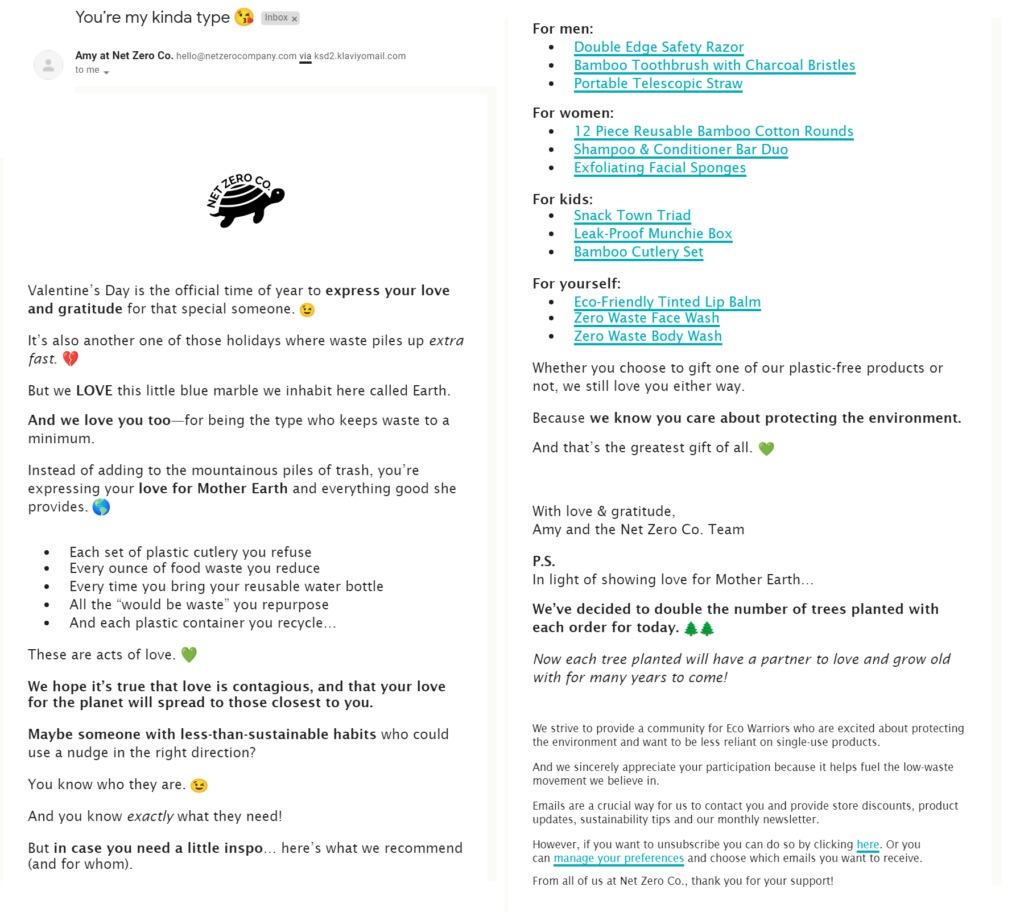
Net Zero puts its values front and center in its newsletters from Amy, packed with encouragement and tips to help reduce waste.
While we often think of newsletters as reporting “just the facts,” you can also add storytelling elements to your newsletters. Create a theme or an ongoing narrative that resonates with subscribers and makes them want to keep reading (or viewing) to find out more.
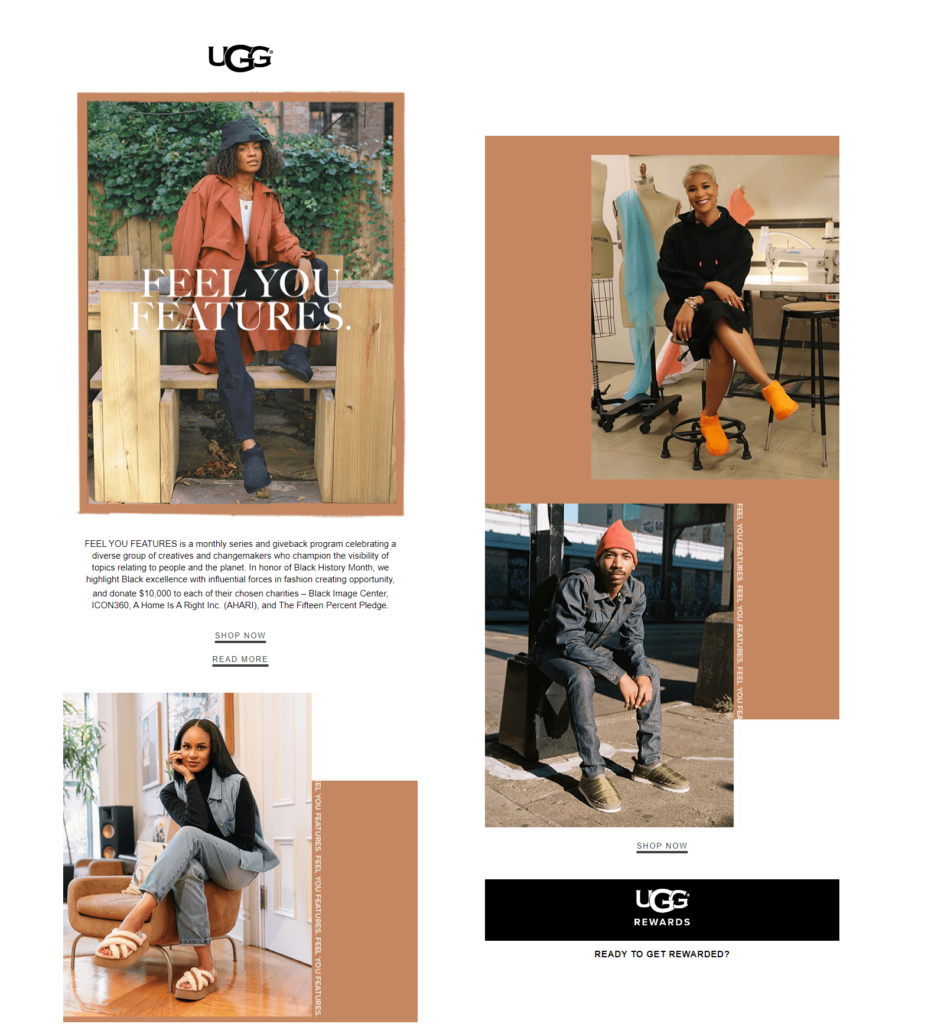
UGG created a special edition of its Feel You Features email to celebrate Black History Month and show its commitment to the values it shares with subscribers.
Continue to analyze and improve your email newsletters strategy to maximize results
Which newsletter strategies and tactics are suitable for your brand?
You’ll find the answer to that question through testing and data collection. Experiment with different segmentation and content strategies until you achieve the performance results you set as your goal at the beginning of your email newsletter campaign.
Your Ongage testing and analytics tools can help you stay ahead of the crowd when it comes to what’s in and what’s out with your subscribers. Use A/B and multivariate testing to help you choose between tactics, and be prepared to pivot in response to changes in performance.
Want to try and send your newsletter through the Ongage email marketing platform? Start your free trial today!

