Landing in the inbox is what every email marketer desires. But what happens when your emails reach the Gmail Promotions tab? Turns out, if you learn to embrace it and use its features, it can make your engagement rates shine. Here’s how.
Email marketers have been trying to get out of Gmail’s Promotion tab since ancient 2013.
This is the year that Google, with one mighty swoop, decided to change the way Gmail looks, ushering a new area in email marketing. (BTW, two years later they launched Google Postmaster Tools).
A council was gathered, and a single inbox tab to rule them all was split into several.
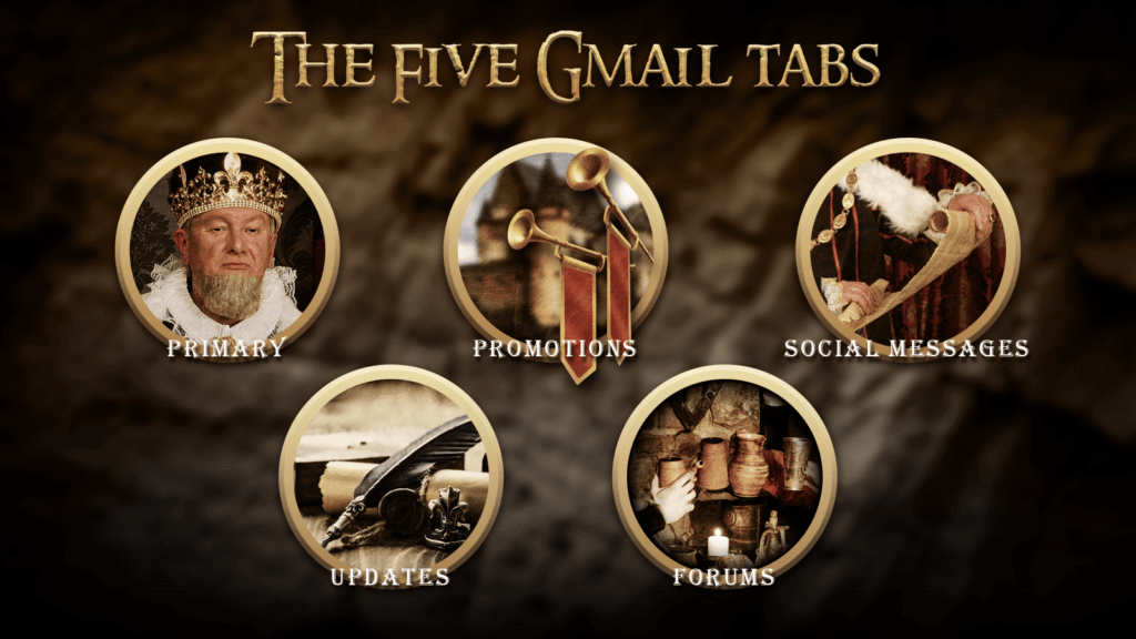
And so, the giant divided it into five tabs:
- Primary – messages from friends, family & work (mostly).
- Promotions – newsletters, deals, offers and other promotional emails.
- Social messages – sent by social networks, media-sharing sites, online dating services, gaming platforms, and other social websites.
- Updates – notifications, confirmations, receipts, bills, and statements.
- Forums – messages from online groups, discussion boards and mailing lists.
Each tab possessed different content categorized according to different purposes for the end-user.
We email marketers got exiled to the Promotions tab.
Naturally, many were frustrated, as they perceived the Primary tab as their precious. Some reported a drop in open rates even.
Such a catastrophe, especially since legend has it that the primary tab is where your emails get opened and your click rate soars.
Understandably, many email marketers have since tried to weed their way into the primary tab, but it has a will of its own, and it answers to her true master only.
But, while their plight is understandable, is there any sense to it?
Let’s fast forward a couple of years and out of the fantasy we created.
According to studies, read rates indeed are lower for emails in the Promotions tab (19.2%), but only marginally so compared to the Primary tab (22%).
That being said, it seems like 45.1% of the users who use the Promotions tab, check it at least once a day.
Further, according to an earlier report, the rates of This Is Spam (TIS) complaints are about double in the primary tab compared to the promotions tab.
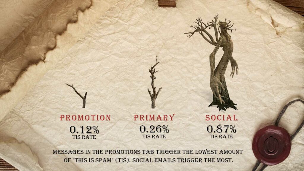
This data indicates that the Primary tab is not the new precious some people would make you think it is.
It’s imperative to remember that as always, engaging content creation should be your number one priority.
Landing in the Primary tab –
- Won’t make your email “non-promotional”.
- Doesn’t necessarily mean your promotional email will enjoy higher read rates.
Our advice?
Embrace the Gmail Promotions tab
According to Return Path’s study, not many people activate the multi-tabbed feature on Gmail anyway these days.
Since its launch, the number of people using multi-tabbed Gmail is actually down to only 33%.
That’s 1 in 3 Gmail users!
Additionally, if you’re sending commercial emails, it’s actually riskier for you to be on the Primary tab.
When people open their Primary tab, they’re conditioned to expect personal or work-related emails, sent from contacts they know.
But when they see a promotional email, it “doesn’t compute” and is more likely to trigger a negative reaction.
Disappointing people is the worst thing you can do in email marketing, an impulsive reaction can send you hurling away via reported as spam click. And as seen by the above stats, it’s more than an assumption.
But when people check out their Promotions tab, they know they will be reading promotional emails. In fact, they’re actively looking for it.
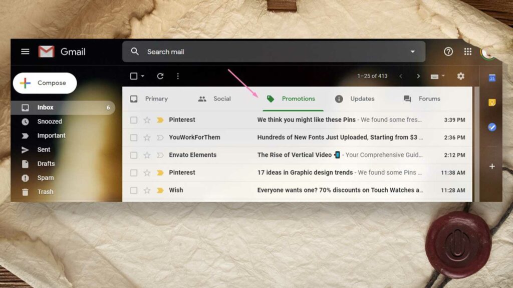
A user, for example, who has subscribed to Sephora’s newsletter, knows to check the Promotions tab to see if there are any new products worth buying or if they simply just want to browse catalogs from their other subscriptions.
Users going out of their way to visit the Promotions tab are more likely to be in a buying mood, and less likely to report promotional emails as spam.
In this sense, your marketing emails are actually better off staying in the Promotions tab.
And once more email marketers accept this development, they can focus on improving their engagement metrics by fully utilizing the Promotions tab’s features.
How to stand out in Gmail’s Promotions tab?
Now that the data confirms how Gmail’s Promotions tab can be better for your promotional emails, it’s time to focus on how to make the most out of it.
In December 2018, Google rolled out a new update to the Promotions tab that gave Email marketers more ways to add details and visually spruce up their content.
By adding email annotations to the Promotions tab, email marketers can add visual branding elements, copy, and context to their promotional emails in order for them to stand about.
Additionally, these features make it easier for subscribers to immediately get hooked by promotional images and their offers.
“Annotations” allows you to add key information to your email:
- Image preview
- Company logo
- Expiration dates on deals
- Deal badges & promo codes
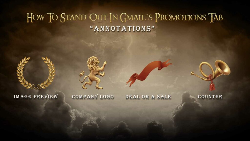
When utilizing all of the above, your email can visually stand out and invite higher conversions.
Image preview: A picture is worth a thousand opens
Images are an essential part of marketing in general, and even more specifically when it comes to email marketing.
By utilizing image preview, it is now possible to give recipients a quick glimpse of your email.
You can showcase your product, set the mood with a lifestyle image, or include some short copy.
This is prime real-estate!

Company logo: Let them know who you are
Another plus of using Annotations is the ability to attach your logo to the email.
This makes email from you instantly recognizable.
Since your content is engaging and interesting, having the logo pop within a slew of them would make your email more likely to get opened.
Just don’t forget to use https when linking to your images, otherwise, you may experience some issues.
20% off!
When offering a deal or a sale, it’s possible to easily communicate the most important detail – the amount of the discount.
Users don’t have to open the email in order to see how much they can save on this sale.
Once implemented, a green badge will appear with the deal written on it.
On top of that, if you have a coupon code you want to share, it will appear as a grey badge right next to it, further enticing users to open your email.
Expires in 3 days!
Ever heard of FOMO (Fear of Missing out)? It’s a very powerful tool in today’s marketing world. Creating a sense of urgency is one way to achieve it, and helps to make users buy something.
Marketers often use this method in the form of a limited sale or a limited stock (also referred to as scarcity).
With Annotations, email marketers can easily present the end date of the promotion, drawing the users’ attention even more.
The preview has it all
It’s quite amazing really. Combining all of the above makes for quite a strong preview.
Just by scrolling the Promotions tab, users are able to infer key aspects of an email – who’s it from, what’s the deal, when it expires and the products available.
This allows you to provide greater value for your users. After all, it’s all about them, not about you.
That being said, while these tools help you stand out, content is still king.
If your content is not engaging, all the images and green badges in the world won’t help your open rate or CTR.
How to implement Gmail Annotations?
All you have to do to enjoy this nifty feature is to insert a small snippet of code into your email header, here’s an example we’ve made for a promo:
| <!DOCTYPE html PUBLIC “-//W3C//DTD HTML 4.01//EN”> <html> <head> <script type=”application/ld+json”> [{ “@context”: “http://schema.org/”, “@type”: “Organization”, “logo”: “http://img.oc.gg/images/4705e4bf4511cac0.jpg“ },{ “@context”: “http://schema.org/”, “@type”: “EmailMessage”, “subjectLine”: “High Velocity Emails” },{ “@context”: “http://schema.org/”, “@type”: “DiscountOffer”, “description”: “20% off”, “discountCode”: “Ongage20”, “availabilityStarts”: “2018-01-01T08:00:00-07:00”, “availabilityEnds”: “2018-12-30T23:59:59-07:00” },{ “@context”: “http://schema.org/”, “@type”: “PromotionCard”, “image”: “https://www.google.com/gmail-for-marketers/promo-tab/markup-tool/sample.png” }] </script> </head> <body> <p>Email Body</p> <p>Line 2</p> </body> </html> |
If the above code snippet made you uneasy, have no fear.
Head over to This Google Developers Page and easily test it.
Paste your code snippet there and start to experiment with Annotations, you’ll be able to preview the changes you made before sending your campaign.
If code testing environments are not your forte, you can head over to free implementation tools like the one FreshInbox is offering.
Still convinced the Primary tab is for you?
This next section will be of interest.
How do I get my emails to the primary tab in gmail?
The Primary tab is mainly reserved for messages from friends, family & work, i.e, real people.
If you want to get in there, you need to make yourself much friendlier, and less promotional.
In essence, all of the following tips aim to make your email look like it’s from someone the user personally knows.
There are a few ways to achieve this:
Personalize your email
Add personalization to your email by writing short, simple notes as if you were writing to a friend.
This is better than using a tone that’s more marketing-like and geared for a general audience.
By making it look like you know the user personally, Gmail might let you in the Primary tab.
To learn more about email personalization, click here.
Opt for light HTML or use plain text
While promotional emails (especially ecommerce newsletters) typically contain stylized text and images with a properly designed layout that are coded in HTML, personal messages usually aren’t.
When trying to get into the Primary tab, use simple HTML code consisting mainly of paragraphs. Just as a friend of yours would.
Limit your images
A personal connection isn’t likely to send an email with heavy use of images, either. And for those that do send images via email, these are usually attached instead of embedded. Even when a personal connection does embed images to an email, it’s usually just 1 or 2 at most.
So given the goal of making it through Gmail’s volatile filters and into the primary tab, it’s better to err on the side of caution in this case.
When crafting your email, try to keep it looking as “natural” as possible by limiting or totally eliminating any image use.
Remove social icons and links
Social icons with links are characteristics of mass promotional emails, so it’s best to remove these as well.
Simplify your footer
Most email campaigns that are sent to large email lists have headers and footers.
If you want to look “all natural”, don’t use them.
So if you really want your emails to avoid sending promotional signals, truncate your footer text into something simpler, like “Unsubscribe” instead of the longer footer text used in most marketing emails.
Limit your links
Having too many links in your message could be seen by Gmail as promotional at best, and spam at worst. Link dumping in emails just shows characteristics of a mass-sent spam email or a newsletter.
Try to keep your links at a minimum, not sending more than three. In fact, most email marketers would say to limit it to just the one.
Use friendly, non-promotional language
Mind the language and tone of your sales pitch, this is the Primary tab!
Simply put, draft an email that sounds and looks like it’s from a friend and not from a brand chasing down a sale.
Adding words such as “sale!” “50% off” “selling now,” or any promotional phrases for that matter are a surefire way to get flagged as a promotional email rather than personal.
Check out Hubspot’s piece for a list of spam trigger words that could keep you away from the primary tab.
Ask subscribers to move your emails to their primary tab
If you developed a warm relationship with your subscribers, then don’t be shy about asking them to add you to their contacts list.
There are two ways to do so, such as:
- Ask them to manually add you to their contact list
- Drag your email from the Promotions to the Primary tab

Doing that will land your email in the user’s primary tab.
For more detail, check out these Gmail Help instructions.
Don’t use a domain that already has a promotional reputation
If you’re going to make it to the Primary tab, use a domain that you don’t use for any other sending activities.
To make sure their emails achieve maximum deliverability, most big companies use different domains or sub-domains for their personal, marketing, and transactional emails.
Add some of your emails to your sending list for testing
Add a set of your own emails to your sending list so you can use these to test how your main emails perform and on what tabs your newsletter emails land on.
Such a step is necessary if you want to test, tweak, and determine the exact variations that would take your emails to and from the primary tab.
Test your emails
You’ve gone through all the trouble and changed your email so they’d land in the Primary tab. Now it’s time to see if the effort was worth it.
Create A/B variations of emails, where A is the more stylized and promotional version, and B is the more mellow and personal one.
Send both versions to your subscribers and analyze the results. It’s important to look at all relevant metrics:
- Open rates
- Click-through rates
- Spam rates
- Unsubscribe rates
- Revenue
Each of these tells a different story. At the end of the day, you need to decide which story you want to tell.
Gmail’s Promotions tab is a part of the inbox
The Primary tab is a picky, unpredictable space.
When despite all of the tips above your emails still get “stuck” in the Promotions tab, then there’s no need to despair.
The Promotions tab isn’t so bad after all. In fact, it means your deliverability is great, as you made it into the inbox. Plus, users actually check the Promotions tab each day and make purchase decisions in it according to a Return Path’s study.
And now that you’ve learned to embrace Gmail’s Promotions tab, it’s time for another unexpected twist – embracing the unsubscribe.

